It has been while since posting a project update, as many of the other posts have covered industry insights and experiences.
One of core project that appears to get a lot of attention is the post on how we created a successful game project. A post that is packed full of information on our design approach and what we did.
This Design Post
This post covers a range of packaging designs that were used and are still actively being used in the retail market – a phrase that was used often when creating the packing was “retail ready”.
These designs range from Tech Girl, Satzuma Gifting,Stem and a whole range of projects and pre-production artwork. These products have graced the shelves of Boots, Tesco’sTK Maxx, Robert Dyas, Menkind, Staples and stores across the globe.
Unicorn Power Bank
Yes… yes it is a Unicorn. And a Power BankPackaging and branding design for a ‘build your own Smartphone cover’ product
You can read more on the project on the portfolio website. It covers the branding, the packaging, the marketing and the digital design.
Proof Of Concept Packaging
The proof of concept packaging was used for design approval, used in product pitches to large retailers and also used to ‘visualise’ the package for print factories.
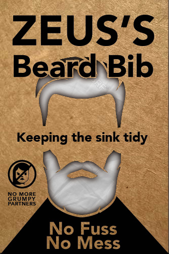
Early Beard Bib Packaging, This was put together very quickly to get a feel for the concept.
Packaging illustration
Boogie Pong Game Box Mock Up
Another Tech Girl Mock Up – Typography would be ‘Rose Gold’ Mock up / Render of a power supply boxFlash Memory Top – FSDU – Final ProofNeon Packaging – Product – Testing look and feel
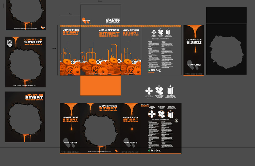
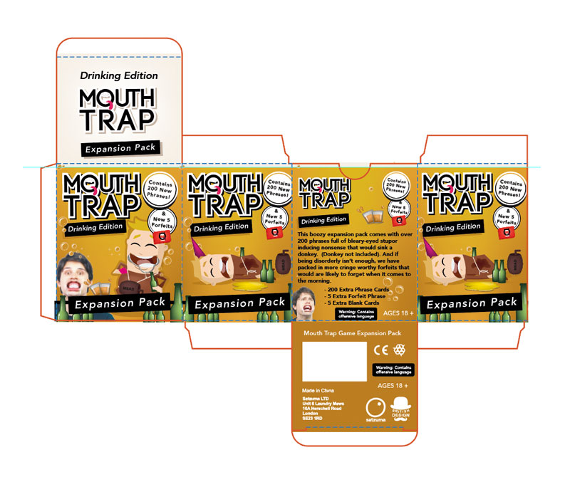
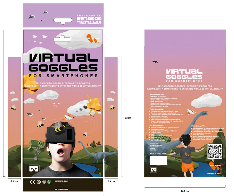
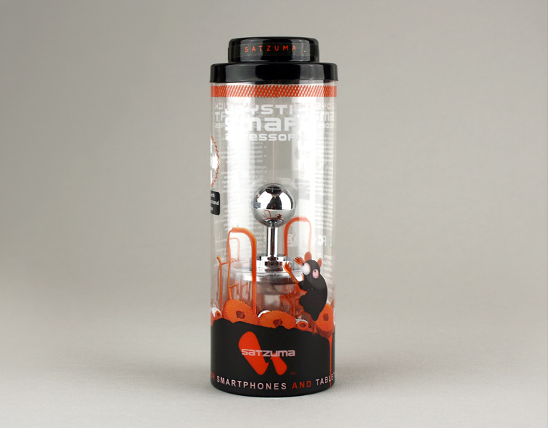
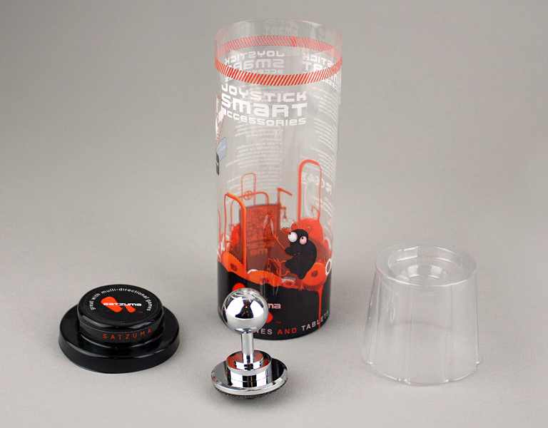
Packaging Nets
The images below show the flat nets of the packaging. This is the print ready or near print ready artwork that is generally sent of production after approval.
Early Joystick design – Packaging – Card + PET – Concept (shelved)Card box net for packaging an expansion pack.
This is one part of a larger gaming project, if you would like to read more this product please feel free. Or if you would help with you card or game design feel have a look.
Google Card DesignAR Blaster Packaging NetStem Product | Build You Own RobotBeard Bib Dev
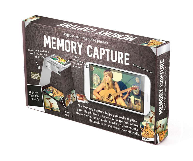
Final Products & ‘In Situ’ Shots
These are the completed products based on the designs I supplied.
Memory Capture Box & Product DesignHead phones packagingCounter Display for Product – VR GogglesMake your own Neon SignJoystick PackagingPOS design inside a retail store.
That’s all on this packaging post!
Retail Read
Packaging
If you would like any assistance in your latest packaging design be it the concept or putting together a punchy, relevant and cost effective solution feel free to get in touch or have a look at projects on the brochure website.
Retail Ready Packaging Projects – Perhaps you’d like to read :
The following block shows a simple method for making your own custom cursor in Stencyl. Please refer to theStencylcommunity help section for further details on coding blocks.
Big Stencyl logo
Getting started with your custom Stencyl cursor
This ‘how to’ covers some basics for making a custom cursor in Stencyl. In a nutshell, you need to hide the default operating system cursor and swap out for your own custom cursor, which will be an actor type.
Cursor
Part 1 : Graphics
A ) Firstly you will need to draw your one custom cursor in graphics program of your choice. I used Adobe Illustrator to draft up this pointer and exported it as a .PNG – Dims 29px 27 px, remember to save your .PNG in logical place in your project folder.
Part 2 : Importing a Cursor As An Actor Type
a ) Open Stencyl and navigate to your game project (assuming you have already made a project)
b ) In the upper left corner press on the “Actor types”and create a new actor. You will then need to add a frame and import your newly created cursor!
Example
Part 3 : How To Make it work
a ) Click on ‘actor behaviours’ and create a new behaviour! This will be a basic behaviour to make your Cursor work in your game.
b ) Click “add event” in the top of the panel. Add > When updating
c )You can either navigate through the code blocks manually or you can search for them. Using the image shown.
Stencyl Custom Cursor Code Block
That’s how to make a basic Cursor in Stencyl!
Don’t forget to attach the block to the Cursor Actor, the green button in the top right will allow you to do this – “Attach to actor”
Run game!
Bug!
Please take into account that the flash player from Stencyl ( when tested from the game ) game glitches in full screen mode. The main default operating system mouse will still be visible despite having the cursor hidden.
This could be an apparent issue with the flash player. – Dated from May 2016.
Try unticking the full screen mode… Not the best
Notes
: this bug happens on a iMac OSX i5 10.9.5
This post is edited originally from here > personal blog.
If you are looking to download stencyl you can download the software here.
If you need assistance with some of you game design assets have a look at the design portfolio here
This post covers how we planned, created and constructed a Kickstarter page down to the intricate details with a demanding deadline! We wanted to create a page that would both captivate prospective backers and sell a product… with all this in mind, we set about to create a Kickstarter page design quickly.
The crowdfunding page is a final hurdle, the last and important bastion of your project which shouldn’t be ignored.
How to create a killer Kickstarter page
As you may or may not be aware, creating A Kickstarter isn’t a small undertaking. There are many contributing factors that can influence the success of your campaign, these can range from: the product you are trying promote, the size of your audience, your marketing, page design, your authenticity – the design of the page is a single element of a much larger project. There is no absolute rules to designing your page, Although I have listed some key elements you should certainly consider.
Kickstarter Page | Basic Design Steps
The General Outlay Of A Kickstarter Page Template
Introduce the product / campaign
At the top of your page, you should place your product or item you are trying to promote. It will be the first thing a potential backer will see. Take this into consideration.
What is the campaign about
Introduce what your campaign is about and why they (the backer) should back you. You could also consider a talking a bit about yourself here.
Product Contents
Break down the campaign or product down into details. The KS crowd love to know about what they are backing. For example if you are making a game you could place some of the individuals characters or miniatures.
Key Information
it is a good idea to break down reward tiers, shipping, when etc so Backers know the details of what happens when they back you what they get at the end of the Kickstarter campaign. Remember to keep it simple to skim.
Trust
Can you make your product? Do you have experience? Are you passionate about it. Build trust with your campaign.
Also, place the emphasis on how it will help a backer if they offer their money. Don’t focus on you too much.
Look at the visual template below on how to Structure a Kickstarter Page design. This is your pitch remember!
Rough diagram for creating a Kickstarter page (feel free to share)
This post focuses on the page design, being a designer this was my largest part in creating project.
HOW TO START YOUR PAGE DESIGN
Plan your page design
If you are well underway with creating a Kickstarter or a crowdfunding project, then you are probably fully aware of how much you have on your plate. You may considering, the video, the hero header, details etc but, have you considered the actual ‘content’ on your page once you have potential backer? Consider what you are saying.
Research and ‘rough out’ your Kickstarter page
You shouldn’t just jump into your graphics package and start making pretty things. Before getting stuck into the details of your Kickstarter it would wise to look at other successful campaigns and inspect what cool elements they have on their pages. When we created pages, we did a lot of research and studied a lot of successful page designs. You shouldn’t copy, but it is worth looking at the best bits of campaigns to see what they are doing right – especially if they are promoting a similar product.
Now, start designing your page
If you have an idea of how you want your page to behave or act now could be a time to move onto your graphic design. A Kickstarter page is not only about creating a fancy theme, it needs to have easy to read content packed with relevant and interesting information about your campaign and product. Sell your campaign and show how it’s a must have for your backers.
Keep it clear and concise
You need to keep your page easy to navigate and perfect for those with a 2 second attention span. The backer should be able to skim the content easily and pick out the useful data. Such as ; what the product is, rewards and when you are intending to manufacture the game.
Make the rewards stand out
Web users are impatient. Make the rewards easy to find in the body of your page and make them look exciting! You want to grab a potential buyers attention and drive them to make a call to action. In other words – ‘back your campaign’ – now!
Be authentic
The crowdfunding community can sniff out anything that is a little bit off with your campaign – it’s like blood to a shark, you don’t want sharks swimming around you I’m sure.
Be as honest and as open as possible. You should be clear and open with your backers, you want them to trust you! Using rendered images, fluffy ‘Maybe’ language, or concealing parts of the project will only arouse suspicion when at this delicate stage you want to win trust.
Tell a story
Who are you and why are
you doing a Crowdfunding campaign? Don’t be afraid to create a story
about why you want funding and why others should feel as passionate
about your campaign.
Validation
To convince a backer that you are able to fulfill your demand, you will need to make sure you cover a few areas on your page design. Eg.
– Do you have previous experience in what you are trying to create? – How many years experience do you have? – Do you have a trusted supplier?
You don’t have to focus on all the fears of your project, but mentioning a couple can add an extra layer of sincerity.
Make it VERY interesting
Keep your page interesting, you want to hold the backers attention for as long as possible. Writing line after line of text about your campaign is too much, you are expecting too much from the backer.
You need to break up the information and make it easy to skim. Vary the page by including diagrams, illustrations, photo’s, animations, videos, timelines and any other element that could stimulate the reader. This is about designing your content and how you intend for it to be read. Make it great for ‘them’ not you.
Don’t be boring!
A killer Kickstarter page design isn’t a guarantee
With all of this excitement about creating a killer Kickstarter page getting you bouncing with joy, I feel it is only responsible for me to say this
– A killer Kickstrarter page doesn’t guarantee success.
The page design is a slice of a very big crowdfunding project cake, an important slice, but not the only part.
The page design is important but it is useless If you are creating with no audience to see it…
But don’t scrimp on the page design either
The crowdfunding page
is an import stage to the campaign, don’t neglect it. The page design
is your last port of call – a landing page – to convert a
speculate backer into your product champion!
That was a guideline that will hopefully fast track your page design
The pages I designed came from study and collaboration and a little extra sauce. Below outlays my involvement in the creating the Kickstarter.
The Characters – the characters were an important part of game, this is where I could go to town on creating characters that would capture the infantile fun and playful nature of Guess Poo. The Character Illustrations are a composite drawing created by me using a pen and Adobe Illustrator.
Poo characters created by me
Time Line – a pooing timeline, how could I resist. A game about poo, it would have to be a sewage pipe. Pipeline
The Time + the top of the Kickstarter PageLovely…
Video intro, placed at the start of the video on the Kickstarter Page.
Did you know?
That you can integrate
your campaign with Google analytics and see how many visits the page
is getting? I would recommend doing it, it will show you the peaks
times for you campaign.
That is all on how to design a Kickstarter page, quickly and on a shoe string budget.
Thank you for reading, if you would like help with you campaign or design project feel free to get in touch.
Design is many things, across many different mediums. You may hear the word ‘Design’ being used and ‘over’ used in many places. In business, I have on occasions felt that the word ‘Design’ can have negative connotations when talking to non-design based businesses. The word ‘design’… that expensive word, can bring MD’s out in a financial rash – Design = expense. Design shouldn’t be seen solely as an expense, it should be seen as investment in your business, whether you are
Design should be more than just taste or making something pretty, it’s many things depending on the niche and problem it is trying to solve. I am a visual designer with history in creating websites, banners, brands, animations and game content. My attitude to design, it should solve a problem, convey a feeling or a message or all of that was mentioned. Design should be applied in a way that can push your product, message or marketing material to the next step using visuals, imagery and media, I like to create pieces that invoke excitement, create buzz and perhaps sell a product depending on the challenge.
I have created some
illustrations to capture the nuances of the creative design Journey
as it works for me. This isn’t a step by step process, it’s more
discussion on how the journey often looks, at a slightly humorous
slant.
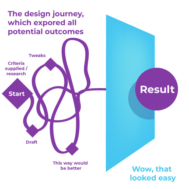
Design is a Journey
With design, it can
take time to arrive at the final result. It takes time to explore the
relevant paths before finalising the best route to take in order to
achieve the best outcome. People see this = The result
Journey Hidden Behind Results
When the journey can
look like this
‘Why not just use the one path?’ or ‘It looks easy’ I am glad in one respect that it ‘looks’ easy – maybe I did something right. Perhaps it’s the path I took to slick or polished outcome, perhaps it’s practice.
Not always an easy road
Quality results which applies to design is rarely ‘easy’. Occasionally very quick – but not easy. If you went with your first unresearched approach it may look something like this.
Comic Sans… = no
But it was quick!
Going with your first design isn’t necessarily good design, effective or as it should be for the task. You may strike it lucky, but why leave business down to luck? Fast isn’t strictly good, it’s just ‘quick’ and ‘quick’ isn’t always best.
Design that looks straight forward in the end, may have taken different routes to success. When starting a substantial project I like to plan, like with most journeys. When creating a design it can be similar, how much is the budget, time, does it have brand look and feel, who is it for, market research, these are all factors that should be considered when creating a design, be it a website or a product.
With design, it can be
as if cutting a path through bracken
Plan your journey
Before going on a long
trip, do you plan what you are going to take? What if you are going
away for two weeks and failed to pack tooth past, under-wear, or a
passport? You plan it. A good design service should be the same for
anything of size – granted you don’t need to plan for your regular
trip to metaphorical trip to the shop, you already know that route.
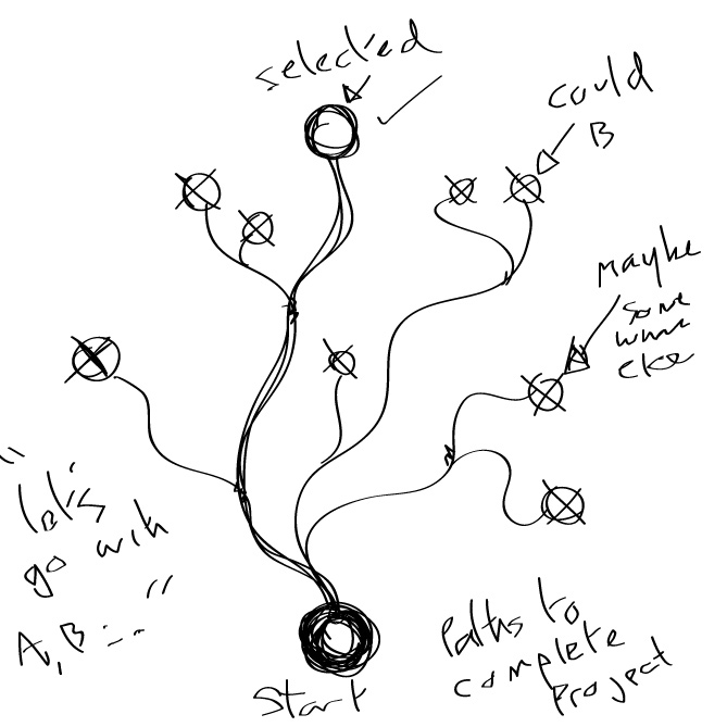
I often have a
destination or a planned end. But my root make look something like
this. Exploring all of the best roots and discovering from time to
time better ways of doing things. Ideas can be tricky to ‘Process’
and itemise but the end results will show something.
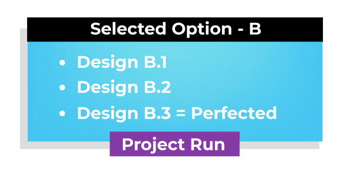
Design Forks
Sketch or paths for a project
A polished design
A good design can be
part of polishing something or pushing an existing concept to it’s
maximum potential.
I hope you have enjoyed having an insight into my design journey. If you would like to share my approach or sign up to my newsletter that would be great. I can sherpa you to creating something that you could be proud of.
If
like me you need work layers in Photoshop any time saving measure is
a bonus. I have a compiled a short list of shortcuts for making the
best use of Photoshop’s layers for both the Mac and PC – Enjoy!
(Swap CMD for CTRL on Windows)
Photoshop Layer icons
Layer Graphics
Change the layer order, move it up and down :
Cmd+[ Move Down
Cmd+] Move Up
Cmd+Shift+] = to move it to the bottom of the stack
Cmd+Shift+[ = Move it to the top of the stack
Direct
select a layer
With
move tool selected (V) hold Cmd
to highlight the
layers directly from the art board. This will also highlight groups.
Duplicate a layer
Ideal for copying a layer! Cmd + J to copy a selected layer! Or you can drag the selected onto the ‘New” icon! OR right click and duplicate – A personal fave.
Colour
Coordinated
In
addition to organizing you layers into folder and groups, why not
colour coordinate the layers so you glance at groups? Brown for dirt,
green for sea etc. Right click and select a colour.
New Layer Cmd+Shift + N brings up the new layer dialogue.
Cycle Through Blend Modes
Need
to see what a multiply, saturation, or overlay will look like on the
fly?
Shift
+ (Minus or plus, top right of the keyboard)
Layer Opacity With the layer selected you can quickly change its opacity by pressing >
Shift + (Minus or plus, top right of the keyboard) Shift + 22, 30, 23 (a number from the top row) typing the number in quick succession will change the layers opacity percentage. Hold shift and then press “22” the layer will be 22% “30” = 30 %.
Very handy for digital painting or retouching.
Group
Layers
Select
your layers and press Cmd + G to
group them together. If you are not grouping your numerous layers…
you should start. For sanity’s sake.
The original text for this was created and added to blogger in 2016 (Jimm Odell Blog). This has since been tweaked and added to this blog – the professional blog.
This website uses cookies to improve your experience. We'll assume you're ok with this, but you can opt-out if you wish. Cookie settingsACCEPT
Privacy & Cookies Policy
Privacy Overview
This website uses cookies to improve your experience while you navigate through the website. Out of these cookies, the cookies that are categorized as necessary are stored on your browser as they are essential for the working of basic functionalities of the website. We also use third-party cookies that help us analyze and understand how you use this website. These cookies will be stored in your browser only with your consent. You also have the option to opt-out of these cookies. But opting out of some of these cookies may have an effect on your browsing experience.
Necessary cookies are absolutely essential for the website to function properly. This category only includes cookies that ensures basic functionalities and security features of the website. These cookies do not store any personal information.
Any cookies that may not be particularly necessary for the website to function and is used specifically to collect user personal data via analytics, ads, other embedded contents are termed as non-necessary cookies. It is mandatory to procure user consent prior to running these cookies on your website.