
Example Website Design Projects | UI Design, Digital Products
With over 15 years of commercial experience in creative design and front-end web development, I have been given some brilliant opportunities to work on products which have been fun, engaging and challenging.
In this post, I am sharing a portion of my website design experience from my time at Satzuma, a gifting and tech company based in London.
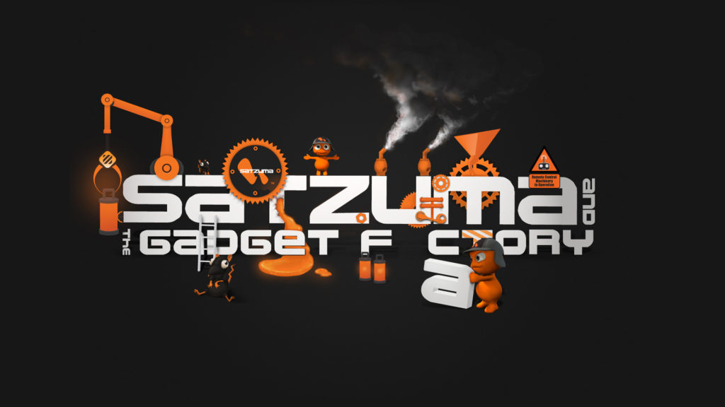
At Satzuma, ‘Branding’ and appearance were key. All the of websites and any web-based media. Be it the UI’s, the logos, or even when I used the flash to make an application. It still needed to tie in with the broader brand ideology.
Portfolio Website & Interface Projects | Desktop & Application Icons
I created icons for this application, but all in all, it was the browser-based application that was used more readily. Without going into too great detail on that application here, here are some snapshots of that application in action.
The Application In Action!
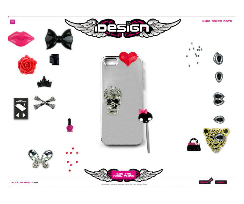
In brief, the application’s goal was to demonstrate how a real-world product worked virtually to prospective buyers. The product, in essence, allowed ‘The Buyer’ to decorate their own phone case. This web-based and browser-based application could be used by both B2B and B2C users.
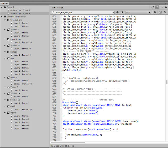
So that is what ActionScript 3 looked like!
Yep, the app didn’t work by magic. To make the application work, code is needed! And ActionScript was the lifeblood that made Adobe Animate tick. ActionScript is a largely defunct language now; you can read more on this website.
I have other code-based blog posts here, too, if interested?
- Using PHP for the header and footer of a brochure website
- Theory – making a story-based game in Adobe Animate
What was the point of this website and application?
The real-world product was designed so you could decorate your own smartphone and headphones with an all-encompassing DIY kit. We branded this the “i Design kits” or kits. It was for the gifting and tech market. And for this, the website’s look and feel needed to meet the following criteria:
- It needed to be eye-catching and appealing to large retail stores on the high street
- The product was geared toward slightly ‘edgy’ young female teens – students
- The app needed to show the product in action from the ‘Buyers’ browser.
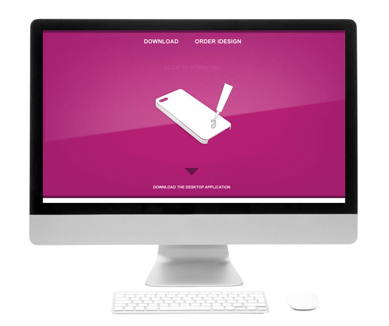
Example Website Design Projects | Designing a Landing Page
As shown above, a landing page was created to offer a central point which users could download the app to their desktop or use the app directly through their browsers. According to the analytics, the app played on the browser was the most used method.
When creating this page, I designed the UI and the content to be on brand and in keeping with the product we were trying to sell.
Creating An E-shop
It was discussed that it would be a good idea to create an online shop so business to business retailers could buy the products in bulk. 1000 units, 50 units, etc, and the platform would maintain the stock. After research and looking into core requirements, maintenance, ease of use and cost, and stability, OpenCart was given the go-ahead.
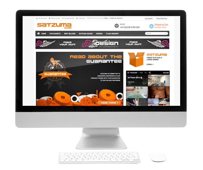
This is an example of the OpenCart theme with the core Satzuma branding applied to it.
The website needed to look engaging and be in keeping with the brand as a whole. Packaging like one business and a website that looked like another would potentially put off customers and larger retail brands.
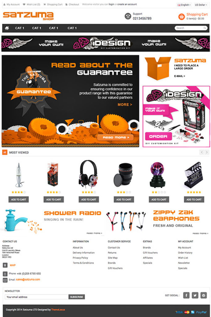
A Piece UI Design
This is a piece of UI design that was applied to one of the earlier original Satzuma brochure site designs. These buttons and elements were broken down and written into the HTML and CSS. This website gave a punchy brand experience whilst offering information on the product.
This design encompasses some of the core elements of the website. Such as :
- The user interface design – buttons, backgrounds, quotes, decorations, navigation, logo, social media, and other ad-hoc parts that constructed the general interface of the website
- Buttons – Its not a coincidence that buttons are orange. Based on a seminar by a ecommerce consultancy. People clicked more often on the colour orange. Which was fortunate as so was the core branding of Satzuma. This allow for clear areas of Calls To Action on the web page.
- Dark Elements – The core branding of Satzuma was orange a black – fun and tech. Using these core principles of the brand, I created a look that was both functional and respectful to the branding of the business. This also plays into something called ‘semiotics’ you can read more on semiotic examples here. The main purpose of the black, in addition to be part of the black/dark branding was to act as a neutral bed of colour to emphasise the CTA’s and the content.
- Charm & Character – following the charming elements and the character of the brand you will see (or used to) the Satzuma Man drawing attention to promotions and core messages. He was a face / mascot which captured fun elements of the brand
More Projects –
If you need help with your website be it basic consultation, design, growing online, design the look and feel, helping to set up a WP website so you can manage your own website – feel free to say hello.
You may also find some of these more current projects interesting: