Feeling stuck, confused, unmotivated by your design brief? You have been sat at your computer for hours on end unable to produce the work and the time is ticking?
Here it is – where to find creative design inspiration (well… some) – 10 websites for creative inspiration
In this post, I have collected together 10 links to websites that I hope will inspire you to nailing that deadline. Hey whilst you are reading this why not put the kettle on, sit back and think… don’t panic
– Trust me there is a difference.
Don’t rely on a blank Illustrator document to inspire you
If you have been sat for a long period of time staring at a blank document you need to give your mind an idea injection. And for this, your mind needs creative fuel. I believe it is a rare thing that something comes from nothing. All ideas, products, and designs will have something to trigger that initial spark.
Aimlessly Pushing Pixels – Not very inspiring
You may be stuck because you have put the cart before the horse. There is no harm in discussing a brief with a client or boss to help you gauge and progress a project. Conversations with the right people can be a great motivator and bring a different angle to a project that you wouldn’t have otherwise considered.
There is no harm in coming away from your screen and stretching your legs and getting some blood and oxygen flowing around your body! A study here, shows how walking can stimulate thinking – if someone questions your seemingly random urges to push yourself away from the screen and go for a walk it could be worth mentioning the information in this study.
When going for a walk at lunchtime, I see it as ‘non-working’ working. It’s generally more progressive for me to do this than sit then in a brain haze.
Wish you were here! I find the outdoors very inspiring, but each to there own.
10 websites for creative inspiration
Did you go for a walk? Maybe you cant go for a walk for whatever reason. I have pulled together some posts from an older personal blog post and placed them here.
Did you make yourself that drink? Okay creatives…. here we go.
Social Media Websites such as Pinterest and Twitter can be a great source to get the old creative juices flowing – remember not to get carried away… you have a deadline after all!
Youtube can also be a great place to get some ideas also.
Thank you for reading this post on 10 websites for creative inspiration. I hope if you didn’t manage to stretch your legs some of these websites may point you in the right direction.
With over 10 years commercial experience in creative design and front-end web development I have been given some brilliant opportunities to work on products which have been fun, engaging and challenging. A large proportion of my experience has come from Satzuma, a gifting and tech company based in London.
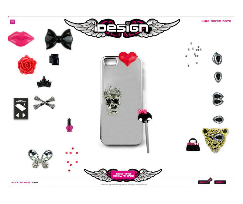
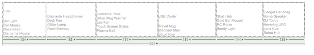
A collection if interface elements for a section of a flash memory sub domain
Projects have ranged from a tangible products to a new website which were created for promoting the product that was designed. ‘Branding’ and appearance was key, so the visual design for the website would have to work well for the packaging, the branding, the promotional material and all else in between, The design needed considered how it would be implemented across the board from start to finish.
Snap shot of early icons for the flash application –
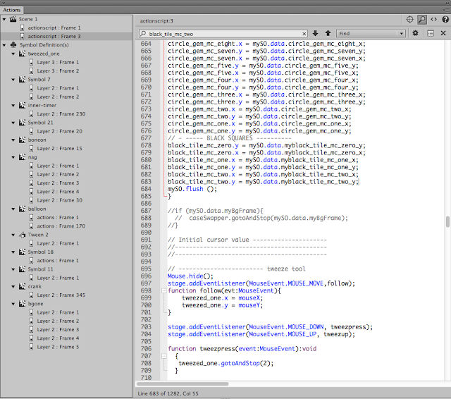
Icon design for the applicationThe drag and drop application – in action! Shows how the product worked. Doesn’t work by magic. In order to make the application work, it needed code! the life blood. So getting my coding hat on this was app was developed in Action Script 3. Once it was finished and released, the app could be played either in your browser or downloaded. The application, also had a dedicated page on the website so you could download the play the game / application from your computer.
What was the point in this website and application?
A product was designed so you could decorate your own smartphone and headphones with an all encompassing DIY kit. It was for the gifting and tech market. And for this, the website look and feel needed meet the criteria:
Needed to be eye-catching and appealing to large retail stores on the high street
The product was geared toward slighty ‘edgy’ young female teens – students
The app needed to show the product in action from the ‘buyers’ browser. It was also used for the B2C market so ‘end-users’ could see what the product was about.
Creating An E-shop
It was discussed that it would be a good idea to create an online shop so business to business retailers could buy the products in wholesale. So a 1000 units, 50 units, etc and the platform would maintain the stock. After research and looking into core requirements, maintenance, ease of use and cost and stability OpenCart was the go ahead.
This is an example of the of the OpenCart theme with the core Satzuma branding applied to it.
The website needed to look engaging and in keeping with the brand as a whole. Packaging like one business and a website that looked like another would potentially put off customers and larger retail brands.
This is the UI design based around the Nexus Theme. This is the design stage before the artwork was broken down and applied to the online store.
A Piece UI Design
This is a piece of UI design that was applied to one of the earlier original Satzuma brochure site designs. These buttons and elements were broken down and written into the HTML and CSS. This website gave a punchy brand experience whilst offering information on the product.
On closer inspection you will see the various elements that made up the functionality and aesthetic of the original Satzuma website.
This design encompasses some of the core elements of the website. Such as :
The user interface design – buttons, backgrounds, quotes, decorations, navigation, logo, social media and other ad-hoc parts that constructed the general interface of the website
Buttons – Its not a coincidence that buttons are orange. Based on a seminar by a ecommerce consultancy. People clicked more often on the colour orange. Which was fortunate as so was the core branding of Satzuma. This allow for clear areas of Calls To Action on the web page.
Dark Elements – The core branding of Satzuma was orange a black – fun and tech. Using these core principles of the brand, I created a look that was both functional and respectful to the branding of the business. This also plays into something called ‘semiotics’ you can read more on semiotic examples here. The main purpose of the black, in addition to be part of the black/dark branding was to act as a neutral bed of colour to emphasise the CTA’s and the content.
Charm & Character – following the charming elements and the character of the brand you will see (or used to) the Satzuma Man drawing attention to promotions and core messages. He was a face / mascot which captured fun elements of the brand
Thank you for reading
If you need help with your website be it basic consultation, design, growing online, design the look and feel, helping to set up a WP website so you can manage your own website – feel free to say hello.
Using PHP include will make maintaining a larger bespoke website much easier.
Maintaining a large bespoke website can be very time consuming. Using “include” can take the website to the next stage of modular design.
Imagine having to write 1 line of code into a ‘php’ file instead of having to copy & paste the same piece of code across 70 or so pages, worse still… imagine that piece of code had a typo – across all 70 pages! You would have to go back and amend all of the pages and it would be a costly waste of time!.
Using PHP include can reduce the time consuming method of copy and paste, shorten time and take your website to that next stage of design (Or look at a CMS system but that is a different topic). With the php Include method, the information you amend in one file can change across multiple webpages with a simple save and upload. To name a couple of ideas, you can use this method for navigation, footers, banner adverts and much more. I cannot emphasise how much easier this will make your life when working on larger projects if you must take the bespoke method. Change once to update many!
It will save hours!!!
Getting start with PHP include
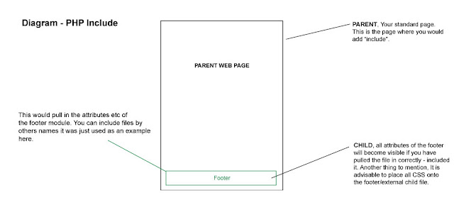
As a basic example we are going to make a footer. We will have a master or ‘main’ document that will “include” – pull in, integrate, import a file from your website.
This tutorial/experiment will assume you already have prior knowledge of setting your website up with root folders etc, if you need some more help with this please follow these tutorials.
– The main file (The parent/master) – An external footer file (why not add some styling to your html?) – one line of code, which you will embed into the parent folder. – A space to upload/test your experiment. (domain and hosting)
Stage 1 – Parent File (Master)
The ‘Parent’ (master) will pull in the external files to construct the page. in this example. The master will have some code in the bottom of the pagethat will say ‘Hey footer, you included down here’.
Why not call your parent file ‘master.php’
This image shows (with straying CSS, bleurgh! sorry an old image ) the master.php and Product-footer-test.html working together… or popping out of the bottom.
This is a master file and a and external footer.html / or PHP working in conjunction.
Stage 2 – Footer File
I have used the footer in the example. This area of the website at my previous company used to have frequent updates, with new products being added constantly. As you can see, all styling is added to this queasy example with the accursed table by using CSS – the image below is the bare bones of the footer file – no bells, no whistles! ( Why did I use the horrible table back in the day… I groan).
If completed correctly, changes or modifications to the footer file, will be included in the master file once you add the “include” piece of code to the master file. So what you change here (the footer file) will be visible once you come to uploading all of the files and testing the file.
How you treat you footer is down to you, this tut is here to show you the principle.
A bare example of a footer files – you can write and external CSS file for this to give it some magic or use inline CSS styling!
Stage 3 – The Simple Piece of Code to Paste Into Your Master PHP file
The image below shows in red where the piece of “include” code sits. So, imagine you have made a hollow space on your webpage, in the hollow space you are going to add this code to the bottom. As shown.
Its just 1 line of code… 1 line that could potentially save you hours!
Product-footer-test.html”); ?>
The line of code above which has been inserted into the bottom of your master file will call on the footer module and all of its elements. Once you upload your files you can see whether the footer has worked! Oh and check you have saved everything!
The visual diagram below will visually show how the principle works – leaving aside how the coding works for the PHP include.
Summary of PHP include in action
This is a image of what is happening with you PHP include!
In a nutshell. You have a the parent (the main page) and a child, in this example it was the footer. 2 elements talking to each other. Thank you for reading.
Hey, need a hand with your website?
There’s other methods to get the results you want which may be even more effective if you are a non-coder. You can use a web builder, a CMS or something else. If you would like help you can find out more on the design website
Simple techniques to reduce ‘banding’ ( Posterization ) in Photoshop ( *updated )
Posterization or ‘banding’ as it is known in Photoshop is a bane to many graphic design professionals or those working in print.
However, ‘banding’ is not limited to just print.
Banding, or posterization can also occur with screen-based imagery but it tends to be more pronounced and commonplace with print-based media in my experience. There is nothing more frustrating than seeing your lush and smooth gradient onscreen only when printed to see the same artwork with segmented bands across your gradient.
Over the years as a professional in-house designer, I have come across banding on more than one occasion. One of the worst culprits for showing banding is when working with greyscale or black. It was a challenge that used to drive me up the wall.
After much trial and error, here is a quick overview of some simple techniques I used to employ to reduce banding in Photoshop.
Some of the simplest techniques to reduce banding or posterization in Photoshop is by either applying ‘noise’ to your brush ( in your brush settings F5 ) or creating a separate ‘noise’ layer and overlaying this on top of a gradient layer to disguise the banding. This will give the illusion of smoother better blended artwork and remove the ‘stepping’ from your gradient. These techniques for handling banding can work especially well when working with mono-colour gradients such as black and white. There are also other tricks I have used in conjunction with this method written below.
“It often took various attempts to get it correct before sending it to print so don’t become too disheartened if your first try isn’t quite on par with what you expect.“
Simple techniques to reduce ‘banding’ | how I handled it
I often ran into banding situations when creating super smooth blends with colour.
It often took various attempts to get it correct before sending it to print so don’t become too disheartened if your first try isn’t quite on par with what you expect.
*Simple tip! If you have a local home printer or high-quality photographic inject printer, use this to test and measure your artwork.
I found these methods I have written below to make a world of difference when it came to creating a prototype or print production. All these methods I have actively used when working in Photoshop.
Some may call these hacks, others tricks but I like to regard them as ‘techniques’ for fixing a problem in print.
You may need to try various levels and settings, brushes and overlays to cure your banding problems. One solution may be enough, but you may wish to employ more than one if you are struggling to get the result you want.
Here is a detailed overview of some of the simple techniques I used to reduce banding.
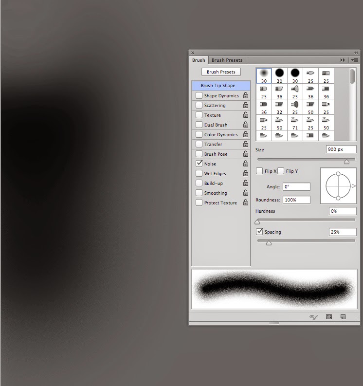
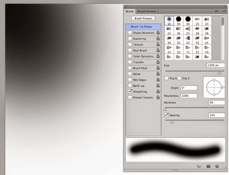
Look in the top left of the brush, and notice how you can see the steps/rings on the outermost edge? This is much less obvious in the lower part of the black blob where I have switched the noise on. This is an example of where I have used noise! Take note of the speckly grainy edge of the soft-brush. This brush helps the ‘steps blend better!
Simple techniques to reduce ‘banding’ ( Posterization ) in Photoshop – tricks
Silkly smoote !!
Before jumping in with the simple tricks you can use. Let us start with the basics. Or if you can’t be bothered reading about banding and when it occurs, you can jump straight to the tricks and hacks for dealing with it.
Banding & Posterisation in Photoshop – When it occurs
If you don’t wish to read about when “banding” has occurred for me, feel free to jump to the next section.
The dreaded banding aka Posterization in Photoshop.
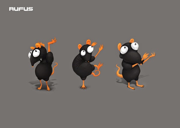
The methods above were used on this character – Copyright Satzuma LTD – Rufus Rat.
Trick 1 ) ‘RGB?’
Controversial, I know. But when waging a battle to reduce ‘banding’ in Photoshop, any tool at your disposal can help.
RGB ‘can’ offer a greater degree of flexibility in the beginning when trying to wrestle with artwork to remove banding such as playing with filters or seeing how the art works on screen.
But remember, that once you tinker with filters and have done what you need to do with trying editing your artwork remember to turn your artwork back to CMYK if this for print. CMYK is a common colour format preferred by most UK printers.
Sadly though, CMYK can… 1 ) Offer a more candid look at your colours at the end of the process. 2 ) Make your colours look like a sadder version of RGB.
‘tangent alert’ Using RGB in the early stages is my preferred method for some projects, not all. It depends on the project.
“Isn’t this madness? You won’t see the genuine colours of your artwork!”
Well unless, your screen is calibrated exactly and you’re using pantones, guaranteeing what you see on the screen to print can be tricky anyway. Besides, I work across both mediums of screen and print, hence working with either CMYK or RGB ( digital )
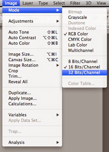
Trick 2 ) Think of the ‘Bits’
I have tested this method in Adobe Photoshop CS5 and CC with similar results from version to version of Adobe Photoshop. There has been some improvement when working to problem-solve banding.
64-bit – 32-bit – 16-Bit RGB to CMYK
The difference has shown to be marginal but still of noteworthy impact when trying to reduce banding in Adobe Photoshop.
Although the steps are unnoticeable between 8-bit, and 16-bit at reducing banding, this can be enough to tame mild banding.
However, at 32-bit, the latter offered tighter rings and hues around the banding and showed to reduce some of the posterization in Photoshop – 32 bit helped the bands to better blend and higher still should only improve upon this further.
Below is a screenshot from the menu option in Photoshop, when with banding.
*Note : Also the colour profile listed below is on an iMac. This is by no means a significant contribution to the final outcome with reducing banding but may be worth noting in case you are reading this as a Windows PC. Although, I am of the opinion that this should make no difference whether on a Mac or PC. But your screen type might.
Caption of colour modes
Trick 3 : ‘Ultimate Trick’ – Brush & Noise
Assuming that you are running into this issue whilst using a soft-edged brush tool in Photoshop, I would advise turning the ‘noise’ on under the brush panel ( as shown throughout – press F5 to bring this window up)
With noise ticked in the ‘brush setting window’ this helps in the blending steps with greys as shown below.
Based on my experience, this improved the overall smoothness and graduation of the tones from light to dark regardless of bit mode or any other trick and hack for beating banding. Texture can help with the blending, and noise can help with texture. You can also dabble with the filters if you are using large radials (That would be a different article ).
Example As you can see below, the black brush at the top has rings that appear like tide marks, (banding). The blend below has far fewer rings as I had the ‘noise’ ticked on my brush. The speckled effect will be less obvious once you take your artwork to print. And shouldn’t look grainy.
But, be mindful not to be overzealous with noise. You may need some trial and error to get the balance right and run some text prints for good measure.
Example of Noise and brush in action
Trick 4 ) Big to small – experiment with scale
Another trick for tightening banding is by shrinking/scaling down your completed artwork, illustration, or photo.
This works well if you use some of the tricks above to blend and tighten any remaining bands before shrinking your work to hide evidence of banding.
Do this.
When you have applied the ‘noise’ to help blend your artwork, then shrink the image to hide some of the messier details.
This is method not only disguises banding when painting or retouching but also gives the appearance of tighter line work and detail in both photography and illustration. This is a principle I have adapted since being taught this trick in college.
In principle, all you need to do is the following.
Start with your artwork at 100%, and then scale the artwork down to 75%.
If you intend to use this technique, do remember to factor this into the sizing of your artwork with a 25% drop in size!
Eg, if you want your artwork to be 150 cm wide for argument’s sake, consider starting at 200 cm to scale down. Or if you want something to be 750mm wide, start at 1000 mm. Or if you want to 75 px wide start at 100 px.
In other words, knock a 1/4 quarter of the size but remember to factor in scale back at the end. If you don’t, you may end up with an image that is too small.
Step 1 piece of art = 100%
Step 2 scale art to = 75%
In theory, nothing is stopping you from playing with lesser scale-backs and scale-downs.
How can this work with hiding banding?
When you print the document some of the details and blemishes are hidden away from the naked eye.
This approach can also hide some of the rings in banding. With an added element of noise, you can combine this to scrub out the bands
Otherwise your hard could look like a dirty spill stain!
Simple techniques to reduce ‘banding’, the final tip
Using a combination of the above has helped me to kick banding into touch. My favourite by far is my experience with noise without going over the top with artwork to make it look fizzy.
Simple techniques to reduce ‘banding’ – Credentials
My name is Jimm ( Jim ) and I am designer with over 14 + years of experience. I have had to deal the banding. My old college course and grit and experience is what has helped me to deal with banding.
Black can be a trouble to work with when it comes to print, especially with all of the varying print processes, paper finishes and general variations with commercial printing machines, inks, screen calibrations and so on – working with a black is a headache and I’m sure many others would agree! So, I have put together some tips and tricks to assist with your projects – it can be a dark and treacherous path. This post will mostly focus on creative approach rather than the pure technical aspects of Black ( K ). Working with 4 colour printing and spot colours is a detailed topic in its own right which is worthy of a post.
Illustrators, painters, artists and photographers
If you are a designer / work in print skip this paragraph!
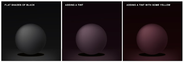
Firstly, does it really need to be BLACK? When I say does it need to be ‘Black’ are there many things in the real world that are completely black? Aside from an all light absorbing, all-life-drinking black hole that absorbs all light and colour? Besides… that’s something that;s not of our world as far as I’m aware. Looking at the world around you, you will see come to see how lighting, surface, atmosphere and texture will absorb surrounding colours, including what you would what you would call a black surface. For example, someone is wearing a black t-shirt, more often that not if, even if it is new, light will catch on the folds, the creases and the contours of the fabric giving the black fabric a slight hue or tint depending on the light source and ambience.
Study things! I like to look at surfaces and objects that have an interesting finish for example : gloss surfaces, bottles, matte paint, skin, fur, hair, shadows, animals, sunglasses, cloth, etc. Another good source of reference of how to use light and dark with dramatic effect is Chiaroscuro – do some research online – research Caravaggio (one of many artist’s using this approach) and see what comes back. Caravaggio used light and dark with excellent dramatic effect framing the narrative in light and shadows. This is potentially subjective but hopefully… it will be food for thought – if its jet-black you’re after then please read on! ( I have attached a little image below with some dark but not black shading )
This image shows how tints shades can show some almost black can work. Most things are not strictly jet black
RGB BLACK… A HACK
A Preference
Typically, I like to work in RGB first and then convert my files to CMYK afterwards, especially if I’m working on a bitmap illustration or digital painting. Why? Because working in RGB generally gives me more creative freedom in the beginning and it also allows me to move between digital and print at a later date anyway. This is a my preferred method when working on an illustration and by no means a rule, just a preference. I’m not the only one working this way. By doing a Google search I stumbled upon a commercial artist who also likes to work this way – this writer and artist goes into much greater detail about the in’s and outs of color channels on their blog. I recommend having a read at some stage – perhaps after you have read my post.
Unexpected Results – Designers a pleasant accident
I was always taught to work in CMYK for print and RGB for digital. I still champion this for working with professional printers as trying to print from RGB file may produce some erratic results, be it for leaflets printing, flyers, and other mediums. I accidentally ran a test print from Photoshop in RGB (Thinking it was CMYK) and the results were far more superior than the CMYK version. Both were printed on the same satin finish paper, on a Canon Pixma A3 with an impressive result. Despite my efforts and tinkering with the levels in the CMYK version to replicate what had happened In the RGB Version, I couldn’t produce the same results. I will make an assumption that my Inject printer translated the RGB to CMYK and just knew what I was after. I can’t complain too much as this project was sent to print and retained all the vivid colours and strong black colours. Saying this, I still recommend trying to stick with the CMYK for design and print despite this result as this is typically what is asked – best to be safe, but something worth exploring for the future.
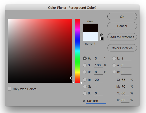
Digital Black Colour in Photoshop – Add a Hue
Unless your are working in RGB and your artwork will remain for screen (digital) only. Then may be best to work with ‘Designer Black’ check the numbers. Although the computer says it black (or you’ve had it calibrated) it is best to drop a bit of colour into the mix – and do test print it.
And Example of using the black in the colour palette
Last Round Up Hacks!
Take Notice of the colour warnings when you are in the colour picker window. This could save a lot of headache later on. (Yellow Triangle)
Let the printer do the leg work. Send your artwork to the printer and try to let them help you. A printer worth their salt will want to help you and have your return custom. To reinforce your expectations, send them a physical sample from your home printer – assuming you have a good quality home printer.
A HUE, if you are working on an image with a lot of dark areas why not add a little hue / tint of colour? 20% cyan for example or some magenta/red for a warmer image.
Avoid working with 0, 0, 0, 100 K, as this best reserved for font/text printing and can your work charcoal appearance. Use a ‘Rich black’ or ‘designers black’ instead. 20, 20, 20, 100 k for example.
Avoid 100, 100, 100, 100, CMYK as this is reserved for crop marks and using this colour can drown the paper – no one wants drowned paper!
Don’t be fooled. Your screen can be way out of the sync with your printer. Do some test’s first and see what results come from your printer (even printing on your home printer cannot guarantee the finish you require when you send your work to print) So take note.
Yes… black can be painful to work with! And can be tricky colour to tame!
Thank you for reading how to work with black in print!
This website uses cookies to improve your experience. We'll assume you're ok with this, but you can opt-out if you wish. Cookie settingsACCEPT
Privacy & Cookies Policy
Privacy Overview
This website uses cookies to improve your experience while you navigate through the website. Out of these cookies, the cookies that are categorized as necessary are stored on your browser as they are essential for the working of basic functionalities of the website. We also use third-party cookies that help us analyze and understand how you use this website. These cookies will be stored in your browser only with your consent. You also have the option to opt-out of these cookies. But opting out of some of these cookies may have an effect on your browsing experience.
Necessary cookies are absolutely essential for the website to function properly. This category only includes cookies that ensures basic functionalities and security features of the website. These cookies do not store any personal information.
Any cookies that may not be particularly necessary for the website to function and is used specifically to collect user personal data via analytics, ads, other embedded contents are termed as non-necessary cookies. It is mandatory to procure user consent prior to running these cookies on your website.