20 killer tips to land your first Junior Graphic Design role

Your first Junior Graphic Design role…. that was many moons ago.

This post offers useful, honest, and actionable tips to help you land your first Junior Graphic design role or internship. Much of this experience comes from hiring design interns and from myself hiring interns for more traditional design roles.

Although I would like to add… the design profession has changed dramatically. There will still be some helpful little tips for me to share.

Now, go get your first Junior Graphic Design role of dreams ( maybe ).

You are on a mission graduate graphic designer - your first Junior Graphic Design

This post is here to help

“If you have no idea what type of design you want to do, don’t be too hard on yourself – I didn’t know either.”

My older to younger self

Getting your first Junior Graphic Design role: overview

Finding work as a fresh-faced young ‘Graphic Designer’ can be a challenge! More so in this day and age.

In order to land that perfect design role, you need to really sell your skills and passion in a very competitive and crowded market. Saying ‘give me a job’ won’t cut it. Companies don’t want to do you a favour, they haven’t the time. By offering your assistance in the role, you can help in a design position, which may shift your mindset.

What can you bring to the role? Does your portfolio align with what the company wants and needs? Does your style suit the job and the company?

This post has been written to offer assistance in your journey to landing that desired role. Hopefully, following these 20 graduate designer tips will bring you closer to achieving your goal of becoming an intern or a graduate designer. But, I shall promise and guarantee nothing – the creative world is too turbulent for that, I am afraid!

As for my credentials, I have both been a design graduate and a manager in charge of hiring interns and graduate designers. This post will cover what the company looked for (my previous role), what ‘I’ looked for, and what I wasted my time doing in the beginning when looking for work.

My Career Credentials in Design


1) I’m not Neville Brody or Saul Bass.
2) A lot of this experience comes from nearly 20 years working in-house and freelance
3) The rest is self-taught
4) The rest of it is from first-hand experience hiring

Your first Junior Graphic Design role: 20 detailed tips for landing that ideal creative role :


Part 1.

Part 1 – Getting Into Mindset –Job hunting is a job in itself.

Design Brain - your first Junior Graphic Design role

1 ) Be positive, and stay positive

There may come a time in your search for work where you will feel down in the dumps, the worst thing you can do if you really want to be a Graphic Designer is throw in the towel too early on.

Some graduates manage to find jobs as a designer straight out of University, they are lucky or super gifted or both… or know somebody.

Others will land roles off the back of work experience

Other graduates will land a job after 4 months of applying for design work ( mine was 11 )

After 400 applications and rejections.

Or moving closer to where you are likely to find design work ( that was my story )

Keep going and push forward. No two people are the same and your journey could be different. Do what you need to do – it’s tough. Think adapt and learn.

2 ) Don’t waste (too much) time with recruiters

I put too strong an emphasis on talking to recruiters en masse when looking for work in London! This was at the start of my career, believing they would be the gatekeepers to my dreams! I can recall a few being pretty blunt, some downright rude, and very few kind or helpful.

Generally speaking, recruiters don’t manifest results if you are a graduate. This may not be the case for all, but this was certainly the case for me.

I will assume they are more preoccupied with chasing bigger commissions. Or speaking with cooler non-country bumkin designers. Who knows!

The few that were useful gave some interesting advice – remember these people. All in all, don’t wait for recruiters. Go search yourself.

Try this website: –
Creative Opportunities

3 ) Keep bettering yourself

This follows on from “wasting time”. Sitting on your computer watching Youtube videos about cute cats jumping off of furniture isn’t going to land you a job!

Make use of your time by researching companies, learning the nuances of your desired design specialisation. The more skills and worthwhile projects you have in your portfolio, the closer you will come to landing your first ideal role.

You may find things like this interesting while you are tinkering with software :

4 ) Imagine your ideal role


Landing your first Junior Graphic Design role is hard enough, so is trying to imagine it.

For me, this was the trickiest part of finding a role, and I feel that my portfolio, although diverse, could have been considered convoluted. This was at a time when graphic designers and multimedia designers did not wear the same badge at all. You were one of the other.

I didn’t have a clue what sort of design job I wanted – I just wanted a lucky break. However, reflecting on it, a more focused approach to my portfolio may have helped me land a role. A scattergun approach can have its advantages, but being too broad can also be a disadvantage.

If you have no idea what type of design you want to do, don’t be too hard on yourself – I didn’t know either.

You want your portfolio and visual language to be in tune with your first full-time job. If you can.

In hindsight, I had no idea about what type of job I wanted! I just wanted a creative job. If you don’t know, consider working backwards – what jobs don’t you want?

With this in mind, this could help you in shortlisting the types of design roles you make like. Now take the time to look at what these types of jobs are looking for and align yourself with these expectations. Hopefully, this may help align you with your first Junior Graphic Design role.

5 ) Your portfolio and CV are not speaking to each other

Not as crackers as it sounds!

When trying to land your first Junior Graphic Design role, make sure your CV and portfolio reflect each other. At least, to a lesser or greater degree.

I don’t think I’m God’s gift to recruiting, design or jobs, but I was involved heavily in hiring my own intern designers. I wanted to see who could assist and help a little while also giving them with their journey.

I have read great CVs, useless CVs, silly CVs, random CVs, and just obscure and irrelevant CVs. And CVs that looked like they didn’t belong to the same person or portfolio – that is my point here.

Your CV needs to be relevant to the role for which you are trying to win, as does the portfolio. The contents of your portfolio should reflect some or most of the information in your CV as a designer, they should link or marry up.

Spelling and typos are only the beginning. A CV and portfolio that relate to each other will in land a role.

Make sure they relate and match.

6 ) Right place at the right time | luck and availability

Sounds like a cliché? It is!

You can be a ridiculously talented designer with a great portfolio, but if you’re not in the right place at the right time, then you won’t get the job.

Roles can become available due to an employee leaving, maternity cover, looking for contractors for specific tasks, or the company is expanding!

Be on the job boards, be ready, and be available. You need to be watching the job market all the time to give yourself the best chances of finding that desired design role. In other words, you need to make your own luck.

7 ) Businesses aren’t charitable

Your first Junior Graphic Design role probably won’t come out of generosity. When I first started trying to get my first job, my CV and covering letter didn’t hardly brought anything to the job. This is the power of hindsight.

Unconsciously, I expected the role would just land in my lap as I was a shiny new graduate with all the paperwork. Don’t buy into that illusion, I will tell you now.

Graduating or passing your course is just the beginning, and employers smell your un-jaded optimism and inexperience from a mile away.

Here is how I first started applying for design work, so you can avoid the mistakes I made.

How I ( badly ) presented myself when I tried to land my first junior design role


With my begging letter (covering letter) at the ready, it said far more than what was written on the paper. Between the lines it said :

“Please give me a job, I have nothing to offer, and you will be doing me a favour by hiring me… please do me a favour! I need experience.”
Of between-the-lines wording to that effect.

Companies will already know how much experience you don’t have if they take a close look at your CV. They’d only need to take a look at when I graduated to guess my experience level! Avoid pleading and sounding desperate if you can. Even if you are!

Word your CV to sound as if you have something to offer them, not ask for them to offer something to you. Even if this is the reality of your situation.

Draw attention to how you are bristling with energy and ideas, or your design strengths, or how you are a passionate designer who works on plenty of side projects in a similar industry.

Instead of please give me, consider ‘eager to learn and become part of a team.’ Getting a graphic design job – a true ‘Graphic Design’ job is harder than ever to find.

Some kind souls took the time to answer my queries and offer advice, but most of the time, they ignored my queries. I sent 100s and 100s of applications to land my first full-time role.

Aside from drawing attention to my blemish of inexperience, employers will know you are a graduate just by looking at the graduation dates. Focus on what you can do and do well.

Companies won’t hire you out of pity

Section 2 | Getting your first Junior Graphic Design role – Preparation

Preparation is key.

Vector Black Portfolio

Looking at the points before, have you picked your ideal employer or type of job?

Are you considering how your portfolio will align with your ideal role?

8 ) Design Portfolio

Trying to land your first Graphic Design role as a junior? You will need a portfolio.

As a hiring manager for my own little department ( it was small ), I have had “designers” apply for roles without a portfolio.

You need a portfolio.

This shouldn’t even need to be pointed but I have run interviews where ‘Graphic Design Graduates’ came to a creative design interview without a portfolio… or anything to show for that matter. To begin with, that applicant was relying on my memory (my poor memory) and hoping that I could recall everything in their portfolio, at least they got dressed! Turning up to a graduate position without anything wasn’t ideal for a couple of reasons:

1) Did their college or institution not make the designer create a portfolio?
2) They should want to put their best foot forward.
3) This is a chance to discuss their best pieces of work! To really shine!
4) Dozens of other applicants will turn up with a portfolio and it is VERY a competitive market.


Ah it will be ok not to have a portfolio, I am the best designer of all of them” – chances are there will be many good designers going for that position, especially in London.

There were times when we would get over a 100 applicants. Hoping an employer will remember your best work is putting you, as the applicant, at a huge disadvantage – you are a Designer, as general rule, you need something to show.

Having a professional portfolio displaying your best and treasured work – especially for print roles is a must in my opinion.

Below are some key points which I have collected together from interviews and sharing information with Creative Directors and MD’s :-

  • Put your best pieces of work at the front and at the back, a strong start and a strong finish.
  • Try to include relevant pieces of work for the job role.
  • Keep improving your portfolio, offline and online.
  • Avoid rubbish work : if you have a ‘live project’ where you had to use ‘Comic Sans’ for the local church poster, leave it out of your portfolio. Putting a low-quality project in your portfolio will undo all of your hard work. At most, just mention in your CV about a live project – if your gut and design sense tells you have added an terrible project, you probably have.
  • Add as much ‘good’ quality live work as possible. Work experience goes a long way and ‘showing’ that you have this experience reinforces trust and credibility.
  • I have always used an A3 professional portfolio since graduation. I’ve seen others use archival boxes also which look good. I would personally avoid an A2 ring-binder portfolio, they are too big and and says ‘art college’ to me. It’s all about impressions.

Your portfolio needs to reflect you as a professional, you’re not a student any more… sorry to remind you!

9 ) Digital Portfolio
Before an employer looks at your ‘physical portfolio’ you are going to need a digital portfolio, a website, or something online so you can make that initial first impression or ideally all of the aforementioned in order to help grab their attention. Whether it is a compressed PDF or something on Behance, get your work online. When creating your digital PDF portfolio, keep it a small file size, anything above 10 MB may get rejected with inbox limitations.

10 ) Your Design CV
You NEED a CV. Don’t rely on your portfolio to do all of the talking as employers will want to see where you have studied, what you have studied, when, your skills and so on. Employers and hiring management are looking for relevant information, they are looking pieces of information and that will help recruit the ideal candidate for the role. If your CV is irrelevant, thin, too much or riddled with typo’s you are lowering your chances of being selected.

Handy CV notes :

  • Don’t create your CV in Word. You are a designer, put some style and class in it.
  • Remove irrelevant job experience. Art Directors, Seniors Designers etc, are not interested in your paper round from when you were 15. You won’t be delivering papers in your internship or graduate design role.
  • Make it easy to read and skim. Hiring managers are in a rush and they are also human… make your information snappy and easy to navigate. They might be reading a lot of CV’s and by the 70th applicant, the focus can start to go out of the window.
  • Use your CV to sell you and reinforce your absolutely killer portfolio!

11 ) Covering letters
Covering letters are where I have seen some of the biggest mistakes. Keep it polite and acknowledge the job listing. You can sniff a ‘copy and paste’ email from a mile away as it seems to ignore all of the points in the job listing. But if you do ‘copy and paste’ make sure to add name and don’t leave sentences like this.

“Dear …..

I would like to apply for the position of … as believe I could bring something new to the team.”


I have seen a letter with the “…”still left in. I don’t think they cared much about the job, maybe they were tired!

12 ) Portfolio & CV are inline
I’m going to let you in on secret, after reading so many CV’s for the creative intern roles at my former company, I stopped reading the CV first!

Why? I have taken the time to read CV’s in past and individuals can talk the talk but can’t walk the walk or so the cliché goes. In essence, they bigged themselves in CV and when I looked at the portfolio(s)… Wow, that’s awful

Now that isn’t me bashing Graduate Designer, not at all, I’m not actually convinced they studied design, unless it was at the school MS Publisher 1995. That CV was created by somebody that didn’t have clue about design. I felt ‘had’! The covering letter and CV were so convincing when I opened the digital PDF Portfolio, I was shocked. Imagine reading an epic CV and then you click onto a digital PDF that looks something a 12 year would create .

Trouble is, I had already wasted my time reading a borderline deceptive covering letter and CV. I will have to see the good and assume they were very optimistic and deluded. They Certainly were not a designer, but they sounded like one.

What could I do to with such an individual? Time is very precious in a busy commercial environment. From then on : folio first, glance at covering letter, good! Go back, read.

Part 3 – Uncomfortable & Unspoken Realities

I’m going to spill the beans on things outside of your skills, CV and portfolio that could have an influence on your being passed over. Some of these are opinions, others are first-hand experiences as an applicant and other little ‘gems’ from behind very closed business doors.

Hopefully, the points in this section will be both helpful to you and make me hated by recruiters and companies – good!

Spilling the proverbial design beans

13 ) Your Uni, School and background can influence your selection
When having a conversation with another Senior Designer I was surprised when I heard a couple of things.

According to the designer, at a certain establishment, they checked the following :-

  • Where applicants had studied
  • Grades
  • Secondary school and GCSE’s – ‘secondary school and GCSE’s?’ – honestly.

You cannot choose your past and where you went to school as a teenager. Back in school, I didn’t know what I was going to study afterwards, nor would I know that being at that school could have an influence. Believe it or not, I think there is a certain level of elitism in certain establishments that goes beyond your accomplishments and attainment, sadly…

But you should choose your future.

14 ) Geography – you live too far away.
This is both from personal experience as an applicant and an employer. Recruiters and employers can sometimes see ‘where’ you have applied from. So if you are looking for a Job in London for argument sake and you are based in Northern Scotland – certain jobs websites tell the recruiters and prospective employers where the application came from.

How do they know and why does it matter?
It shouldn’t but it will be counted against you regardless, I will come to that. I have experimented with this by accident I the past. On my CV I wrote that I was currently living in London, I was staying in London on and off but not living here. On my CV it stated that I currently lived in London. I applied for a role through a website and a recruiter rang me the following day.

“So your CV says, you live in London, but your application came from Cornwall?” or similar words.

How did they know and why did it matter!?

It matters. This problem, among many as a graduate was more of a gulf than a hurdle. I didn’t understand why geography should matter if I wanted to apply for the position, they were interested before I told them where I was from. I can recall being told a couple if times after the initial telephone interview with the recruiter that I was too far away for the job – despite being willing to pay for a ticket in an attempt to get a job! As time went on I ran into this a couple of times. Mostly from recruiters.

Recruiters want to make money quickly, and sadly if they find another eligible graduate for the position that lives in or around the city they will get the first pick, it can be as simple as that.

My previous boss also favoured locals as it was convenient. I tried my best when possible to favour, passion, talent, work ethic, and a cracking portfolio when selecting a candidate – geography was irrelevant to me perhaps I was also motivated by an emotional ideal. I remember how many times I was thrown on the heap before I could even finish saying the sentence
“I am from Cornwall…”

This comes from the perspective of coming to and living in London. How to vault over the Geography issue:

  • Persist and keep applying.
  • Be patient
  • Find a friend or relative to stay with whilst you look.
  • Look for more creative jobs that by pass-recruiters where you feel less like a slab of design meat.

– Last point here – DO NOT RUN UP A DEBT!

15 ) You might not get the most fun tasks
As a graduate you may be given some repetitive or smaller jobs – that’s just how it is. But you should use these to your advantage, do a great job, do it quickly and use these tasks to make an impression! You might also get a great reference from your employer at the end. When handing out these tasks I would also mix them in with more interesting and conceptual tasks.

Part 4 – Design Tips | Employers Perspective

I will now write of what I, and my fellow colleagues looked for when at the interview stage of recruiter a graduate.

16 ) Character
Good portfolio, an active mind, somebody who will do the tasks. We would recruit someone with flair, a graduate that would be able to apply their skills to the brand and be part of the team.

In a highly sociable office / studio I would have to gauge how you, the applicant ,may interact with me and the rest in the team and how they might react to you. I could be away, in a meeting or really busy. If I left you as the Junior or Graduate alone with a sales manager would the office combust because he asked you to help implement an email sig for example? Knowing the personalities of the office how would you react to person A, B who you’d work with every day. We are people after all and not all people get along. Making the wrong match In a work environment could cost the company money

There is more to an interview than just a Portfolio and CV.

17 ) Ask questions, show interest.
Another thing that doesn’t appear to be mentioned much in other interview or advice articles. An interview is not only about you being interviewee, it’s also about you and the company. If I have a discussed potential project coming up in the future it is nice to see if you are actually interested in the role or topic. So asking more about the projects, the role, the progression are are worthwhile questions to ask when it comes to making that first impression.


18 ) Your ‘Interests’ on your CV
Why did this matter to me and the company? It’s not a huge point but as strange as it sounds, if I was interested in the candidate’s CV, I would look at their hobbies and interests to see I could find any relevance to the role.

If the candidate mentioned that they were interested in ‘tech’ games, gifting, arts and crafts, etc it, it could have been a tipping factor for taking more interest in them as I would be aware of the type of project in the pipeline. Not only that, I would consider the following based on your interests.

A – You would be more interested and passionate in a project if you were already like it as a hobby.

B – More likely to come up with vivid and strong marketing and product ideas if you already had some background knowledge on the topic.

It’s a piece on the CV that is often taken for granted, but as person recruiting for an intern, freelancer or potential graduate designer I would look!

For an actionable tip, perhaps write a bit about yourself, love computer games or books? Write it. You could find a company, agency or publisher that is looking for someone with a love for what you do. It’s a potential spot to add ‘icing’ on the cake.

19 ) Commercial experience will put you a an advantage.
Relevant experience more so. Seeing that you have already worked on commercial design projects, even be it for family and friends, will still offer transferable experience. If you can find freelance work, or work experience in your local area this will put you at an much bigger advantage when it comes to landing your first graduate designer role! To find thes jobs look in local papers, social media, talk to friends, Google, Jobs boards.

Conclusion : Tip Summary for Getting a Graduate Design Role

Ok that might be a lot of action to undertake in a short period of time but hopefully, now that you have read this article, you will leave this page feeling prepared and motivated to smash it and get the job. Here is a condensed summary.

  • Make good use of your time.
  • Be prepared, have you portfolio and CV ready
  • Remove irrelevant information from your CV
  • Create a portfolio that is applicable to your ideal role
  • Get as much experience as possible!
  • Work on personal projects and keep bettering yourself
  • Try to network with companies, directors, charities, etc – focus much less on recruiters
  • Keep checking jobs boards
  • Show interest in the role if you get the interview

Lastly from me…

As a closing note I have decided to add a little personal message from me – a small piece of my career journey from back in the day which shows I am human, just like everyone else. Here is a story from one of my less than ideal interviews.

The less than ideal interview

After applying for a job for a ‘Junior Designer’ I found on jobs board, I landed an initial interview with a recruiter. I had my portfolio, CV and smile ready. When asking the recruiter for tips – I asked the question along the lines of ‘would the employer want grow and improve the website?’ I was keen, eager and naïve. I wanted to bring my passion to the company. After looking at the website and the branding I made some notes – taking into account that the recruiter also thought It may be a good idea to share these ideas.

With my mental notes scribed neuron juice onto my frontal lobes, my enthusiastic nature and my slick black portfolio, I was ready for the interview.

I sat down in front of 2 people, A Developer and his Manager I will assume.

I mentioned some ‘technical issues’ with the main website (being a website designer role – sort of – I though it would help) little did I know… That the person who built the website, tech issues included, was sat in front of me – in front of his Manager! The damage was done.

I had in inadvertently bruised this Developers ego without knowing or meaning to, I just wanted to point out tips to improve the website.

I didn’t get the role – he hated me, a lot!

The gentleman who had built the page probably came away from the interview squirming and I had put my foot in it by offering my ‘positive ideas’ for improvement. I was a fool, it was never meant to be and hey-ho I went onto other interviews.

Lesson : watch what you say, and be very mindful who you are talking to. Don’t accidentally ruffle too many feathers in an interview.

Further to this job, it wasn’t quite as advertised, it wasn’t a creative role. I was going to copy and past text into ‘mailshots’. Recruiters and job listings can have a sneaky habit of ‘fluffing’ up job descriptions.

I think I was happier not getting it, or so I tell myself.

So, don’t worry about the bad stuff, good will come along!

20 – Big Last Point – Stay Positive

GOOD LUCK GRADUATE DESIGNER!

Thank you for reading this post another handy post – creating a graphic design portfolio

20 Killer Tips to land your first graphic design role

jimmsdesign

Simple techniques to reduce ‘banding’ ( Posterization ) in Photoshop | Tricks

Simple techniques to reduce ‘banding’ ( Posterization ) in Photoshop ( *updated )

Posterization or ‘banding’ as it is known in Photoshop is a bane to many graphic design professionals or those working in print.

However, ‘banding’ is not limited to just print.

Banding, or posterization can also occur with screen-based imagery but it tends to be more pronounced and commonplace with print-based media in my experience. There is nothing more frustrating than seeing your lush and smooth gradient onscreen only when printed to see the same artwork with segmented bands across your gradient.

Over the years as a professional in-house designer, I have come across banding on more than one occasion. One of the worst culprits for showing banding is when working with greyscale or black. It was a challenge that used to drive me up the wall.

After much trial and error, here is a quick overview of some simple techniques I used to employ to reduce banding in Photoshop.

Some of the simplest techniques to reduce banding or posterization in Photoshop is by either applying ‘noise’ to your brush ( in your brush settings F5 ) or creating a separate ‘noise’ layer and overlaying this on top of a gradient layer to disguise the banding. This will give the illusion of smoother better blended artwork and remove the ‘stepping’ from your gradient. These techniques for handling banding can work especially well when working with mono-colour gradients such as black and white. There are also other tricks I have used in conjunction with this method written below.

It often took various attempts to get it correct before sending it to print so don’t become too disheartened if your first try isn’t quite on par with what you expect.

Simple techniques to reduce ‘banding’ | how I handled it

I often ran into banding situations when creating super smooth blends with colour.

It often took various attempts to get it correct before sending it to print so don’t become too disheartened if your first try isn’t quite on par with what you expect.

*Simple tip! If you have a local home printer or high-quality photographic inject printer, use this to test and measure your artwork.

I found these methods I have written below to make a world of difference when it came to creating a prototype or print production. All these methods I have actively used when working in Photoshop.

Some may call these hacks, others tricks but I like to regard them as ‘techniques’ for fixing a problem in print.

You may need to try various levels and settings, brushes and overlays to cure your banding problems. One solution may be enough, but you may wish to employ more than one if you are struggling to get the result you want.

Here is a detailed overview of some of the simple techniques I used to reduce banding.

Simple techniques to reduce 'banding' ( Posterization ) in Photoshop example banding
Look in the top left of the brush, and notice how you can see the steps/rings on the outermost edge? This is much less obvious in the lower part of the black blob where I have switched the noise on. This is an example of where I have used noise! Take note of the speckly grainy edge of the soft-brush. This brush helps the ‘steps blend better!

Simple techniques to reduce ‘banding’ ( Posterization ) in Photoshop – tricks

Simple techniques to reduce 'banding' ( Posterization ) in Photoshop - how to smooth...
Silkly smoote !!

Before jumping in with the simple tricks you can use. Let us start with the basics. Or if you can’t be bothered reading about banding and when it occurs, you can jump straight to the tricks and hacks for dealing with it.

Divider

Banding & Posterisation in Photoshop – When it occurs

If you don’t wish to read about when “banding” has occurred for me, feel free to jump to the next section.

The dreaded banding aka Posterization in Photoshop.

Drawing, digital painting, and creating renders in Photoshop have been a core part of my past and present career.

I have seen the issue of ‘banding’ arise over and over again, so have had to find techniques to better deal with it.

This issue rears its ugly head when it comes to working with radial and linear gradients and tones of black and grey inside Adobe Photoshop.

When working with black as part of the colour palette, I have witnessed these scenarios of when banding tends to happen :

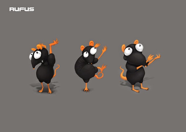
  • When rendering characters like Rufus the rat as ( black and grey ) ( illustrated below )
  • When trying to gain soft curves of light-darker areas
  • When light grey curves around to dark grey
  • It was more common when working with black
The methods above were used on this character – Copyright Satzuma LTD – Rufus Rat.
Divider

Trick 1 ) ‘RGB?’

Controversial, I know. But when waging a battle to reduce ‘banding’ in Photoshop, any tool at your disposal can help.

RGB ‘can’ offer a greater degree of flexibility in the beginning when trying to wrestle with artwork to remove banding such as playing with filters or seeing how the art works on screen.

But remember, that once you tinker with filters and have done what you need to do with trying editing your artwork remember to turn your artwork back to CMYK if this for print. CMYK is a common colour format preferred by most UK printers.

Sadly though, CMYK can…
1 ) Offer a more candid look at your colours at the end of the process.
2 ) Make your colours look like a sadder version of RGB.

‘tangent alert’ Using RGB in the early stages is my preferred method for some projects, not all. It depends on the project.

“Isn’t this madness? You won’t see the genuine colours of your artwork!”

Well unless, your screen is calibrated exactly and you’re using pantones, guaranteeing what you see on the screen to print can be tricky anyway. Besides, I work across both mediums of screen and print, hence working with either CMYK or RGB ( digital )

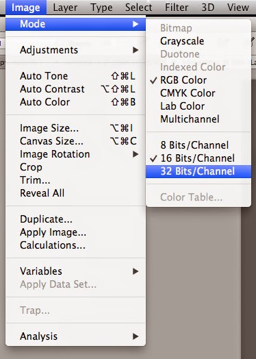
Trick 2 ) Think of the ‘Bits’

I have tested this method in Adobe Photoshop CS5 and CC with similar results from version to version of Adobe Photoshop. There has been some improvement when working to problem-solve banding.

64-bit – 32-bit – 16-Bit RGB to CMYK

The difference has shown to be marginal but still of noteworthy impact when trying to reduce banding in Adobe Photoshop.

Although the steps are unnoticeable between 8-bit, and 16-bit at reducing banding, this can be enough to tame mild banding.

However, at 32-bit, the latter offered tighter rings and hues around the banding and showed to reduce some of the posterization in Photoshop – 32 bit helped the bands to better blend and higher still should only improve upon this further.

Below is a screenshot from the menu option in Photoshop, when with banding.

*Note : Also the colour profile listed below is on an iMac. This is by no means a significant contribution to the final outcome with reducing banding but may be worth noting in case you are reading this as a Windows PC. Although, I am of the opinion that this should make no difference whether on a Mac or PC. But your screen type might.

Beating posterization in Photoshop.
Caption of colour modes

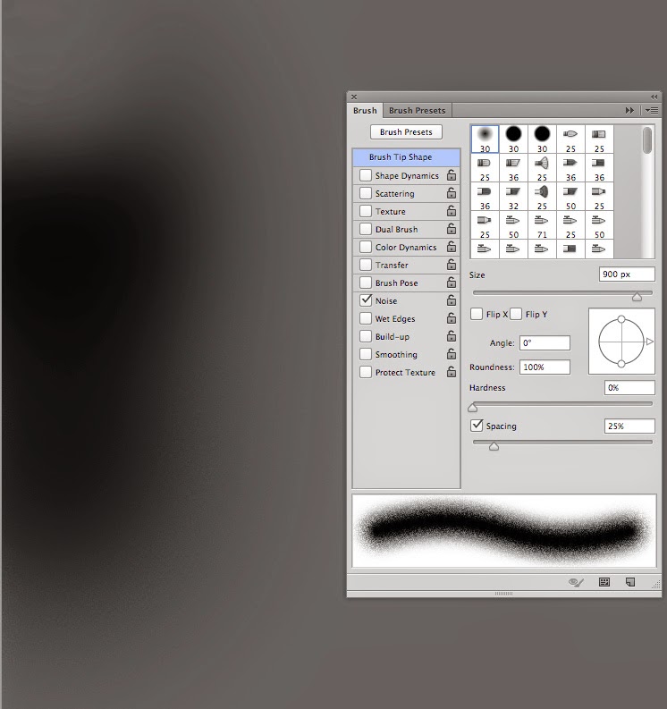
Trick 3 :  ‘Ultimate Trick’ – Brush & Noise

Assuming that you are running into this issue whilst using a soft-edged brush tool in Photoshop, I would advise turning the noise’ on under the brush panel ( as shown throughout – press F5 to bring this window up)

With noise ticked in the ‘brush setting window’ this helps in the blending steps with greys as shown below.

Based on my experience, this improved the overall smoothness and graduation of the tones from light to dark regardless of bit mode or any other trick and hack for beating banding. Texture can help with the blending, and noise can help with texture. You can also dabble with the filters if you are using large radials (That would be a different article ). 
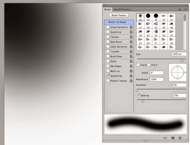
Example
As you can see below, the black brush at the top has rings that appear like tide marks, (banding). The blend below has far fewer rings as I had the ‘noise’ ticked on my brush. The speckled effect will be less obvious once you take your artwork to print. And shouldn’t look grainy.

But, be mindful not to be overzealous with noise. You may need some trial and error to get the balance right and run some text prints for good measure.

Example of Noise and brush in action

techniques to reduce 'banding' ( Posterization ) in Photoshop example of success.

Trick 4 ) Big to small – experiment with scale

Another trick for tightening banding is by shrinking/scaling down your completed artwork, illustration, or photo.

This works well if you use some of the tricks above to blend and tighten any remaining bands before shrinking your work to hide evidence of banding.

Do this.

When you have applied the ‘noise’ to help blend your artwork, then shrink the image to hide some of the messier details.

This is method not only disguises banding when painting or retouching but also gives the appearance of tighter line work and detail in both photography and illustration. This is a principle I have adapted since being taught this trick in college.

In principle, all you need to do is the following.

Start with your artwork at 100%, and then scale the artwork down to 75%.

If you intend to use this technique, do remember to factor this into the sizing of your artwork with a 25% drop in size!

Eg, if you want your artwork to be 150 cm wide for argument’s sake, consider starting at 200 cm to scale down. Or if you want something to be 750mm wide, start at 1000 mm.
Or if you want to 75 px wide start at 100 px.

In other words, knock a 1/4 quarter of the size but remember to factor in scale back at the end. If you don’t, you may end up with an image that is too small.

  • Step 1 piece of art = 100%
  • Step 2 scale art to = 75%

In theory, nothing is stopping you from playing with lesser scale-backs and scale-downs.

How can this work with hiding banding?

When you print the document some of the details and blemishes are hidden away from the naked eye.

This approach can also hide some of the rings in banding. With an added element of noise, you can combine this to scrub out the bands

Otherwise your hard could look like a dirty spill stain!

Simple techniques to reduce ‘banding’, the final tip

Using a combination of the above has helped me to kick banding into touch. My favourite by far is my experience with noise without going over the top with artwork to make it look fizzy.

You may also find this post interesting :- working the black in print. Or how to edit the text in a card game.

Simple techniques to reduce ‘banding’ – Credentials

My name is Jimm ( Jim ) and I am designer with over 14 + years of experience. I have had to deal the banding. My old college course and grit and experience is what has helped me to deal with banding.