
Design consultations shouldn’t be reserved for ‘professional’ people or seen as an extravagant waste of money! On the contrary, they can actually save you time, money, and headaches, especially if carried out at the beginning of a project.
Talking matters, ideas matter, and so does the execution of these ideas.
Design consultations matter if you wish to have an experienced designer cast their professional eye over a piece of branding, a website, a product, or any other form of media that has been ‘designed’. Their experienced opinion can offer that missed opportunity, avoid a costly mistake waiting to happen, or remedy that bit of stray design work in dire need of design attention.
A design consultation can give impetus to a shy thought or want. It can create ideas and turn these ideas into something tangible, too. A product you can sell. A service you can offer, a concept yet to be made.
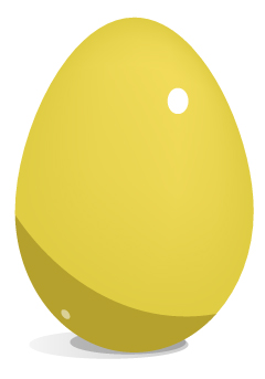
Design consultations can seed an idea and help lay that ‘golden egg’. Imagine that successful product that never happened, or that service you didn’t quite know how to get off the ground? Or that project you have been itching to start, but haven’t known where to begin.
Graphic Design is all about communication, as is a design consultation.
“Let me listen… Yes, yes, I see the problem here. It is called Comic Sans on a funeral parlour sign board!”
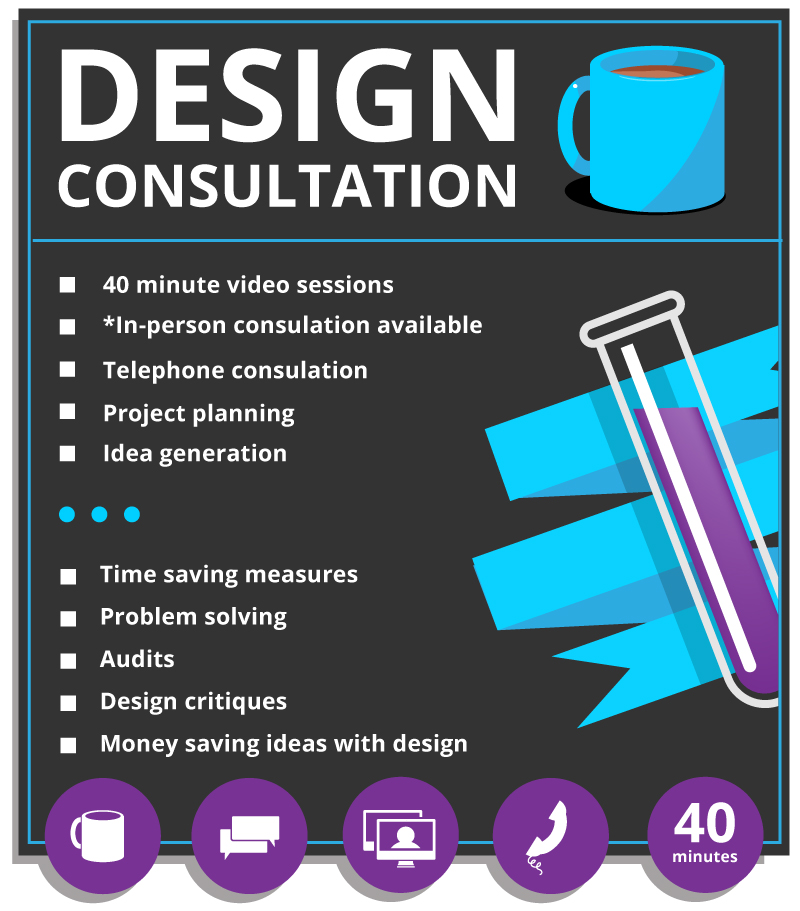
Graphic Design Consultations: Why They Matter
A graphic design consultation can be all or part of a grand plan. An analysis or consideration before you take action. It can be light-touch or heavy-duty, depending on what is required for the project.
Design consultations can be used to ideate and communicate thoughts. They can be used to reflect upon branding, packaging, and even website design.
A design consultation can offer tremendous benefits to a business in the early or latter stages of a design project, without necessarily being expensive!
Design consultations can encourage collaboration, discussion, and even constructive debate.
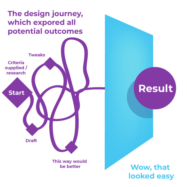
Consultations should work toward a main goal … making something great! Design is a journey after all.
Design Consultation: What you actually might get!
With a design consultation, you might uncover a branding inconsistency, ideas for stronger calls to action, or how to approach a project as a whole to get the most from your budget.
Sometimes, we design types confirm you’re on the right track.
Other times, we help you reroute completely. Either way, you gain clarity, confidence, and a plan! Sometimes, with actionable steps, which can either be carried out by you or the designer. You could see us as design doctors who only offer their skills by appointment only!
“Let me listen… Yes, yes, I see the problem here. It is called Comic Sans on a funeral parlour sign board!”
Pointing out problems is one thing, offering solutions to these problems is even better!
I have found more and more that businesses, start-ups, and individuals value the opinions of somebody who has been there, done that, and got a T-shirt.
This is why I launched this service. Because my clients, in essence, asked for it. ( In a roundabout way )
Here is a bit more on what a design consultant actually does!
What does a design consultant do? ( And no, it’s not all fluff! )
A design consultant is a seasoned creative professional who can share their knowledge, skill, and expertise either by appointment, contract, or on a ‘rolling basis’. Their time is sold in exchange for money.
A design consultant is part creative visionary, part strategic problem solver and all-round creative diamond! ( And in my case, an idea generator, who runs on sugarless tea and biscuits )
We’re brought in to evaluate, guide, and improve design-related projects with fresh, professional insight. From branding to packaging, digital experiences to print campaigns, we help businesses bridge the gap between style, substance, and function. We spot inconsistencies, suggest improvements, and propose new directions that align with your brand’s goals.
As an example, much of my experience comes from retail design, before moving ever more towards ‘web’. Believe it or not, your brand doesn’t end with a box or just a website.
To itemise further, a design consultant can do the following :
- Review brand goals and styles
- Investigate whether the communication and marketing tie-in together
- Offer specialised industry knowledge in dedicated design fields such as branding, online, UI design, or print.
- Offer sector-specific design solutions
- Visual problem solving
- Contrive ways of getting customers and clients to engage with your product or brand
- Suggest tips and methods to the creative process
- Advise on approaches to avoid and approaches to take
- Offer ideas
- Give opinions
- Suggestion methods for saving money in design
- Check semiotics, typography, layout, and styling
Design consultants can do this and much more . They can bring their design-specific skills and specialisms to the table. Share experiences, ideas…
In my case, I don’t just like to tell what I know. I like to ask the client what they need!
What does a ‘graphic’ design consultant do?
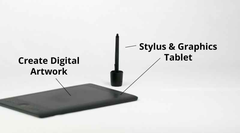
A graphic design consultant concentrates on the visual stuff: branding, logos, retail packaging, colour palettes, layouts, and much, much more.
We’re the ones who see five shades of orange ( so much orange… ) and know exactly which one says “trustworthy tech startup” versus “Board game cafe!” Our job is not just to make things look pretty, but to make them communicate clearly and effectively. We help translate your brand’s personality into design that speaks to your audience.
In my case, Graphic Design is but one faucet of my current skills. Graphic design ties in with my website experiences and board game products, too.
Fundamentally – deep down, I am a creative and enterprising spirit with a designer’s hand.
What to expect with a design consultation
Design consultations are not all just about tea and biscuits and Zoom with me.
Expect honesty (the kind that’s helpful), fresh ideas, and clear recommendations.
Design consultations can offer practical and actionable steps, visual suggestions, and perhaps even a stronger sense of your brand’s personality.
And, possibly… a few “EUREKA!” moments sprinkled in for good measure. But I will leave the Eureka badge to the client. I can’t self-appoint a eureka badge!
Areas covered by a graphic design consultant
Graphic design is such a broad, ever-growing, and ambiguous term now! In 2006, it was more straightforward.
I often see roles looking for a designer when in fact, they want a videographer, a graphic designer who is actually a website designer, a graphic designer who has many strings – I could talk more about that, but that is a conversation for another day.
For the sake of clarity and purity.
Design Consultations: why they matter and the areas they cover
Designers! We’re multi-tasking creative computer people, or… as I have been endearingly referred to – ‘Artguy’.
These are some of the areas that are covered by a design consultant :
- Branding and identity
- Print and digital design
- Web and UI layout
- Packaging design
- Typography
- Visual messaging
- Content design
- Visual storytelling
Is a graphic design consultation a waste of time and money!?
A graphic design consultation is not a waste of money. A great consultation saves you from costly mistakes, amateur design choices, and hours of second-guessing.
A graphic design consultation can streamline your branding process, align your visuals with your message, and elevate your branding presence—online and off. I don’t think a design consultation is a waste of money. It comes down to the nuanced skills and knowledge of a designer and what the client is trying to gain from the consultation.
I will say this, however, bad design – not just the finished product, but in how it is approached, can be a waste of money.
Although the design industry has changed significantly in recent years, and it is not just down to AI. I feel there has always been an itch to remove a designer from the design process, and to decentralise design as a whole.
However, this paves the way for amateurish, lacklustre, and poor design decisions in many cases. And, not to forget soulless design.
Honestly, there can be so much to Graphic Design than just “style”. Consider the marketing, packaging, product development and so much more.
Based on those points alone, graphic designers or ‘graphic design’ in general still matters. But the Earth will continue to spin without us design types if we vanished tomorrow.
It can be a waste of money if some of the fundamentals have been ignored.
Graphic design consultation | What inspired this service?
A whisper.., a murmur from a dark corner of somebody’s office! I was summoned through ritual and sacrifice, the devotees offered their newest member of staff to the design gods above. In a crack of thunder, I, their creative messenger, was sent to the mortal realm to fulfil the design need.
That was a joke and hyperbole; I feel I should put that disclaimer out there.
No, in all seriousness. It was more mundane.
It was because of my knowledge, skills, and experience across a range of sectors that people were seemingly craving that I created this service.
Is that an assumption? Somewhat, but not entirely. It was also born more out of frustration!
Clients were asking for my opinions, my guidance, and ‘how-tos’. Only, not all would value my time, as I didn’t value my time enough!
Design Consultation – how I got an idea ( brace yourself )
The case of making lemonade from lemons. As the saying goes.
Although I would like to add that not all those who sought my knowledge and skills were time-wasters. There were those who were sincere in placing value on my time. I’d like to thank those who did. But for every one of these who did value my time – there were probably 2 for every 1 who didn’t. I enabled them.
The idea for this service was born out of ‘the cheeky’ and me seeking a solution; I needed to learn.
Time-wasting video calls from those who sought my knowledge and experience and had no intention of paying for it in the first place. Emails, in-person meetings, creating plans, helping to write a brief, actually booking areas to meet in person, paying, and travelling to places for the person not to turn up or even give a reason! These were some of the painful real-life experiences.
Education on the graphic design process, reviewing briefs – or in particular offering thoughts on game projects- these all cost my time.
Imagine working for somebody for half a day or a full day and not being paid? Ouch indeed.
Or giving up half a day of your time for free with clients promising work only to vanish once they’ve got what they wanted?
Enough was enough. But, these lessons gave me an idea which was a long time coming. Gradually, I started to offer video consults ( link to brochure site ), and now I have turned into an organised boxed service.
From lemons, you can make lemonade
I wanted to share my knowledge and skills via an insightful design session that delivers value in an easy-to-digest format. This service was built to empower, teach, and help those with a genuine interest and value for my time.
What do I charge for my Design Consultations?
Each project is treated on a case-by-case basis. You can read more about my services here for more information.
What next, Design Consultation maybe?
If you’re feeling curious or even a little stuck, booking a consultation could be your next best move! ( couldn’t resist ) No pressure, just an open door to design clarity. You bring the questions, I bring my buzzing design brain brimming with ideas, suggestions, and opinions! Fuelled by tea!
How does my design consultation work?
Like so:
- A 15 minute free telephone or discovery call – to check if I can help
- I send an invoice for the booking, which covers preparation also.
- I do some homework for you, where applicable – if applicable
- We chat, review, critique, and ideate.
That is about it, there is more on my design consultation page on my services page if interested.
Design Consultations: Why They Matter | Credentials
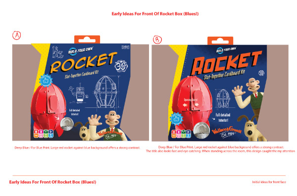
With nearly 2 decades of design experience in both online and offline design, a portfolio spanning both creative, gifting, gaming, retail, and charity, and an innovation and making things, I’ve got the design stories to share.
I’ve worked with startups, brands-in-rebirth, and everything in between. From strategy to execution. Let’s see what we can make work for you!
Design Consultations: Why They Matter – Related posts
- What is a design process
- What is my design process
- A design journey
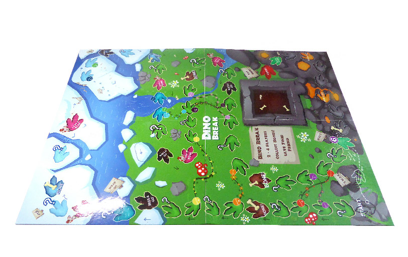
- Case study : Board game London pub crawl
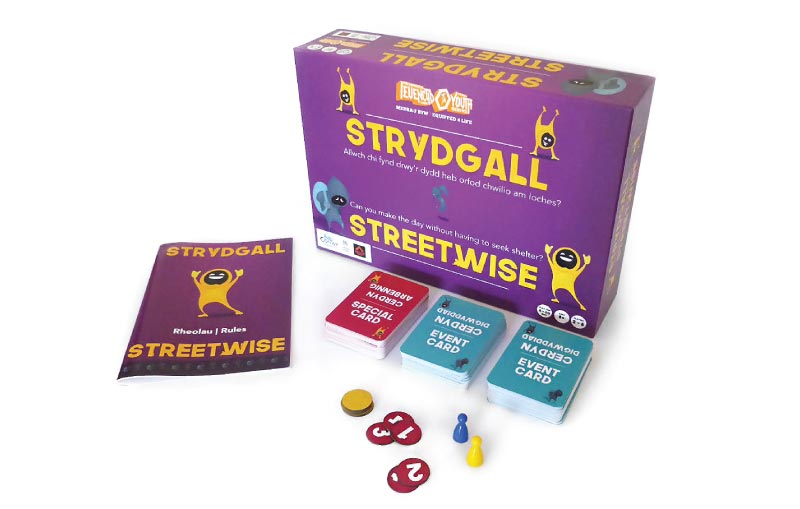
- Case study : Game design around youth homelessness
- Case study : Designing a Snakes and Ladders game
- Retail packaging examples
- Website Design – The Living Centre
Copyright Jimmsdesign 2025 – Subject : Design Consultations: Why They Matter and What You’ll Actually Get – Illustrations – Jimmsdesign.co.uk.


