If
like me you need work layers in Photoshop any time saving measure is
a bonus. I have a compiled a short list of shortcuts for making the
best use of Photoshop’s layers for both the Mac and PC – Enjoy!
(Swap CMD for CTRL on Windows)
Photoshop Layer icons
Layer Graphics
Change the layer order, move it up and down :
Cmd+[ Move Down
Cmd+] Move Up
Cmd+Shift+] = to move it to the bottom of the stack
Cmd+Shift+[ = Move it to the top of the stack
Direct
select a layer
With
move tool selected (V) hold Cmd
to highlight the
layers directly from the art board. This will also highlight groups.
Duplicate a layer
Ideal for copying a layer! Cmd + J to copy a selected layer! Or you can drag the selected onto the ‘New” icon! OR right click and duplicate – A personal fave.
Colour
Coordinated
In
addition to organizing you layers into folder and groups, why not
colour coordinate the layers so you glance at groups? Brown for dirt,
green for sea etc. Right click and select a colour.
New Layer Cmd+Shift + N brings up the new layer dialogue.
Cycle Through Blend Modes
Need
to see what a multiply, saturation, or overlay will look like on the
fly?
Shift
+ (Minus or plus, top right of the keyboard)
Layer Opacity With the layer selected you can quickly change its opacity by pressing >
Shift + (Minus or plus, top right of the keyboard) Shift + 22, 30, 23 (a number from the top row) typing the number in quick succession will change the layers opacity percentage. Hold shift and then press “22” the layer will be 22% “30” = 30 %.
Very handy for digital painting or retouching.
Group
Layers
Select
your layers and press Cmd + G to
group them together. If you are not grouping your numerous layers…
you should start. For sanity’s sake.
The original text for this was created and added to blogger in 2016 (Jimm Odell Blog). This has since been tweaked and added to this blog – the professional blog.
Making a simple PHP include website need not, in principle, need not hurt your brain!
So… Let’s make an easy-to-maintain bespoke brochure website using PHP. This post covers the principles of using PHP and how it can be used for brochure websites, also known as ‘brochureware’. This is not a whole guide to making a website, only the PHP part.
Using PHP include will make maintaining a larger bespoke website much easier.
Maintaining a large bespoke brochure website can be very time-consuming, based on my past experience. Using PHP “include” can take the website to the next stage of modular design and streamline your workload.
Imagine writing one line of code into a ‘php’ file instead of copying and pasting the same piece of code across 70 or so pages? Now that is time-saving.
Now imagine if you had to manually edit and retype code across all 70 pages due to a typo! You would have to go back and amend all of the pages one by one, and it would be a costly waste of time! And you’d get an arm ache!
This is especially useful on navbars and footers. Using PHP include can reduce the time-consuming method of copy and paste, shorten time, and take your website to the next stage of development (Or look at a CMS system, but that is a different topic).
With using the ‘php Include’ – the information you amend in one file can change across multiple webpages with a simple save and upload.
To further illustrate this, you can use this method for navigation, footers, banner adverts, and much more. I cannot emphasise how much easier this will make your life when working on larger projects if you must take the bespoke method. Change once to update many!
It will save hours! Or as I said before, just use a CMS system.
The Principle Of Using PHP INCLUDE for Navigation and Footers
In short, with PHP Include, you can use this line of code to include things into a web page. For example, you may wish to add custom navigation, a footer, a banner advert or just something that you wish to include. It pulls in external files and components.
For example, on a master page – parent page or however you wish to address a main page, by adding a line of script into a ‘div’ or area of your page, you can pull in files such as a navigation if it were to be created in a separate file. Such as a separate nav bar.
Likewise, this principle and line of code can pull in footer data. Or anything of similar nature.
You need not copy and paste the navigation again and again. It has many uses and purposes.
Steps for making a bespoke, low-maintenance brochure website using PHP include: the first block.
As a basic example, we are going to make a footer. We will have a master or ‘main’ document that will “include” – pull in, integrate, import a file from your website. This file will be a footer.
This tutorial/experiment will assume you already have prior knowledge of setting your website up with root folders etc, if you need some more help with this, please follow these tutorials.
– The main file (The parent/master) – An external footer file (why not add some styling to your html?) – One line of code, which you will embed into the parent folder. – A space to upload/test your experiment. (domain and hosting)
Component 1 – Parent File (Master)
The ‘Parent’ (master) will pull in the external files to construct the page. In this example. The master will have some code at the bottom of the page that will say ‘Hey footer, you included down here’.
Why not call your parent file ‘master.php’
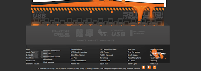
This image shows (with straying CSS, bleurgh! sorry, an old image ) the master.php and Product-footer-test.html working together… or popping out of the bottom.
This is a master file and a and external footer.html / or PHP working in conjunction.
Component 2 – Footer File
I have used the footer in the example. This area of the website at my previous company used to have frequent updates, with new products being added constantly. As you can see, all styling is added to this queasy example with the accursed table by using CSS – the image below is the bare bones of the footer file – no bells, no whistles! ( Why did I use the horrible table back in the day!
If completed correctly, changes or modifications to the footer file will be included in the master file once you add the “include” piece of code to the master file. So what you change here (the footer file) will be visible once you come to uploading all of the files and testing the file.
How you treat your footer is down to you.
The Code Example – The Simple Piece of Code to Paste Into Your Master PHP file
The image below shows in red where the piece of “include” code sits. So, imagine you have made a hollow space on your webpage, in the hollow space, you are going to add this code to the bottom. As shown.
Its just 1 line of code… 1 line that could potentially save you hours!
Product-footer-test.html”); ?>
The line of code above, which has been inserted into the bottom of your master file will call on the footer module and all of its elements. Once you upload your files you can see whether the footer has worked! Oh and check you have saved everything!
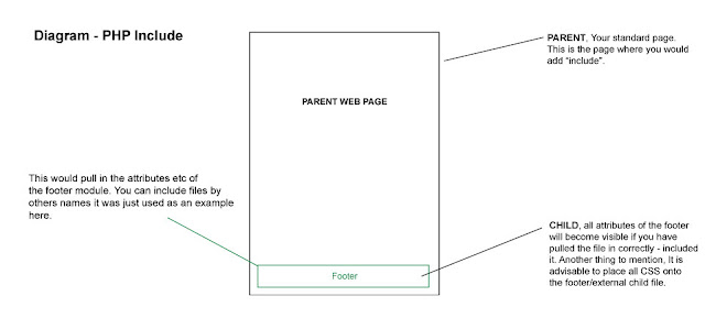
The visual diagram below will visually show how the principle works – leaving aside how the coding works for the PHP include.
Summary of PHP include in action
This is a image of what is happening with you PHP include!
In a nutshell. You have the parent (the main page) and a child, in this example, it was the footer. 2 elements talking to each other. Thank you for reading.
Hey, need a hand with your website?
There are other methods to get the results you want, which may be even more effective if you are a non-coder. You can use a web builder, a CMS or something else. If you would like help you can find out more on the design website.
If you need a hand with a blog or website, please get in touch.
You may also find these posts interesting :
Making a simple PHP include website : Website Posts
Simple techniques to reduce ‘banding’ ( Posterization ) in Photoshop ( *updated )
Posterization or ‘banding’ as it is known in Photoshop is a bane to many graphic design professionals or those working in print.
However, ‘banding’ is not limited to just print.
Banding, or posterization can also occur with screen-based imagery but it tends to be more pronounced and commonplace with print-based media in my experience. There is nothing more frustrating than seeing your lush and smooth gradient onscreen only when printed to see the same artwork with segmented bands across your gradient.
Over the years as a professional in-house designer, I have come across banding on more than one occasion. One of the worst culprits for showing banding is when working with greyscale or black. It was a challenge that used to drive me up the wall.
After much trial and error, here is a quick overview of some simple techniques I used to employ to reduce banding in Photoshop.
Some of the simplest techniques to reduce banding or posterization in Photoshop is by either applying ‘noise’ to your brush ( in your brush settings F5 ) or creating a separate ‘noise’ layer and overlaying this on top of a gradient layer to disguise the banding. This will give the illusion of smoother better blended artwork and remove the ‘stepping’ from your gradient. These techniques for handling banding can work especially well when working with mono-colour gradients such as black and white. There are also other tricks I have used in conjunction with this method written below.
“It often took various attempts to get it correct before sending it to print so don’t become too disheartened if your first try isn’t quite on par with what you expect.“
Simple techniques to reduce ‘banding’ | how I handled it
I often ran into banding situations when creating super smooth blends with colour.
It often took various attempts to get it correct before sending it to print so don’t become too disheartened if your first try isn’t quite on par with what you expect.
*Simple tip! If you have a local home printer or high-quality photographic inject printer, use this to test and measure your artwork.
I found these methods I have written below to make a world of difference when it came to creating a prototype or print production. All these methods I have actively used when working in Photoshop.
Some may call these hacks, others tricks but I like to regard them as ‘techniques’ for fixing a problem in print.
You may need to try various levels and settings, brushes and overlays to cure your banding problems. One solution may be enough, but you may wish to employ more than one if you are struggling to get the result you want.
Here is a detailed overview of some of the simple techniques I used to reduce banding.
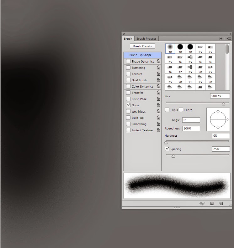
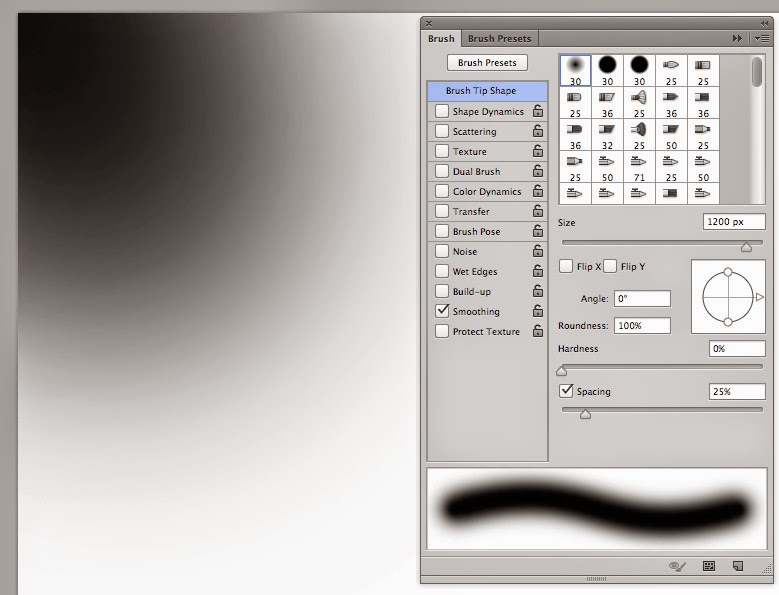
Look in the top left of the brush, and notice how you can see the steps/rings on the outermost edge? This is much less obvious in the lower part of the black blob where I have switched the noise on. This is an example of where I have used noise! Take note of the speckly grainy edge of the soft-brush. This brush helps the ‘steps blend better!
Simple techniques to reduce ‘banding’ ( Posterization ) in Photoshop – tricks
Silkly smoote !!
Before jumping in with the simple tricks you can use. Let us start with the basics. Or if you can’t be bothered reading about banding and when it occurs, you can jump straight to the tricks and hacks for dealing with it.
Banding & Posterisation in Photoshop – When it occurs
If you don’t wish to read about when “banding” has occurred for me, feel free to jump to the next section.
The dreaded banding aka Posterization in Photoshop.
The methods above were used on this character – Copyright Satzuma LTD – Rufus Rat.
Trick 1 ) ‘RGB?’
Controversial, I know. But when waging a battle to reduce ‘banding’ in Photoshop, any tool at your disposal can help.
RGB ‘can’ offer a greater degree of flexibility in the beginning when trying to wrestle with artwork to remove banding such as playing with filters or seeing how the art works on screen.
But remember, that once you tinker with filters and have done what you need to do with trying editing your artwork remember to turn your artwork back to CMYK if this for print. CMYK is a common colour format preferred by most UK printers.
Sadly though, CMYK can… 1 ) Offer a more candid look at your colours at the end of the process. 2 ) Make your colours look like a sadder version of RGB.
‘tangent alert’ Using RGB in the early stages is my preferred method for some projects, not all. It depends on the project.
“Isn’t this madness? You won’t see the genuine colours of your artwork!”
Well unless, your screen is calibrated exactly and you’re using pantones, guaranteeing what you see on the screen to print can be tricky anyway. Besides, I work across both mediums of screen and print, hence working with either CMYK or RGB ( digital )
Trick 2 ) Think of the ‘Bits’
I have tested this method in Adobe Photoshop CS5 and CC with similar results from version to version of Adobe Photoshop. There has been some improvement when working to problem-solve banding.
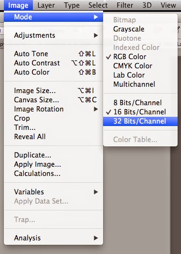
64-bit – 32-bit – 16-Bit RGB to CMYK
The difference has shown to be marginal but still of noteworthy impact when trying to reduce banding in Adobe Photoshop.
Although the steps are unnoticeable between 8-bit, and 16-bit at reducing banding, this can be enough to tame mild banding.
However, at 32-bit, the latter offered tighter rings and hues around the banding and showed to reduce some of the posterization in Photoshop – 32 bit helped the bands to better blend and higher still should only improve upon this further.
Below is a screenshot from the menu option in Photoshop, when with banding.
*Note : Also the colour profile listed below is on an iMac. This is by no means a significant contribution to the final outcome with reducing banding but may be worth noting in case you are reading this as a Windows PC. Although, I am of the opinion that this should make no difference whether on a Mac or PC. But your screen type might.
Caption of colour modes
Trick 3 : ‘Ultimate Trick’ – Brush & Noise
Assuming that you are running into this issue whilst using a soft-edged brush tool in Photoshop, I would advise turning the ‘noise’ on under the brush panel ( as shown throughout – press F5 to bring this window up)
With noise ticked in the ‘brush setting window’ this helps in the blending steps with greys as shown below.
Based on my experience, this improved the overall smoothness and graduation of the tones from light to dark regardless of bit mode or any other trick and hack for beating banding. Texture can help with the blending, and noise can help with texture. You can also dabble with the filters if you are using large radials (That would be a different article ).
Example As you can see below, the black brush at the top has rings that appear like tide marks, (banding). The blend below has far fewer rings as I had the ‘noise’ ticked on my brush. The speckled effect will be less obvious once you take your artwork to print. And shouldn’t look grainy.
But, be mindful not to be overzealous with noise. You may need some trial and error to get the balance right and run some text prints for good measure.
Example of Noise and brush in action
Trick 4 ) Big to small – experiment with scale
Another trick for tightening banding is by shrinking/scaling down your completed artwork, illustration, or photo.
This works well if you use some of the tricks above to blend and tighten any remaining bands before shrinking your work to hide evidence of banding.
Do this.
When you have applied the ‘noise’ to help blend your artwork, then shrink the image to hide some of the messier details.
This is method not only disguises banding when painting or retouching but also gives the appearance of tighter line work and detail in both photography and illustration. This is a principle I have adapted since being taught this trick in college.
In principle, all you need to do is the following.
Start with your artwork at 100%, and then scale the artwork down to 75%.
If you intend to use this technique, do remember to factor this into the sizing of your artwork with a 25% drop in size!
Eg, if you want your artwork to be 150 cm wide for argument’s sake, consider starting at 200 cm to scale down. Or if you want something to be 750mm wide, start at 1000 mm. Or if you want to 75 px wide start at 100 px.
In other words, knock a 1/4 quarter of the size but remember to factor in scale back at the end. If you don’t, you may end up with an image that is too small.
Step 1 piece of art = 100%
Step 2 scale art to = 75%
In theory, nothing is stopping you from playing with lesser scale-backs and scale-downs.
How can this work with hiding banding?
When you print the document some of the details and blemishes are hidden away from the naked eye.
This approach can also hide some of the rings in banding. With an added element of noise, you can combine this to scrub out the bands
Otherwise your hard could look like a dirty spill stain!
Simple techniques to reduce ‘banding’, the final tip
Using a combination of the above has helped me to kick banding into touch. My favourite by far is my experience with noise without going over the top with artwork to make it look fizzy.
Simple techniques to reduce ‘banding’ – Credentials
My name is Jimm ( Jim ) and I am designer with over 14 + years of experience. I have had to deal the banding. My old college course and grit and experience is what has helped me to deal with banding.
This website uses cookies to improve your experience. We'll assume you're ok with this, but you can opt-out if you wish. Cookie settingsACCEPT
Privacy & Cookies Policy
Privacy Overview
This website uses cookies to improve your experience while you navigate through the website. Out of these cookies, the cookies that are categorized as necessary are stored on your browser as they are essential for the working of basic functionalities of the website. We also use third-party cookies that help us analyze and understand how you use this website. These cookies will be stored in your browser only with your consent. You also have the option to opt-out of these cookies. But opting out of some of these cookies may have an effect on your browsing experience.
Necessary cookies are absolutely essential for the website to function properly. This category only includes cookies that ensures basic functionalities and security features of the website. These cookies do not store any personal information.
Any cookies that may not be particularly necessary for the website to function and is used specifically to collect user personal data via analytics, ads, other embedded contents are termed as non-necessary cookies. It is mandatory to procure user consent prior to running these cookies on your website.