Wimbledon Brewery UI – This project was carried out through a local agency based in Wimbledon. After some initial meetings and discussions with the agency Director, I was commissioned to come up with an early proof of concept for a new website idea for Wimbledon Brewery. It was to pitch a new idea.
I was commissioned for only the ideas and visualisation stages of the project. My part was to come up with a new UI ( user interface ).
In this post, I wanted to share both my involvement, and some of the processes to create for this project.
Gathering Research | Working With The Brief
At first, I went over the brief with my client and discussed the limitations or any important criteria that would affect the project.
After collecting together all of the information for the project, I then set about gathering some additional research and ideas. This could range anything from looking at recommended drinks companies, looking at competitor websites to seeing what we could learn. And browsing Pinterest to name a few.
What was important – was that the brand image of the company was sustained. The UI design needs to stand on its own two feet with the brand being seamlessly integrated.
Roughing Out Ideas
Once some of the initial research was collected together, I then set about putting together the low-fidelity visuals and ideas to share and discuss.
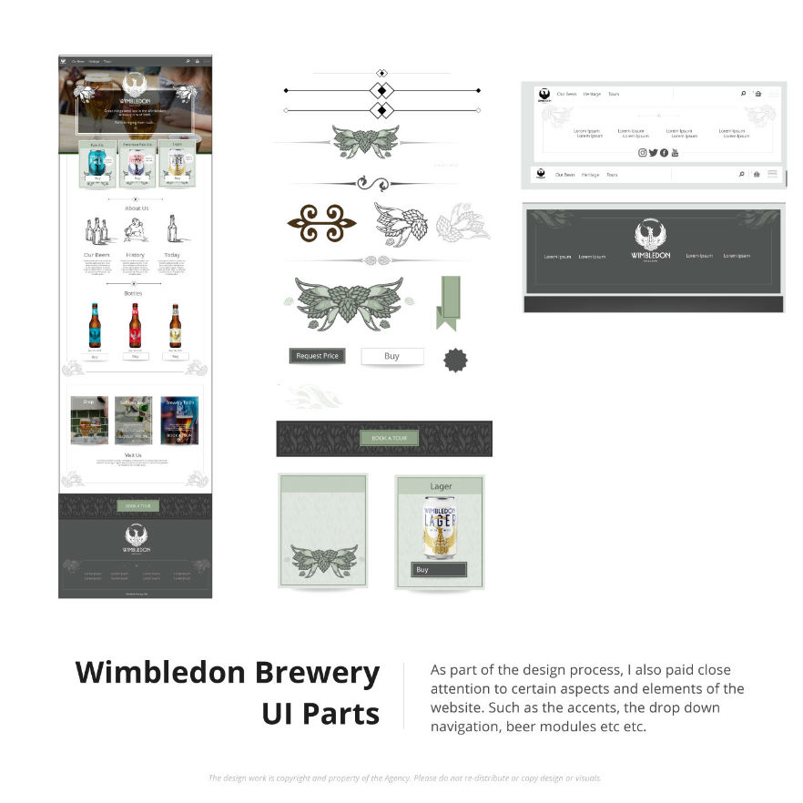
Initial Design & UI Kit Pieces
Bit by bit, I started to put together some initial designs for the various components on the page. For example boilerplates, brand accents, information cards, and the main navigation amongst other important pieces of content.
The design process and the idea generation were created modularly. Key components were examined in close detail before committing them to a polished design and compiled into pages in their entirety.
Proof Of Concept | ( POC )
After the various stages of discussion and mutual brainstorming with the client. I then started to put together some complete and polished visuals for the early proof of concept for a new website.
*This was put together for illustration purposes only
This is an example of a User Interface and website revamp project for a large community centre based in King’s Cross London.
My role in the project involved brainstorming ideas, drawing the new content and banners, considering the user experience and seeking ways in which to make the website design more user friendly, functional and useful for users of the Living Centre.
The brief
After a couple of conversations and a Zoom call with the team at the Living Centre, I was commissioned to design and revamp the website to ‘look less boring’, represent the institution and add some more practical functionality.
I took this a step further. Although digital design is a faucet of my skills like many designers of 2020’s. I wanted to add more than just a simple “yes man” approach to this project. With my commercial experience and creative direction skills. I didn’t want to just say ‘bam’ take their money and go. There is a website and leave. I wanted this website to work not only as part of the brand but as a website and tool for their business.
Without barraging my client saying ‘do this better, because I think so.’ I wanted to know what needed to work. What questions do customers ask – I wanted to do my homework.
These were the starting blocks, and – it should be noted that these were not all of the questions and rounds of discussions.
The home page needed a lot of TLC
After communicating and carrying out research, I had both inspiration and the key criteria in order to create a new look and feel for the website.
I started exploring the ideas with the homepage first.
The home page, as is the case with most websites, was one of the busiest pages in regards to content and information. The Living Centre’s page was loaded with information but in no particular order and without many calls to action either. I tried to turn the home page into a lobby with well-labelled doors and opportunities to funnel users into either making contact or leading to a making money lead enquiry.
I tried my best to capitalize on this page while trying to keep it to the client’s brief. Very accessible, on-brand, interesting, informative and structured. Some of these changes and updates would appear subtle to the outside reader. But many, even the smallest changes were generally very deliberate and considered.
When recreating this page, I tried to break it down into structured manageable and relevant chunks for the web user.
Design The Hire Page
This page actually was a follow-up project after I have revamped the core look of the website and rebuilt it with Divi. Their website and this page had a lot of untapped value.
Upon spotting the hire section needed some more content and juice, and I got to it.
This page covered both coming up with additional UI designs ( although the guides were now already set due to the first project ) and creating more content too.
Website Design mock ups
Some examples of this are illustrating a top-down view of a floorplan for all the rooms to hire, prices, 3D drawings / oblique drawings of the areas, bolder use of area photography amount other various things.
I tried to make this page a silent ‘Hire Space!’ salesman for the Living Centre.
The illustration I created was used on the website
Experimentation & Design
The brief from Living Centre was nothing quite like what I have worked on before. Creating websites and UI’s, I have worked on plenty of these. Creating plan drawings and landing pages. I have worked on these too. But having all these combined into one single project was an interesting challenge.
Below are some samples of the design, such as the banners and some f the early works in progress.
Website Design | Putting the website together
The website was already made using WordPress and Divi. After working on the design stage for the project I was also commissioned put it all together based on my visuals.
Being an existing licence holder of Divi it was not too much of a stretch for me to build these new pages and add the content I had illustrated and designed. I worked in a non-destructive way for the home page. Behind the scenes, I created a ‘master template’ which I switched with the existing home page when it was ready to go!
Testimonial From the Living Centre
“We worked with Jimm to redesign our website. The brief was simple to bring our website, which was static, had little character and was boring alive, fun and informative. We were not disappointed with the outcome.
From start to finish, my interaction with Jimm was professional, stress-free and I had complete trust in his ability to deliver. Jimm took the time to listen to what I wanted but also brought his own ideas, experience and creativity so that the end design was more rounded. He understood that I needed to see things in a visual context and have some flexibility to ‘play’ around with a few ideas. The challenge was we had to do all this via zoom but Jimm made it very easy; being patient when I had technical difficulties making the whole process enjoyable, stress-free and highly personal. “
Hobbyists, businesses, and potential clients… this post is for you!
This post covers 3 simple ways for you to build a website for free, or almost free. This article is ideal for start-ups, hobbyists, and individuals looking to gradually build their online presence. All you need is a computer and internet access.
This post will cover the pros and cons of each system based on tried and tested experience.
It should be noted I am not affiliated with these companies
How to build a website for FREE – Summary Overview
To build a website for free, you can use a selection of tools, software, and hosting options to start creating your website with next to no upfront cost. Many DIY developers use platforms such as WIX and WordPress to build websites and blogs for free by learning the tools themselves. However, it should be noted that ‘Free’ is not always strictly free in the truest sense.
You can use WordPress’s free domain, for example, to save on money, but the hidden cost is that you are handing control and ownership of your website to their hosting. You are relinquishing a certain degree of control for speed, convenience, and ease. You are also removing professional knowledge skills and expertise from the equation.
Instead of opting for a full website, website owners can also opt for an easy-to-maintain solution, such as having a ‘Facebook Business Page Only’ or solutions such as Blogger in the early stages of their website journey.
Although this is not the same as having a website for free, it can serve as a free starter block for establishing an online presence.
Here is a list of solutions to create a website for free.
How to build a website for FREE | Start building Something
1 ) Use Blogger To Create a Website For Free
Not heard of Blogger? Blogger (blogspot) has been around for years and is part of Google. With Blogger, you can create your website or blog completely free!
Blogger is fine if you are looking to create a simple blog as a hobbyist or put something together quickly for a friend or relative. I have used Blogger as part of my ‘hobby and general stuff’ website, which I treated as a creative/personal dumping ground. You can see my personal blog here.
Blogger isn’t solely for amateurs. I have seen great examples of Blogger being used by professionals and semi-professionals, despite It being a free platform.
However, generally speaking, Blogger is used more by hobbyists than professionals, but this doesn’t render the software totally unworthy.
Due to Blogger’s low point of entry, it is a magnet for homemade, freebie, and hobbyist blog creators. A great starting point for those learning the bably blocks for making blogs and blog content.
This website is a great example of what can be achieved with some dedication and willpower, with its limited build function. The website, Print & Pattern, comes with a jobs board, products, and other pieces of information centered around graphic and surface pattern design.
I doff my cap… If I had one!
It might also be worth mentioning that you can also monetise your ‘Blogger’ blog very easily using Adsense should you choose to do so.
Blogger Pros :
FREE – Blogger is free. You can set up an account today and start writing about your hobby or business pretty much right away.
Reasonably easy to use – Blogger is relatively straightforward to use. Buttons in the left-hand navigation show what is what, from add buttons to other tools. All you need to do is create a “new post” and type away – as easy as that, although it is not without its quirks.
Can be polished – with a bit of thought, a lot of application, and headache tablets, you can make your Blogger look professional. But in my personal experience, it is an uphill struggle.
No fuss – You can set up a Blogger website quickly; you don’t need a coding guru to help.
Blogger Cons :
Typically regarded as unprofessional – if you are using a Blogger for a business website, it can frame you as an amateur. Blogger websites tend to have a dated essence to them in terms of appearance and format. People can more often than not tell something looks a bit ‘Home-made’. In business, making a good impression is important, and you want to avoid being… ‘Homemade’ if you want to be taken seriously. Not all Bloggers are created by amateurs, but many do use this platform as it is free.
If you must use Blogger, dress it well.
Awkward code – know how I said to try and ‘dress it’? Now imagine trying to dress an excited squirrel! Well, it certainly won’t put its arms into the sleeves. This is Blogger, an unwilling and uncooperative squirrel. The code and interface can be very awkward to use if you are trying to tweak alignment, adjust paragraphs, or bold text. It also adds a lot of junk HTML to your article, making it needlessly difficult to tailor in code view. Many hours have been wasted trying to make it play fair. From this perspective, I cannot recommend it. Especially as somebody who has used code such as PHP in websites.
You don’t really own it – Although it is free to use and as a free tool, it is pretty good, it’s not your intellectual property. Should your Blogger be closed for some reason, you will lose all of your content with it. For ‘free’, you will relinquish control and imagine losing 5 years’ worth of posts? Back up your content if you decide to use Blogger.
Blogger and SEO – although it’s not bad, I’m not convinced about its friendliness towards being seen by the search engines either.
How to build a website for FREE | Blogger Verdict :
It’s good for hobbyists, it’s free, but there are other options that I would consider over Blogger. Generally, if you want a professional presence, I would use a better platform, such as WordPress.
Creating Your Website For Free Verdict
Rating out of 5 :
1 = Poor | 5 = Excellent
Cost = 5
Ease of use = 2
Creation Efficiency = 1
Set Up = 4
Quality Of Websites ( On average ) = 2
Value = 2
Total = 16
Got more questions?
Create a website for free using WIX
Although I am less familiar with the pricing structure of WIX, WIX still claims you can build a website for free.
A viable option if you are considering free options to create a website!
Wix gets some unjust stick. Developers ( hardcore coders ) scoff at it because it is a ‘website builder’; the only real reason for this anti, is due to a combination of accessibility and snobbery. Wix, which can be used by non-coders, opens up the market and enables DIYers to attempt to make a website.
My Opinion on Wix: When building a website for free
Although time has long since passed when using WIX, WIX isn’t too bad! And if you are strapped for money and just starting out, maybe consider this as a possible option in the beginning. WIX allows you to visually drag and drop your website together to create a design that you may not vomit over! You can even add snippets of code as and when required.
Not all bad, not all great in my opinion either.
Here is an example page & website I was part of when building a new website. I created both the UI and content for the page.
What is WIX like for building a website?
It’s pretty good in short… but there’s more to that story. I have used WIX in a past role to create an easy-to-maintain website without the need for code.
That’s well and good, but why use it?
It’s accessible, free / cheaper, great for restricted budgets, and does the job. You don’t have to be a coder either.
WIX enables users to position page elements without having to hard-code everything. You can build your website or web page visually.
Imagine using a program like Microsoft Publisher, Photoshop, or Canva to create a website from start to finish? No need to code, no headaches, no bar to entry!
There is more to website design than graphics, but for the sake of argument, I want to keep this post lean. You can make a website as a business owner or as a designer. For those who like a bit of code, you may be interested in reading a bit of theory and practice on PHP include.
WIX – you don’t need to be a Developer to make it work! The mess can be left down to the casual website developer instead. (Whoops, did I say that out loud ? )
Here are my shared experiences with the WIX website builder.
Creating a Website With Wix – Pros :
Neat & Tidy –An all-in-one neat little packaging with a relatively straightforward drag and drop interface to assemble your website.
Cheap – WIX comes with a range of pricing plans to suit a variety of budgets. It also comes with its own hosting packages.
Cool features – It comes with some nice little integrated features, such as a mail-list manager and an easy-to-use image library; you can also create a basic shop with it, too.
Visual Designer – It’s great if you like to create websites visually, but please note that it’s not to be used for creating graphic design and banners!
Wix Cons :
The responsive design was/is sub-par – arguably worse than Blogger. As a non-developer, you may be wowed initially by how easy it is to use, but what you see isn’t what you get. They call these WYSIWYG’s. What you see is what you get. Ironically, with website builders, be it Dreamweaver , Wix, or others, this is not always the case. ( based on when I last used it to make a website )
Build twice, takes twice as long – Further to the point, you ( used to) have to build twice or suffer a website that will not work properly on a smartphone. Eg can’t read text without zooming with fingers etc. This bad user experience will be passed on to your customers.
Clumsy fluid layout – As a designer, this would be something I would pick up on. The default desktop website can have some somewhat awkward behaviour when it comes to viewing the website in different browsers. Fluid and responsive websites are not easy to build, and WIX certainly hasn’t mastered this yet.
Slow Down – If you have a large webpage with lots of elements and content, this can overwhelm the WIX builder. You will find that as you are dragging (pushing) elements around, they start to lag and stick. This can become very frustrating if you are trying to work toward a tight deadline in a busy or demanding environment.
limited control with deeper development issues – By using a website builder such as WIX you surrender building a more accessible and technically proficient website. It’s also trickier to get into the real nuts and bolts to solve somewhat basic issues.
Wix Verdict – Jack of all
Cheap
and cheerful and great for non-techies. This user-friendly website
builder is good if your are starting out. I have seen WIX used for
straight up brochure and small scale websites with great results and
if you are on shoe string it could be something to consider. WIX is
nice to use, quite slick and an intuitive piece of online software!
Not the cheapest, but ok.
//====================== *
– just to the stress this from the previous point. Sometimes,
people think websites are static and they adopt their thinking to an
archaic approach to website design. Websites are no longer static and
it is best to avoid a website design in this way. If you would like
to know more about this feel free to send an
enquiry. //======================
Rating
out of 5 : : 1 = Poor 5 = Excellent
Cost
= 3 Ease of use = 5 Creation Efficiency = 3 Set Up =
4 Quality Of Websites = 2 Value = 3
Total
= 20
———————————————
WordPress is Free
WordPress
has been available for years! It has grown a very large and loyal
following that are building better product everyday. WordPress
is completely free to use,
its open source and has a large community of developers and agencies
available to help. If you have your own domain and hosting, using WP
is as simple as downloading and implementing it yourself. Certain
hosting companies come with one Click
installer
which can make installing very straight forward but this isn’t the
case for all hosting companies.
If
you don’t have hosting or a domain you can also set up your WP
hosting complete free
– WordPress > don’t panic!
You
can create very powerful website using
WP and
comes with a very large library of resources to build different types
of websites; stores, blogs, brochure sites, downloads sites, ticket
software etc etc – it’s vast and WordPress has gone way beyond
being just a blogging tool!
WordPress
is integrated with many 3rd
party companies which range from over automated email systems to
analytics. There is also themes which turn WP into a visual website
builder. All this plus the features mentioned before.
WordPress Cons
Hackers like it – being a victim of it’s own success and a large proportion of websites being made using WordPress, it’s a hackers paradise. If you have a very large scale website perhaps other options are better to consider.
Plugin’s can break – Although there are 1000’s of plugins on the WP market place some of them can fail over time if they are not maintained.
Needs to be maintained – WordPress needs TLC occasionally. Pay attention to your dashboard or email notifications if you need to update you current version of WP or its plugins.
Set up – WordPress can be a challenge from time to time when trying to install it on your own host. This can range from obscure incompatibilities or ‘access’ not being configured properly
Tricky to change – The default version of WP can be tricky to tailor without knowing your way around CSS or downloading a plugin. This is where using a developer could come in use if you decide to use WordPress.
Used a lot – due to a lot of websites using WordPress website can start to feel the same.
WordPress Pros
Progressive
& Powerful
– WordPress is always pushing forward with it’s technology and it’s
developer community are always improving the platform.
Community
– WordPress comes with large pool of knowledgeable developers
creating new functions and extending the function of the default
software through plugins and themes which can either be purchased or
downloaded for free.
Powerful
for no or low budget (FREE) –
you can create a professional and functional website with default
Wordpress software.
Do what
you like with it, more or less
– create your website today on your
own domain
and hosting you and can do what you choose with it – isn’t that
great!
Simple to use – It comes with a reasonably easy to use ‘dashboard’ – not too dissimilar to Blogger.
–
Plugins and Themes
– Just too much awesome to list. Also a lot of dross but there is
essentially a candy store of added functions to select from.
Rating out of 5 : : 1 = Poor 5 = Excellent Cost = 5 / (*1 ) Ease of use = 4 Creation Efficiency = 4 Set Up = 3 Quality Of Websites = 5 Value = 5
Total = 26 / (*22)
*Cost
variable due to free VS paid. As this article is about free and low
budget website solutions the score jumps from free to expensive
depending on whether you need a dev to help you.
WordPress Verdict : Great Value, Great quality
WordPress
is a good platform and worth considering if you want some flexibility
in what functions come with your website and whether you want to
change it at a later date. You may require developer to help you in
the beginning but after that, your WP site is yours to do with as you
choose.
That’s all! 3 Simple ways for getting a website online – in detail.
I hope this will offer some insight! If you are needing a Graphic Website Designer to help out with creating your business send me a message or if you have any queries about the listing above – also get in touch and will try my best to answer!
This article was written to give some guidance as how to go about creating a free website. This is based on my skills and experience. The opinions, based on my experience, are ‘my opinions’ and not that of others. Please bare in mind when making your business decisions on you website that you have considered what has been written and do your research thoroughly.
The scores were created for a bit of fun.
The platforms listed are tools. It’s down to you to offer great experience and value to the person reading it.
Example Website Design Projects | UI Design, Digital Products
With over 15 years of commercial experience in creative design and front-end web development, I have been given some brilliant opportunities to work on products which have been fun, engaging and challenging.
In this post, I am sharing a portion of my website design experience from my time at Satzuma, a gifting and tech company based in London.
At Satzuma, ‘Branding’ and appearance were key. All the of websites and any web-based media. Be it the UI’s, the logos, or even when I used the flash to make an application. It still needed to tie in with the broader brand ideology.
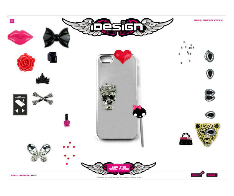
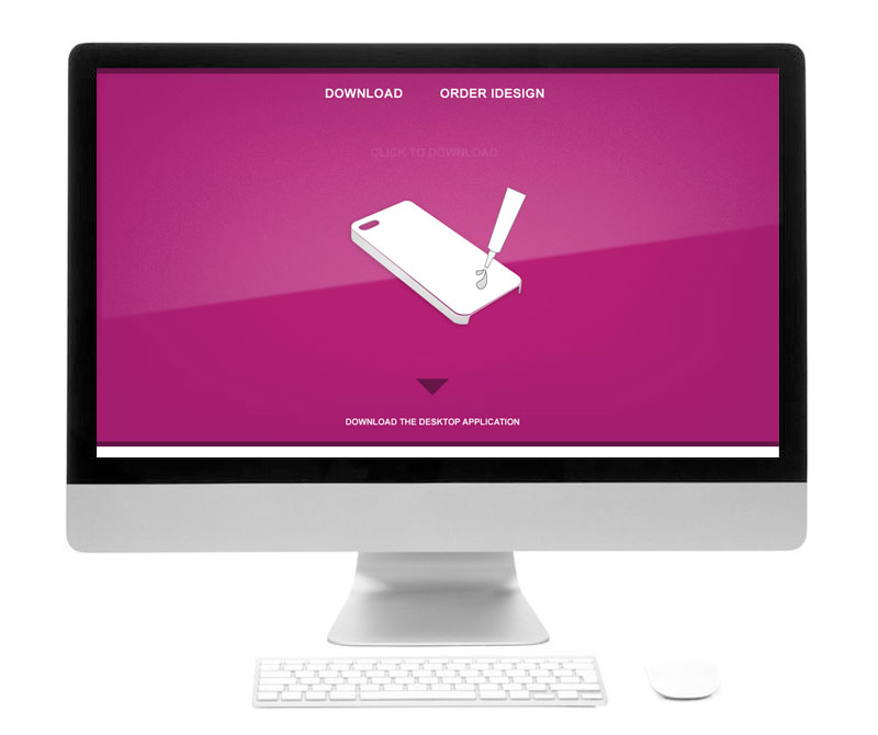
Snap shot of early icons for the flash application –
I created icons for this application, but all in all, it was the browser-based application that was used more readily. Without going into too great detail on that application here, here are some snapshots of that application in action.
In brief, the application’s goal was to demonstrate how a real-world product worked virtually to prospective buyers. The product, in essence, allowed ‘The Buyer’ to decorate their own phone case. This web-based and browser-based application could be used by both B2B and B2C users.
The application also had a dedicated page on the website so you could download the play the game / application from your computer. These types of pages are often referred to as ‘Landing pages’ and this was part of the landing page design.
What was the point of this website and application?
The real-world product was designed so you could decorate your own smartphone and headphones with an all-encompassing DIY kit. We branded this the “i Design kits” or kits. It was for the gifting and tech market. And for this, the website’s look and feel needed to meet the following criteria:
The product was geared toward slightly ‘edgy’ young female teens – students
The app needed to show the product in action from the ‘Buyers’ browser.
Example Website Design Projects | Designing a Landing Page
As shown above, a landing page was created to offer a central point which users could download the app to their desktop or use the app directly through their browsers. According to the analytics, the app played on the browser was the most used method.
When creating this page, I designed the UI and the content to be on brand and in keeping with the product we were trying to sell.
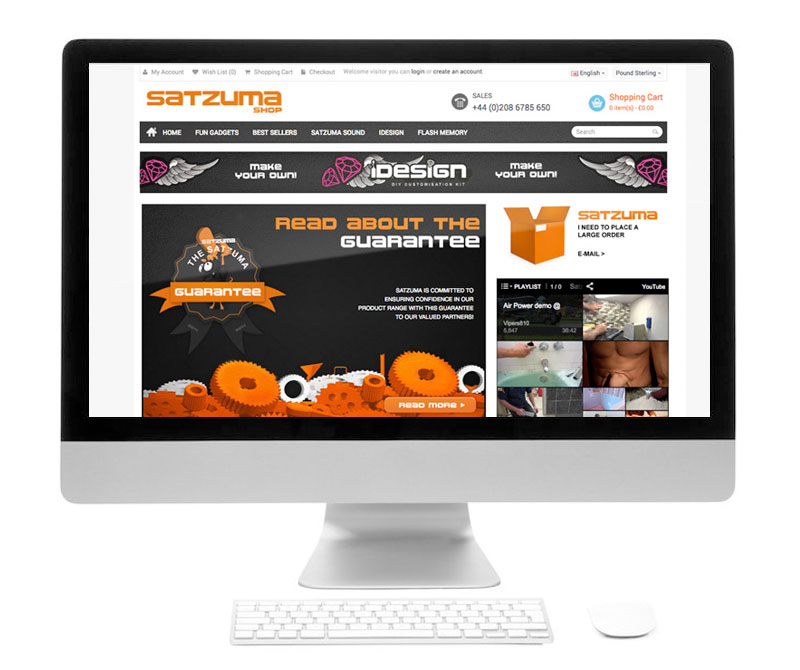
Creating An E-shop
It was discussed that it would be a good idea to create an online shop so business to business retailers could buy the products in bulk. 1000 units, 50 units, etc, and the platform would maintain the stock. After research and looking into core requirements, maintenance, ease of use and cost, and stability, OpenCart was given the go-ahead.
This is an example of the OpenCart theme with the core Satzuma branding applied to it.
The website needed to look engaging and be in keeping with the brand as a whole. Packaging like one business and a website that looked like another would potentially put off customers and larger retail brands.
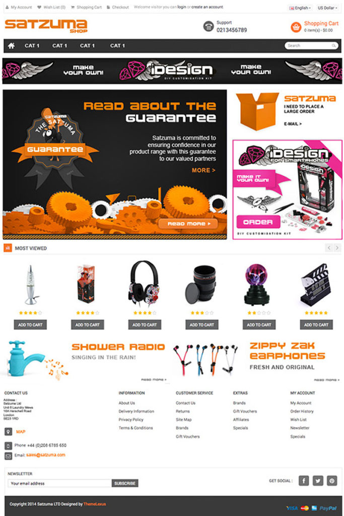
This is the UI design based on the Nexus Theme. This is the design stage before the artwork was broken down and applied to the online store.
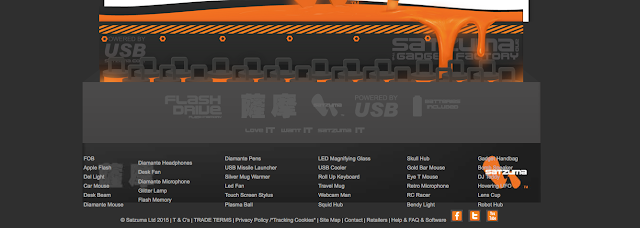
A Piece UI Design
This is a piece of UI design that was applied to one of the earlier original Satzuma brochure site designs. These buttons and elements were broken down and written into the HTML and CSS. This website gave a punchy brand experience whilst offering information on the product.
This design encompasses some of the core elements of the website. Such as :
The user interface design – buttons, backgrounds, quotes, decorations, navigation, logo, social media, and other ad-hoc parts that constructed the general interface of the website
Buttons – Its not a coincidence that buttons are orange. Based on a seminar by a ecommerce consultancy. People clicked more often on the colour orange. Which was fortunate as so was the core branding of Satzuma. This allow for clear areas of Calls To Action on the web page.
Dark Elements – The core branding of Satzuma was orange a black – fun and tech. Using these core principles of the brand, I created a look that was both functional and respectful to the branding of the business. This also plays into something called ‘semiotics’ you can read more on semiotic examples here. The main purpose of the black, in addition to be part of the black/dark branding was to act as a neutral bed of colour to emphasise the CTA’s and the content.
Charm & Character – following the charming elements and the character of the brand you will see (or used to) the Satzuma Man drawing attention to promotions and core messages. He was a face / mascot which captured fun elements of the brand
More Projects –
If you need help with your website be it basic consultation, design, growing online, design the look and feel, helping to set up a WP website so you can manage your own website – feel free to say hello.
You may also find some of these more current projects interesting:
Making a simple PHP include website need not, in principle, need not hurt your brain!
So… Let’s make an easy-to-maintain bespoke brochure website using PHP. This post covers the principles of using PHP and how it can be used for brochure websites, also known as ‘brochureware’. This is not a whole guide to making a website, only the PHP part.
Using PHP include will make maintaining a larger bespoke website much easier.
Maintaining a large bespoke brochure website can be very time-consuming, based on my past experience. Using PHP “include” can take the website to the next stage of modular design and streamline your workload.
Imagine writing one line of code into a ‘php’ file instead of copying and pasting the same piece of code across 70 or so pages? Now that is time-saving.
Now imagine if you had to manually edit and retype code across all 70 pages due to a typo! You would have to go back and amend all of the pages one by one, and it would be a costly waste of time! And you’d get an arm ache!
This is especially useful on navbars and footers. Using PHP include can reduce the time-consuming method of copy and paste, shorten time, and take your website to the next stage of development (Or look at a CMS system, but that is a different topic).
With using the ‘php Include’ – the information you amend in one file can change across multiple webpages with a simple save and upload.
To further illustrate this, you can use this method for navigation, footers, banner adverts, and much more. I cannot emphasise how much easier this will make your life when working on larger projects if you must take the bespoke method. Change once to update many!
It will save hours! Or as I said before, just use a CMS system.
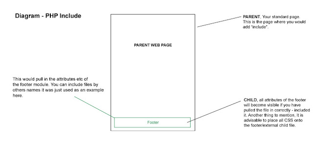
The Principle Of Using PHP INCLUDE for Navigation and Footers
In short, with PHP Include, you can use this line of code to include things into a web page. For example, you may wish to add custom navigation, a footer, a banner advert or just something that you wish to include. It pulls in external files and components.
For example, on a master page – parent page or however you wish to address a main page, by adding a line of script into a ‘div’ or area of your page, you can pull in files such as a navigation if it were to be created in a separate file. Such as a separate nav bar.
Likewise, this principle and line of code can pull in footer data. Or anything of similar nature.
You need not copy and paste the navigation again and again. It has many uses and purposes.
Steps for making a bespoke, low-maintenance brochure website using PHP include: the first block.
As a basic example, we are going to make a footer. We will have a master or ‘main’ document that will “include” – pull in, integrate, import a file from your website. This file will be a footer.
This tutorial/experiment will assume you already have prior knowledge of setting your website up with root folders etc, if you need some more help with this, please follow these tutorials.
– The main file (The parent/master) – An external footer file (why not add some styling to your html?) – One line of code, which you will embed into the parent folder. – A space to upload/test your experiment. (domain and hosting)
Component 1 – Parent File (Master)
The ‘Parent’ (master) will pull in the external files to construct the page. In this example. The master will have some code at the bottom of the page that will say ‘Hey footer, you included down here’.
Why not call your parent file ‘master.php’
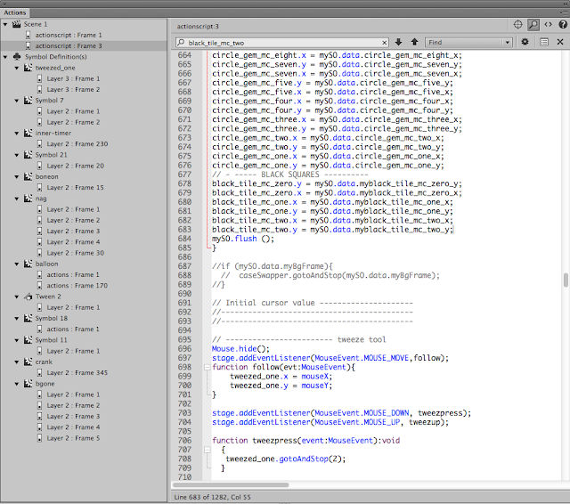
This image shows (with straying CSS, bleurgh! sorry, an old image ) the master.php and Product-footer-test.html working together… or popping out of the bottom.
This is a master file and a and external footer.html / or PHP working in conjunction.
Component 2 – Footer File
I have used the footer in the example. This area of the website at my previous company used to have frequent updates, with new products being added constantly. As you can see, all styling is added to this queasy example with the accursed table by using CSS – the image below is the bare bones of the footer file – no bells, no whistles! ( Why did I use the horrible table back in the day!
If completed correctly, changes or modifications to the footer file will be included in the master file once you add the “include” piece of code to the master file. So what you change here (the footer file) will be visible once you come to uploading all of the files and testing the file.
How you treat your footer is down to you.
The Code Example – The Simple Piece of Code to Paste Into Your Master PHP file
The image below shows in red where the piece of “include” code sits. So, imagine you have made a hollow space on your webpage, in the hollow space, you are going to add this code to the bottom. As shown.
Its just 1 line of code… 1 line that could potentially save you hours!
Product-footer-test.html”); ?>
The line of code above, which has been inserted into the bottom of your master file will call on the footer module and all of its elements. Once you upload your files you can see whether the footer has worked! Oh and check you have saved everything!
The visual diagram below will visually show how the principle works – leaving aside how the coding works for the PHP include.
Summary of PHP include in action
This is a image of what is happening with you PHP include!
In a nutshell. You have the parent (the main page) and a child, in this example, it was the footer. 2 elements talking to each other. Thank you for reading.
Hey, need a hand with your website?
There are other methods to get the results you want, which may be even more effective if you are a non-coder. You can use a web builder, a CMS or something else. If you would like help you can find out more on the design website.
If you need a hand with a blog or website, please get in touch.
You may also find these posts interesting :
Making a simple PHP include website : Website Posts
This website uses cookies to improve your experience. We'll assume you're ok with this, but you can opt-out if you wish. Cookie settingsACCEPT
Privacy & Cookies Policy
Privacy Overview
This website uses cookies to improve your experience while you navigate through the website. Out of these cookies, the cookies that are categorized as necessary are stored on your browser as they are essential for the working of basic functionalities of the website. We also use third-party cookies that help us analyze and understand how you use this website. These cookies will be stored in your browser only with your consent. You also have the option to opt-out of these cookies. But opting out of some of these cookies may have an effect on your browsing experience.
Necessary cookies are absolutely essential for the website to function properly. This category only includes cookies that ensures basic functionalities and security features of the website. These cookies do not store any personal information.
Any cookies that may not be particularly necessary for the website to function and is used specifically to collect user personal data via analytics, ads, other embedded contents are termed as non-necessary cookies. It is mandatory to procure user consent prior to running these cookies on your website.