
Your first Junior Graphic Design role…. that was many moons ago.
This post offers useful, honest, and actionable tips to help you land your first Junior Graphic design role or internship. Much of this experience comes from hiring design interns and from myself hiring interns for more traditional design roles.
Although I would like to add… the design profession has changed dramatically. There will still be some helpful little tips for me to share.
Now, go get your first Junior Graphic Design role of dreams ( maybe ).
This post is here to help
“If you have no idea what type of design you want to do, don’t be too hard on yourself – I didn’t know either.”
– My older to younger self
Getting your first Junior Graphic Design role: overview
Finding work as a fresh-faced young ‘Graphic Designer’ can be a challenge! More so in this day and age.
In order to land that perfect design role, you need to really sell your skills and passion in a very competitive and crowded market. Saying ‘give me a job’ won’t cut it. Companies don’t want to do you a favour, they haven’t the time. By offering your assistance in the role, you can help in a design position, which may shift your mindset.
What can you bring to the role? Does your portfolio align with what the company wants and needs? Does your style suit the job and the company?
This post has been written to offer assistance in your journey to landing that desired role. Hopefully, following these 20 graduate designer tips will bring you closer to achieving your goal of becoming an intern or a graduate designer. But, I shall promise and guarantee nothing – the creative world is too turbulent for that, I am afraid!
As for my credentials, I have both been a design graduate and a manager in charge of hiring interns and graduate designers. This post will cover what the company looked for (my previous role), what ‘I’ looked for, and what I wasted my time doing in the beginning when looking for work.
My Career Credentials in Design
1) I’m not Neville Brody or Saul Bass.
2) A lot of this experience comes from nearly 20 years working in-house and freelance
3) The rest is self-taught
4) The rest of it is from first-hand experience hiring
Your first Junior Graphic Design role: 20 detailed tips for landing that ideal creative role :
Part 1.

Part 1 – Getting Into Mindset –Job hunting is a job in itself.
1 ) Be positive, and stay positive
There may come a time in your search for work where you will feel down in the dumps, the worst thing you can do if you really want to be a Graphic Designer is throw in the towel too early on.
Some graduates manage to find jobs as a designer straight out of University, they are lucky or super gifted or both… or know somebody.
Others will land roles off the back of work experience
Other graduates will land a job after 4 months of applying for design work ( mine was 11 )
After 400 applications and rejections.
Or moving closer to where you are likely to find design work ( that was my story )
Keep going and push forward. No two people are the same and your journey could be different. Do what you need to do – it’s tough. Think adapt and learn.
2 ) Don’t waste (too much) time with recruiters
I put too strong an emphasis on talking to recruiters en masse when looking for work in London! This was at the start of my career, believing they would be the gatekeepers to my dreams! I can recall a few being pretty blunt, some downright rude, and very few kind or helpful.
Generally speaking, recruiters don’t manifest results if you are a graduate. This may not be the case for all, but this was certainly the case for me.
I will assume they are more preoccupied with chasing bigger commissions. Or speaking with cooler non-country bumkin designers. Who knows!
The few that were useful gave some interesting advice – remember these people. All in all, don’t wait for recruiters. Go search yourself.
Try this website: –
– Creative Opportunities
3 ) Keep bettering yourself
This follows on from “wasting time”. Sitting on your computer watching Youtube videos about cute cats jumping off of furniture isn’t going to land you a job!
Make use of your time by researching companies, learning the nuances of your desired design specialisation. The more skills and worthwhile projects you have in your portfolio, the closer you will come to landing your first ideal role.
You may find things like this interesting while you are tinkering with software :
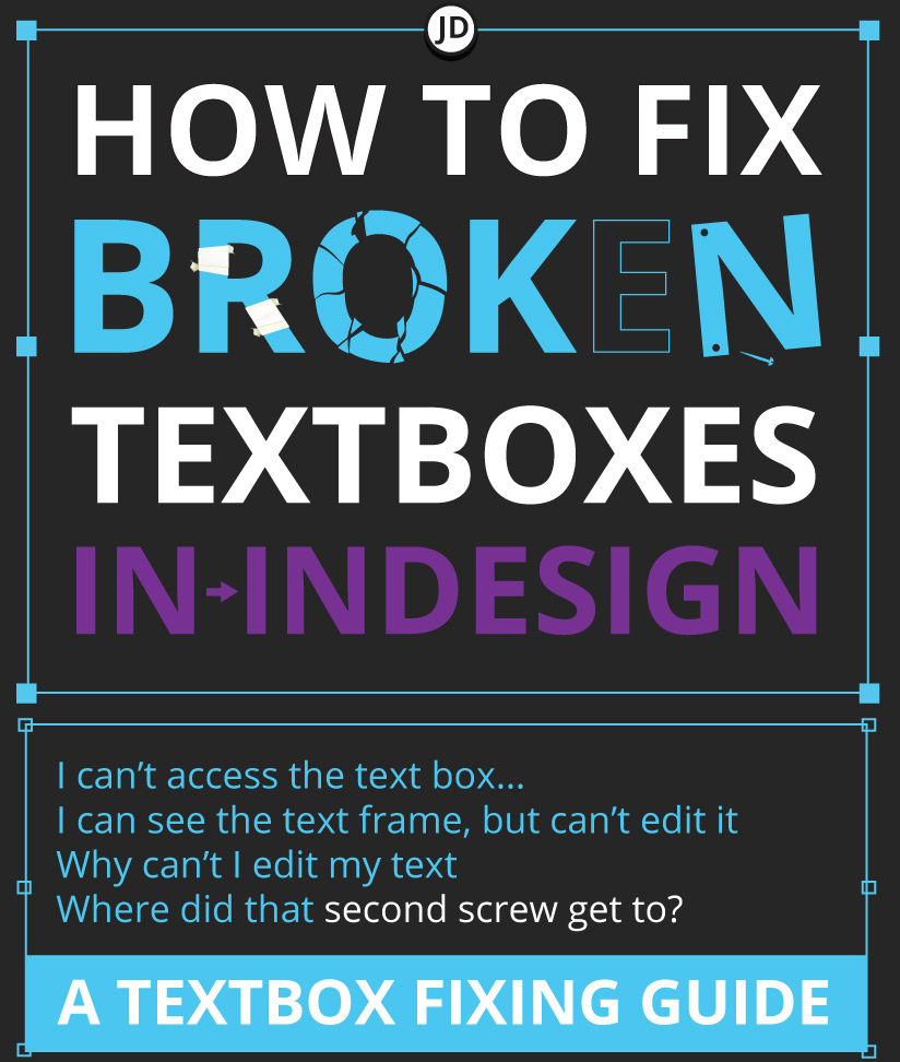
- Common text box headaches in Indesign
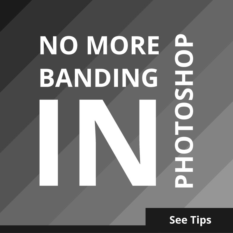
- Reducing banding in Photoshop
- What is a design process
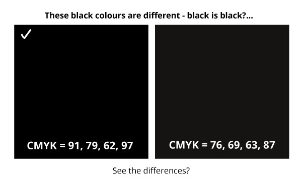
- Why is my black coming out dull in print?
4 ) Imagine your ideal role
Landing your first Junior Graphic Design role is hard enough, so is trying to imagine it.
For me, this was the trickiest part of finding a role, and I feel that my portfolio, although diverse, could have been considered convoluted. This was at a time when graphic designers and multimedia designers did not wear the same badge at all. You were one of the other.
I didn’t have a clue what sort of design job I wanted – I just wanted a lucky break. However, reflecting on it, a more focused approach to my portfolio may have helped me land a role. A scattergun approach can have its advantages, but being too broad can also be a disadvantage.
If you have no idea what type of design you want to do, don’t be too hard on yourself – I didn’t know either.
You want your portfolio and visual language to be in tune with your first full-time job. If you can.
In hindsight, I had no idea about what type of job I wanted! I just wanted a creative job. If you don’t know, consider working backwards – what jobs don’t you want?
With this in mind, this could help you in shortlisting the types of design roles you make like. Now take the time to look at what these types of jobs are looking for and align yourself with these expectations. Hopefully, this may help align you with your first Junior Graphic Design role.
5 ) Your portfolio and CV are not speaking to each other
Not as crackers as it sounds!
When trying to land your first Junior Graphic Design role, make sure your CV and portfolio reflect each other. At least, to a lesser or greater degree.
I don’t think I’m God’s gift to recruiting, design or jobs, but I was involved heavily in hiring my own intern designers. I wanted to see who could assist and help a little while also giving them with their journey.
CVs … CVs everywhere!
I have read great CVs, useless CVs, silly CVs, random CVs, and just obscure and irrelevant CVs. And CVs that looked like they didn’t belong to the same person or portfolio – that is my point here.
Your CV needs to be relevant to the role for which you are trying to win, as does the portfolio. The contents of your portfolio should reflect some or most of the information in your CV as a designer, they should link or marry up.
Spelling and typos are only the beginning. A CV and portfolio that relate to each other will in land a role.
Make sure they relate and match.
6 ) Right place at the right time | luck and availability
Sounds like a cliché? It is!
You can be a ridiculously talented designer with a great portfolio, but if you’re not in the right place at the right time, then you won’t get the job.
Roles can become available due to an employee leaving, maternity cover, looking for contractors for specific tasks, or the company is expanding!
Be on the job boards, be ready, and be available. You need to be watching the job market all the time to give yourself the best chances of finding that desired design role. In other words, you need to make your own luck.
7 ) Businesses aren’t charitable
Your first Junior Graphic Design role probably won’t come out of generosity. When I first started trying to get my first job, my CV and covering letter didn’t hardly brought anything to the job. This is the power of hindsight.
Unconsciously, I expected the role would just land in my lap as I was a shiny new graduate with all the paperwork. Don’t buy into that illusion, I will tell you now.
Graduating or passing your course is just the beginning, and employers smell your un-jaded optimism and inexperience from a mile away.
Here is how I first started applying for design work, so you can avoid the mistakes I made.
How I presented myself ( badly ) when I tried to land my first junior design role
With my begging letter (covering letter) at the ready, it said far more than what was written on the paper. Between the lines it said :
“Please give me a job, I have nothing to offer, and you will be doing me a favour by hiring me… please do me a favour! I need experience.” Of between-the-lines wording to that effect.
Companies will already know how much experience you don’t have if they take a close look at your CV. They’d only need to take a look at when I graduated to guess my experience level! Avoid pleading and sounding desperate if you can. Even if you are!
Word your CV to sound as if you have something to offer them, not ask for them to offer something to you. Even if this is the reality of your situation.
Draw attention to how you are bristling with energy and ideas, or your design strengths, or how you are a passionate designer who works on plenty of side projects in a similar industry.
Instead of please give me, consider ‘eager to learn and become part of a team.’ Getting a graphic design job – a true ‘Graphic Design’ job is harder than ever to find.
Some kind souls took the time to answer my queries and offer advice, but most of the time, they ignored my queries. I sent hundreds of applications to land my first full-time role.
Aside from drawing attention to my blemish of inexperience, employers will know you are a graduate just by looking at the graduation dates. Focus on what you can do and do well.
Companies won’t hire you out of pity
Section 2 | Getting your first Junior Graphic Design role – Preparation
Preparation is key.

Looking at the points before, have you picked your ideal employer or type of job?
Are you considering how your portfolio will align with your ideal role?
8 ) Physical design portfolio
Trying to land your first Graphic Design role as a junior? You will need a portfolio.
As a hiring manager for my own little department ( it was small ), I have had “designers” apply for roles without a portfolio.
You need a portfolio.
This shouldn’t even need to be pointed out, but I have run interviews where ‘Graphic Design Graduates’ came to a creative design interview without a portfolio… or anything to show for that matter. And before applicants got as far as being short-listed, so didn’t have a portfolio with their application, none whatsoever!
Suggestion 1 – A portfolio to win the job.
To win that dream job, you need to show what you can do, not just tell everyone what you can do. A portfolio is proof.
Suggestion 2 – Have a portfolio to hand…. just in case.
For example, I can recall a few applicants coming to an interview without any form of portfolio. To begin with, that applicant was relying on my memory (my poor memory) and hoping that I could recall everything in their portfolio. Don’t leave it to the person hiring to remember; remind them of your awesome designer.
The case for the ‘on-day’ portfolio – your first Junior Graphic Design role
You want to use anything in your arsenal to win that job as a graduate designer, whether through the passage of an internship or via a direct application.
Having a portfolio on the day of an interview can be very advantageous as a graduate designer. Here is a short list of reasons why having a portfolio can be a great idea.
- (Something I used to ask myself) Did their college or institution not require the designer to create a portfolio? Where did they study!!!
- A design portfolio will allow you as a designer to put your best foot forward.
- Your portfolio can be a chance to discuss your best pieces of work and describe your part in a project.
- Dozens of other applicants will turn up with a portfolio, and it is a very competitive market. You will want to do everything you can in a competitive market.
- Your portfolio can be a terrific reminder of your skills… if asked!
In my opinion, having a physical portfolio is important if you are attempting to get a print design role. Which brings me to the next point in preparing you for applying to the right role.
9 ) Compile a digital portfolio
Before an employer looks at your ‘physical portfolio,’ you should have a digital portfolio.
A digital portfolio, a website, or an online presence will be used to make that initial first impression.
Whether it is a compressed PDF, a Behance link, or a website, this will be one of the first things an employer will look at when gauging whether to give you the job for a junior design position.
*Remember! When creating your digital PDF portfolio, keep the file size small. Anything above 10 MB may be blocked by the recipient’s firewall.
Bonus tip – Don’t be afraid to include a little bit of process as well in your portfolio or as a supplement. But all-in-all, your portfolio should focus on final product solutions.
10 ) Your graphic design CV
You NEED a CV.
In the same way, a designer needs to be given a brief for a project.
A portfolio alone is not enough as employers will want to see where you have studied, what you have studied, dates, and so on. Employers and HR are looking for relevant information; they are looking for pieces of information and that will help recruit the ideal candidate for the role.
If your CV is irrelevant, thin, sloppy – you are lowering your chances of being selected.
Handy print design CV notes :
- Don’t publish your CV straight from Word. You are a designer, put some style and class in it to show you design things through and through – including your design CV.
- Remove irrelevant job experience. Art Directors, Senior Designers etc, are not interested in your paper round from when you were 15. You won’t be delivering papers in your internship or graduate design role, well… at least you are not likely too!
- Make it easy to read and skim. Hiring managers are in a rush, and they are also human… make your information snappy and easy to navigate. They might be reading a lot of CV’s and by the 70th applicant, the focus can start to go out of the window.
- Use your CV to sell yourself and reinforce your absolutely killer portfolio!
11 ) Write a covering letter worthy of landing your first Junior Graphic Design role
I don’t proclaim to be god’s gift to writing covering letters. But, covering letters are where I have seen some of the biggest mistakes in an application for a junior design position.
Keep it polite and acknowledge the job listing.
You can sniff a ‘copy and paste’ email from a mile away, as it seems to ignore all of the points in the job listing. But if you do ‘copy and paste’ make sure to add the name and don’t leave sentences like this. eg, the spaces are still there.
“Dear _____
I would like to apply for the position of ____ as I believe I could bring something new to the team.
“
I have seen letters with the “___”still left in. Remember to fill the blanks at least.
Speak to the reader, show your passion. Say what it is you want to do. And try to add the most compelling information in the opening paragraph for jaded eyes.
12 ) Your CV is full of sh*t ( Don’t talk crap! )
Sorry, was that blunt? Please take it with a small dash of humour. We can all over egg a CV. But a CV that talks rubbish is easy to spot in the design sphere. Especially when you should have a graphic design portfolio show.
I’m going to let you in on a secret.
After reading many CVs applying for the creative intern roles at my former company, I stopped reading the CVs first. This is why :
- Some CVs lie
- A portfolio can say more about the designer
- It saved time
- I value a relevant portfolio over a well-written CV telling me what I want to hear
For me, it became a portfolio first and then a CV.
Here is a small design story.
Your first Junior Graphic Design role – A Dull CV Story
Many moons ago, many applicants would apply for a design role. And I mean many! On their CV they would proclaim : “I’m a graphic designer,” ” I own Photoshop!” or that they studied an irrelevant field, so it entitles them to that title – Graphic Designer!
If they are allowed that badge… where does that leave those who studied it?
Or the self-taught one who toiled for years?
I have read CVs that say they have worked on many projects, yet there was but a single A4 page with a poorly designed classified ad in the top left corner.
Some, state they are the next best thing to come into the design world. etc etc. I’ve read their hyperbole, been hyped and somewhat entertained by their prose, and then looked at the portfolio….
Practically nothing. Hot air.
With the one particular applicant in my mind, that isn’t me bashing a graduate designer, not at all. I don’t blame them for trying to find work. But there is selling yourself, then there is the proverbial talking out of it. CV’s can say one thing, but a portfolio can say another.
I wasn’t convinced they studied design, unless it was at the school MS Publisher 1995.
It was these little scenarios that led me to adopt a ‘portfolio first’ approach to the recruiting process. Let me see what you can do, now tell me!
Part 3 – Getting your first Junior Graphic Design role | Uncomfortable & unspoken realities
I’m going to spill the beans on things outside of your skills, CV, and portfolio that may or may not impact you getting a junior design role, and it is not just down to a lack of experience.
Some of these are opinions, first-hand experiences as a design jobseeker myself, and from quiet conversations behind closed doors.
Hopefully, the points in this section will be both helpful to you and make me hated by recruiters and companies. So be it!
13 ) Your university, school, and background can influence your selection
Ouch…
I would like to add that I was sympathetic to those who were not ‘in the club‘ – I was never in the club either. I think graphic design is not immune to this method of selecting who does and doesn’t get the job.
After a conversation with another Senior Designer, I was surprised by a couple of things about their selection process at their company.
According to the designer, at a certain establishment, they checked the following:-
- Where applicants had studied ( they chose from elite universities )
- Grades – fair enough
- Secondary school and GCSEs – ‘secondary school and GCSEs?’ –
( Record skips and scratches, tea is spluttered everywhere! )
Honestly.
And… ‘Secondary School’
This one got my goat a bit. Most graduates did not choose where they studied in secondary school, so how is it fair for this basis to be an influencing factor?
You cannot choose your past or where you went to school as a teenager. Back in school, I didn’t know what I was going to study afterwards, nor did I know that being at that school could have an influence. Believe it or not, I think there is a certain level of elitism in certain establishments that goes beyond your accomplishments and attainment, sadly…
The monocle club is selecting!
14 ) Geography – Where you live can impact your chances of getting a design role
This is both from personal experience as an applicant and as an employer.
Recruiters and employers can sometimes see ‘where’ you have applied from. So if you are looking for a Job in London, for argument’s sake, and you are based in North Scotland, certain job websites tell the recruiters and prospective employers where the application came from.
How do they know, and why does it matter where you are based?
It shouldn’t, but it will be counted against you regardless. Recruiters and employers like you to already live near the location where the job is situated, unless it is a purely remote position! I will come to what I believe to be the case shortly.
Geographical pains of getting a junior design job in London
My location: I have experimented with this by accident. I the past. On my CV, I wrote that I was currently living in London, I was staying in London on and off, but of a fixed address there.
On my CV it stated that I lived in London. I applied for a role through a website, and a recruiter rang me the following day.
“So your CV says, you live in London, but your application came from Cornwall?” That is a paraphrased version of the conversation. Some of the remarks after that – don’t worry, you live too far away, I need you this afternoon, or based on a recent conversation I asked – “Does it matter where I live now?”
“OF course it does!” they replied!
It matters. This was more of a gulf than a hurdle, as I found the design industry to be quite concentrated in London, as many things seem to be so London-centric. Despite the fact that I was up and down to London frequently, they wanted somebody who lived their all the time. there
It was mostly from recruiters who would bin my application after finding out that my permanent address was in Cornwall at the time.
The why! Recruiters want to make money quickly, and sadly, if they find another eligible graduate for the position who lives in or around London, they will get the first pick; it can be as simple as that.
When recruiting for an in-house junior design role
When hiring for internships, my previous MD favoured local applicants as it was convenient, among other reasons. As a designer myself, I tried my best when possible to favour passion, talent, work ethic, and a cracking portfolio when selecting a candidate!
Geography was irrelevant to me, as I wanted to hire based on merit and suitability of the candidate.
However, pay heed to what was mentioned above and note the bigger picture. Recruiters, bosses, companies etc, will often favour those who are near to those who are far. And in terms of supply, there is a glut of graduate designers trying to find work, especially in and around London.
It could be a stark realisation, but if you are a match for a match candidate who can start immediately, this will put you in good standing compared to those who can’t.

What if you live too far away from landing your first Junior Graphic Design role?
It can be easy to become despondent when applying for design work. I spent 11 months applying for my first full-time role in London. Adopt the following mantra to overcome the geographical bias:
- Persist and keep applying
- Be patient
- Find a friend or relative to stay with whilst you look
- Look for more creative jobs that bypass recruiters
- Move nearer to a big city and find alternative work while building your career
- Consider remote positions
15 ) Your first design role | You might be working on boring tasks at first
As a graduate, you may be given some repetitive or smaller jobs.
But you should use these to your advantage, do a great job, do it quickly, and use these tasks to make an impression!
You might also get a great reference from your employer at the end. Onwards and upwards!
Part 4 | Getting your first Junior Graphic Design role | Employer’s Perspective
Here is a short glance through an employer’s lens when recruiting for a junior design role.
16 ) Let your character shine!
A great portfolio, an active mind, somebody who will do the tasks when asked! These were all traits and signals we were looking for when hiring. We wanted to recruit a graduate designer who was buzzing with flair and ideas. We wanted a graduate who would be able to apply their skills to the brand and be part of a team.
In a highly sociable office / studio, I would have to gauge how the applicant may interact with me and the rest of the team. Do take note of how I mentioned ‘the rest of the team’.
It was not enough to only get along with me. I needed to gauge how the applicant would get along with the others in the company. I could be away, in a meeting, or really busy.
If I left leaving the junior designer alone with the sales manager, it would cause the office to combust; it was a risk I could ill afford to take.
How you bond, think, act and speak has a bearing on your application.
There is more to an interview than just a Portfolio and CV. As is winning the junior design role.
17 ) Ask questions, show interest
When applying for a junior design role, take an active interest in the job and company. It is not enough to say you have taken an interest in the role. Make sure to do your homework and come prepared for the role. An interviewer may not ask you anything about what you will bring to the table in terms of ideas, on the other hand – they might!
18 ) Sharing your ‘Interests’ on your CV
Why did this matter to me and the company?
Varying from industry and role to role, sharing your relevant interests may have been utilised for the role advertised. For example, are you passionate about football? Are you applying for a design job that is all about football? This could be helpful to know!
It’s not a huge point, but as strange as it sounds, if I were interested in the candidate’s CV, I would look at their hobbies and interests to see if I could find any relevance.
If the candidate mentioned that they were interested in ‘tech’ games, gifting, arts and crafts, etc it, it could have been a tipping factor for taking more interest in their application.
Not all companies will care about your interests, but I paid attention to them as a footnote on CV.
Consider adding some interests if you think they could be applicable to the role, or whether it will help your bond with the team.
19 ) Commercial experience will put you at an advantage
Relevant experience will put you at a distinct advantage when applying for your first Junior Graphic Design role. Although I do appreciate that this can be very chicken and egg when applying for a role to gain experience.
Any commercial design experience is still transferable experience.
Whether you gain this experience through family & friends, internships, college, university, freelance, or by any other means – this will place you in better standing for a design role in the future.
It can be extremely frustrating to gain experience, and I would highly recommend trying to get as much as you can while in your study years instead of when you are kicked out of education and into the job market. Getting experience can be tough.
I tried to be sympathetic towards graduate designers having no commercial experience when hiring for internships. Speaking in broad strokes, design agencies like you to have experience when you walk through the door.
I collected my experience together via my HND in design, Work placements, and starting with freelance work.
20 ) TAKE NOTICE | Watch the job market around you
Since I first wrote this post years ago, a lot has changed. Even the Graphic Design industry has changed considerably. This point originally said to ‘stay positive’ but I felt this needed a dire change since that point was written!
When trying to get your first Junior Graphic Design role, please pay attention to the design job market. The design industry and design jobs market are ever-changing, and what is true of today may not be true of tomorrow.
Graphic design is at a challenging time – make sure to check your skills and portfolio. Be desirable to help you land your design role.
I think it is okay to consider whether higher education is relevant or will help you land a job. IF you feel it isn’t, consider ways in which you can make yourself ‘more relevant’ and desirable when that job finally comes up.
Don’t bury your head, don’t be passive, don’t wear blinkers. LOOK.
Takeaway to getting your first Junior Graphic Design role
There is a lot to getting a design job, and I am not 100% certain the same rules will apply in the future. But from the more human basics of landing a job, much of what is written will carry.
- Make good use of your time.
- Be prepared, have your portfolio and CV ready
- Remove irrelevant information from your CV
- Create a portfolio that is applicable to your ideal role
- Get as much experience as possible!
- Work on personal projects and keep bettering yourself
- Try to network with companies, directors, charities, etc – focus much less on recruiters
- Keep checking job boards
- Show interest in the role if you get the interview
- Keep a close eye on the industry and try to align yourself
Stay positive, I’ve had a couple of cringey interviews!


