32 email marketing & design tips… are you ready?
Your agenda and measure for success may vary, but I am sure there are email design and marketing tips ideas here that will help steer you towards your own success. This post is a list of 32 ideas and tips to help either help you if have run out of steam or set you on the path if you are new to email marketing.
Your goal could be to inform your readers of your latest product, get a sale, receive a bulk order or to push contact form enquiries, I will leave that part for you and offer up tips!
This post covers tips and techniques which have been tried and tested.
My credentials
I have designed, created and launched email campaigns for over 10 years for various projects, products, and newsletters. I am going to share some important techniques and trade secrets that will hopefully move you in the right direction and avoid disappointment. I’m also pleased to mention whilst working at the previous position, that I managed to get into the TOP 500 for email design, according to Vertical Response.
32 awesome tips for creating a successful email campaign
1 ) Have a good list
I would like to put this as number 1 as having a non-responsive, dodgy or an uninterested email list (readership) will undermine all of your best efforts. It is pointless to create an email campaign where the user won’t open or react to your message because they are bored or didn’t sign up in the first place.
I can’t emphasise how important it is to have a receptive list of readers. A clean database will help tremendously in the success of your email campaign.
2 ) Be GDPR compliant
GDPR is
Practices such as scraping, harvesting – generally taking data without consent, is a big no-no! If you are taking an email address off somebodies website and adding it to your bulk mailing list ready for spamming, this is strictly against GDPR. If you are doing this, please stop now. Besides, there is little point in plugging your services or wares to somebody that really couldn’t care less about what you have to say.
GDPR, in a nutshell (please note I am not a GDPR consultant, but have taken the time to learn best practices)
- Consent
- Handling data responsibly
- What do you do with data, “right to be forgotten”
You can read more on GDPR here – The joys of GDPR
3 ) Consider who you are talking to
It is important to create a clean and responsive email database, it is also important to know who you are talking to. If you can identify who you are sending your marketing emails to, you will stand a much better chance at creating a message that will resonate with the reader.
Somebody who is into fly fishing probably wont be interested being sold air vents, or train wheels (I have actually received an email with a company trying to sell me train wheels!) but, an avid fisherman may want to buy fishing rod or read tips on how to catch a certain fish with rod you have just promoted – especially if it is about Fly Fishing.
Another example worth considering is a Gamer. Who is your Gamer? Do they like Chess, Warhammer of video games? These are all Gamers, but they all different gaming groups and demographics. Narrow down on who it is you are talking to. You would be better to send a relevant message to:
a ) The chess player
b ) The Warhammer collector
c ) A video games enthusiast.
One size fits all, or maybe none at all!
4 ) Establish what you want the email to achieve
Establish what you want the email to achieve and make that your primary goal! If you want your reader to send an enquiry as to the main action, make that a number 1 objective. Avoid the urge to bombard the reader with too many calls to action and too much noise, keep it focused.
5 ) The subject line is very important (but you may already know that)
I wanted to avoid mentioning this tip but could be wrong in assuming that this is your first post and only post you have read for finding tips on creating a successful email campaign. The subject title is important – very important. Having a subject title that works with your target audience could make the difference between your email being opened or deleted.
6 ) Adapt, record and improve
Adapt, record and improve – repeat. When you send an email marketing campaign make sure to observe how it is being opened, when it is being opened and what your readers like! Based on your results over time you can make more calculated decisions be it the design, format, time of day and so on.
7 ) Time and Geography can play a part
Where and when your email campaign goes can be important to its success. If you send an email campaign when your audience is at their busiest can have a negative impact on your open rates. Also, if you have database that covers the whole world it could be worth translating your email so other nationalities can actually read your email!
8 ) Strike whilst it is hot
If you have just returned from a trade-show or a networking event, I have always found some of the best responses were within a week of sending a ‘thank you’ email.
You are still fresh in the other person’s mind when you send the email. If you leave it 3 months before saying “thank you” they will have forgotten who you are… more than likely.
(sometimes people can forget who you are the minute you walk away!)
Tips on important design elements for your email campaign
How you structure your campaign can be very important to get that click, button press of response. You shouldn’t overlook the graphic design of your email campaign which goes hand in glove with the marketing.
9 ) Announce who you are early on
I would advise putting key pieces of information such as your brand, name or title at the very top of your campaign so the reader knows who you are before pressing the ‘junk’ button.
10 ) Don’t do an image only email-shot
If you do an image only campaign you will seriously reduce your chances of your campaign being opened correctly. Your campaign should have visible text which is part of the HTML and not embedded into the jpg.
11 ) Have a clear call to action
Are you trying to get someone to email you, send an enquiry, order a product? Make your call to actions easy to find. *certain audiences respond better to bold and brash, others to subtle and clear. Like a little text link or polite encouraging Call to Action – read more.
12 ) Make sure it works on a Smartphone + Tablet
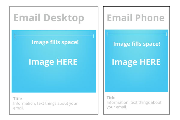
In 2019 (and last decade) your snazzy mail-shot should display on a smartphone! this is called a ‘Responsive” design as it will adapt to the size of the reader’s screen. The images will be elasticated. In essence, stretch and scale according to the width and dimensions of the viewers’ screen. Before launching, test your email campaign on all devices.
13 ) Check, debug, then check again
Great, you have designed a killer email campaign with a witty headline that is certain to get a price request or order!
Whoo-hoo!
Wait why haven’t they clicked anything… oh, you forgot to link the graphic to the contact page! Check the email campaign before sending, ideally with another team member on a different device. They may see something that you have missed! e.g spleling or a tech…
… nic
……al … issue.
14 ) Fresh and interesting design will make a difference
In a previous position, I remember sending email after email after email to the same bored and tired list. It was a case of selling the exact same product worded in a different way to the same 2000 or so prospective subscribers, they must have been tired of seeing those emails coming into their inbox twice a week!
I recall taking a step back and coming up with an imaginative marketing email with distinct image: it was a vector image of a fist grabbing cash “Taking back power”. cash talk was also topical back in the time of the last recession and this design caught attention. I remember getting extra conversions and enquires from this.
The takeaway, create punchy visuals, make them look, don’t just talk at them. And of course, keep trying to come up with new stuff.
15 ) Use a style that appeals to the target reader
When you create an email campaign make sure it resonates with the reader, it is about getting their interest, not yours. If you are trying to sell skateboards, look at themes that may appeal to skateboarders, look at urban art, graffiti, sports, etc. If your target demographic are wine lovers, create a look at feel that may suit them.
16 ) Keep it visible for all devices (Photo Fitting)
Odd point? Not as strange as you might think. Make sure your photo’s or core imagery is easy to see if viewed on a Smartphone or Tablet. If you stick a large group shot of products together and place them in your email, it can be tricky to see the details of what you have to offer, possibly due to scale or width. For example, if you take a photo with 20 products side by side and then scale this down you are more likely to lose the detail due to how much of the picture you need to fit sheer amount going on in the picture.
It may be worth your while if you must have a group photo to ‘pull’ out core products and place them underneath or on their own so they can see what is being sold more easily
Also remember that your text / copy needs to be read on computer and smartphone’s too.
17 ) Mix up the design format
Rearranging the design and format may be just enough to freshen up the email campaign so that it engages the reader or gets them to click on a link and delve a little bit deeper. People get bored, try to keep them interested if you want to have a successful email campaign!
18) Don’t obsess by how pretty it is
Surprised to hear this? That is because the design isn’t all about the aesthetic, and this also applies to email marketing. You should consider how the reader will experience your campaign when it is opened and how they will engage with it. Your campaign needs to offer good information, strong calls to action, accessibility and then… last but not least, the aesthetic. Put content and messaging first, theming second.
19 ) Time efficiency – Re-purpose and recycle a previously created email campaign
If you have just designed an email in the graphics program, there is nothing wrong with considering how you can repurpose it for the future. There isn’t always a need for you to redesign your campaign every time you want to launch – just a thought!
20 ) Oh, it moves!
Animations in email campaigns can be very catchy! If you create an email with an animation embedded into the body this can be a great way of getting people to look but do take a couple of things into consideration. It takes time to create an animation. Not all animations will be seen or downloaded. Is it worth the time when a simple static would do the job?

21 )The type of subject heading matters
How you write an email campaign subject heading can influence its success. You could consider asking your audience a question about them or their business, keep it open-ended allow the reader to say “yes… that’s me go on” if they were to read the copy aloud.
22 ) Heal a pain
If you are in tune with your target audience and hear common complaints and questions consider how you may be able to address their problems. Are they strapped for time? Would they like more activity on social media but are pre-occupied with other aspects of the business.
In other words, can you help to solve their problems?
23 ) Design functionality according to your readership
If you study your analytics and record what you see, you may notice patterns: What your audience likes to read, what they dislike and what they press when they open your campaigns. Study your results and tag your images to see what they have pressed. This could provide valuable information for future email campaigns.
Place things like these at the end of your URL : #imgbtn1 #txtlnk1
You may also notice that your audience may favour text links over images. I have previously found that images were always a surefire way of getting people to ‘look’ in larger businesses but my smaller business lists tend to react more to text links – strange! But something I have acknowledged.
24) What an ‘Open’ really means
You may confuse an ‘Open-rate’ with delivery. When a bulk email is sent to a customer they will more often than not receive an email with a prompt in the top of the Outlook preview panel (or any like) saying whether it is safe or not top open. The images may be blocked out unless the reader permits them to be shown.
Once these images have been shown or displayed, that is in truth is what an ‘Open’ is in email marketing terms. Once the tracking pixel has been shown (because the reader has allowed it, and downloaded it with the images) this is when the email campaign is logged as an ‘Open’.
The good news is, more people than you realise may have seen your email but not reacted to it. There is no saying that they haven’t read the information. So back to an earlier point, don’t make it image only!
You can read more on this here : https://help.campaignmonitor.com/email-open-rates
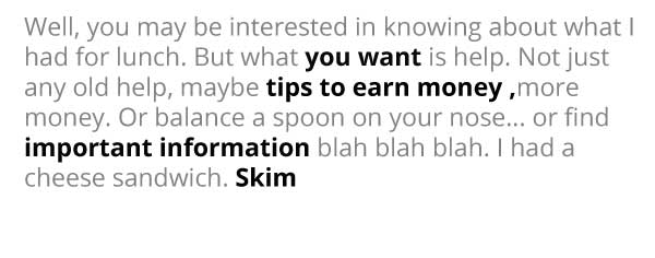
25 ) Consider your ‘skimmers’
Your skimmers, if like me or the general busy web user, they may only skim your campaign to see if it is of any use to them. From there, they will either: read it later, continue reading then and now, or quickly click a button. Or, if they are no longer interested – unsubscribe. Make it easy to skim – make it easy for them to find out what it is about.
Well, you may be interested in knowing about what I had for lunch. But what you want is help. Not just any old help, maybe tips to earn money more money. Or balance a spoon on your nose… I find important information blah blah blah. I had a cheese sandwich.
26 ) Doesn’t need to be the whole article
Believe it or not, you don’t have to bore your readership to death by droning on in their inbox. If you are promoting a post or a blog, give them a quick overview of what it is about and why it may interest them. Give your reader a choice and let them delve a little deeper if they want to.
27 ) Create a HTML template
Doing this saved a tremendous amount of time when launching a campaign after campaign after email campaign. I would advise that you do the same as this is an invaluable time-saving measure. Create an HTML template which is easy to change and update.
Tips & ideas that provoke responses in email marketing (Messaging)
Tried and tested methods for provoking a reaction and getting a response from your email campaign.
28) Urgency!
On a personal level, I hate this method of marketise, but I have to admit on a professional level, that this approach has been very effective in the past. It’s also effective on me.
If I know I need to do something in a certain time frame to save money I will try harder to work to that deadline otherwise I will lose out on money and a potential discount. Moo does this quite a bit, as I write this article Moo has sent me an email offering me a 25% discount which has to be used by a certain time. Is it effective? I have placed that order twice in the past. I have also seen this work in 2 places of work.
29 )Having something ‘new’ to talk about
Announcing in your headline that you have some ‘new’ would often catch the interest of a potential customer. This may be part and parcel to do with the nature of the readership as they were concerned with beating the competition and getting their hands on the latest trend first, regardless the freshness of content cannot be ignored.
If you launch a project, a product, a website, a post, an article, the word “new” in the subject heading has attracted attention, and increased activity in email campaigns.
30 ) Giveaways
Giveaways can be a very interesting carrot if you are really eager to get a response from your list. This can work well if you are offering one of you own products as freebie or part of service. Note, if you give something away that isn’t part of your business, you could be kidding yourself! The customer who takes the offer may only be interested in the freebie and not your actual business, product or service. it could act as a distraction.
31) Catchy discounts exclusive to this email campaign!
Discounts can be a very strong incentive but remember only do this if you can afford to. It is also a good idea to make the offers exclusive to certain audiences for a limited time (combined with a timer).
Just so you know, I have seen discounts often bump enquiries, but don’t get carried away.
32) End of stock (EOL – idea for the retailer)
This falls inside discount territory which can potentially be taken in two ways if you are selling an End of line or end or stock product: 1, the product didn’t do very well the stock is being dumped. 2) The product line is being sold off as something new is about to come out. Either way, looking at selling off a stock that is a dead-weight, old, outdated could be an idea. It could be worth combing this with the sale of a middle-range product that you are also actively looking to sell.
End email design and marketing tips!
Thank you for reading these tips and ideas for your email marketing. If you have any question, queries feel free to get in touch! Or in the meantime feel free to read another post that may help with your business.
If this article was helpful please share on social media!
UI design samples
How To Get the black you want in print (designers, illustrators)
Anatomy of creating a Kickstarter page
Using PHP in you bespoke website


