Over the years I have been involved in designing retail kiosk design and exhibition trade stand design.
These projects have ranged from a sketch, an initial design, to a full design plan and document.
This portfolio post covers my portfolio involving: trade stand design, a retail kiosk example, creative ideas for show stands, and other project parts around stand and retail design.

If you would like to know more about how to design your own kiosk read this.
This post focuses very much so as a portfolio piece as opposed to a ‘how to create’.

Blue Water Retail Kiosk | Portfolio Project
I wanted to share a live project that I been given the honour of designing and co-designing.
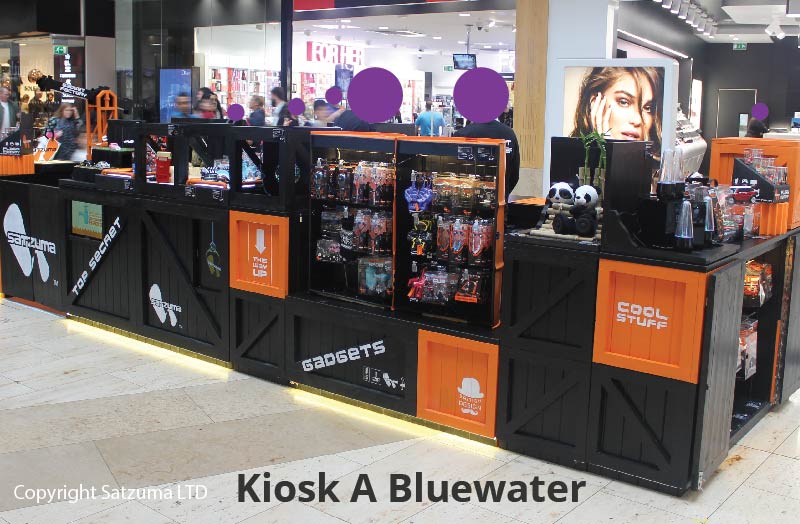
This is a retail kiosk example that was built at the Blue Water shopping centre.
The aim of the kiosk was to sell products to customers from the main walkway. It was also a good brand-building exercise too.
What started as an idea around a fictional theme became part and parcel of both the form and function of the kiosk. The story was built into the visual appearance of the function kiosk.
The theme was based around a “gadget warehouse” and colour with branding.

Going beyond the flat design and illustration
The photo’s and images below illustrate how the kiosk worked in a real retail environment.
Or if you would like help with designing the concept for your kiosk you may read more about my services here:-
Concept and freelance kiosk design services >
Retail Kiosk Example from Bluewater Shopping Centre (Design)
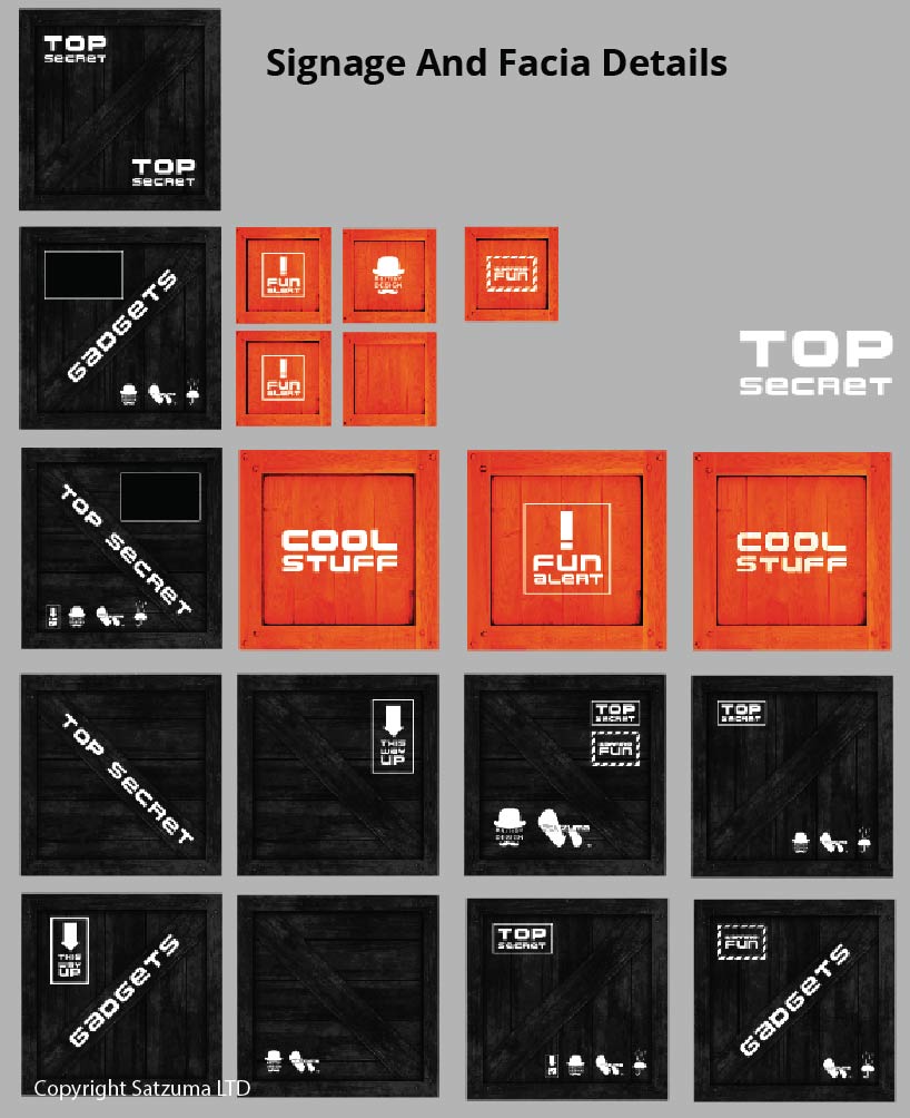
Before committing to a finalized design of the kiosk, I drew a concept illustration. This Illustration was used to show what we intended to do with the kiosk.
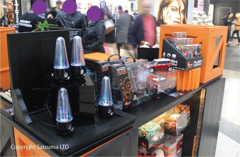

My role covered: collaboration with the team, sketching ideas, discussion of ideas, 2D concept illustration, various portrayals. The detailed design plan.


Trade stand & exhibition design projects
Tradeshow and ‘stand’ design projects.
The projects shown below were created by myself whilst working in-house with an energetic and creative team!
The aim of the exhibition stand or tradestand was to win businesses and display the product lines.
These stands were used in international trade shows – predominantly in gifting and electronics.
A concept I was allowed to direct and run with was the gadget factory. (Thanks MD’s)
You can read about telling a brand story here.
Trade exhibition stand projects (Portfolio)
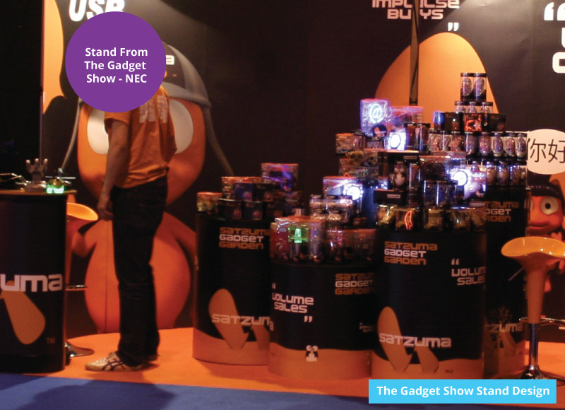
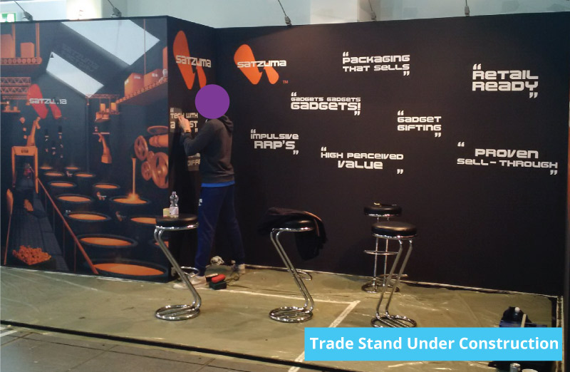

The exhibition design differed from the kiosk design in that, the trade stand needed to be geared towards businesses. And international businesses from a wide array of countries. (Business 2 Business).
But the core idea was much the same.
Engage the users, promote the brand, and sell a product.
When designing the concept for the stands, I ran with the idea of the Gadget Factory.
For the trade stand that was used in the Harrogate gift show, I designed the podiums to suit the products whilst maintaining links to the brand.
The wall stickers were created by my colleague and fellow designer.
Harrogate Gift Show
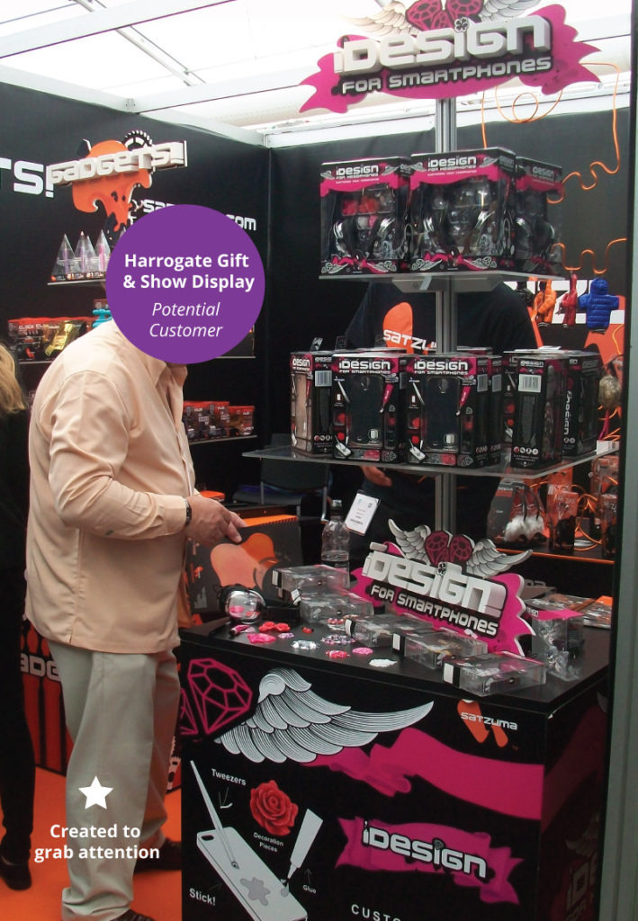


The product displayed was for a range called Idesign. More can also be read on the app design in this post.

The idea for the trade stands
From memory, the idea for The Gadget Factory came from a certain degree of truth. The gadgets – the products and electronics came from factories in China. This was part and parcel of how the business sourced products to sell.
Many of the products were packaged, re-packaged, or adapted and sold to the high-street in large quantities.
You can see more high-street packaging in this project post.

The truth was stylized – but it was still the truth – in essence. The concept for the kiosk, the exhibition stand, and in particular – the Gadget Factory was based around where how the products were found.
The actual origin and story of the brand narrative are not that far removed from reality. The theme was applied to the form, function, and style of all the retail units shown in one way or another over the span of a couple of years.

Kiosk Design, Vector Illustration, and Creative Direction
I still regard myself as being professionally fortunate in that I managed to get my feet wet on this set of projects!
These projects were my early foray into Creative Direction and conceptual design whilst designing, illustrating and collaborating on the project.
Much of the practical design steps were created in Adobe Photoshop, Adobe Illustrator and with a pen and paper.
Appreciation & Acknowledgement for Kiosk Design
Thank you for taking the time to look at this Kiosk and Exhibition stand post. All of the artwork and branding are Copyrighted. They cannot be used for commercial purposes.
You can look at how design a kiosk here. Or get in touch if you would like any help in designing a kiosk or exhibition stand for your business.
I would like to take this time to thank everybody that was involved. And thank you for allowing me to spread my creative wings!
Helpful posts for retail, design products
- Examples of high-street packaging (created by me)
- How to design a kiosk in steps
- How to make a retail-ready board game
- Card products – project example
- Creating a Novelty Flash drive and the character design
- Create a low-cost product
- STEM products
Digital Design
- Example of an E-learning game
- How to make an interactive story in Adobe Animate
- Design/app design (What was made in Adobe Animate
Retail kiosk examples & ideas and Exhibition Stand ideas.
Free Vector Artwork
Retail kiosk examples & ideas and Exhibition Stand ideas. – retail kiosk examples ideas
