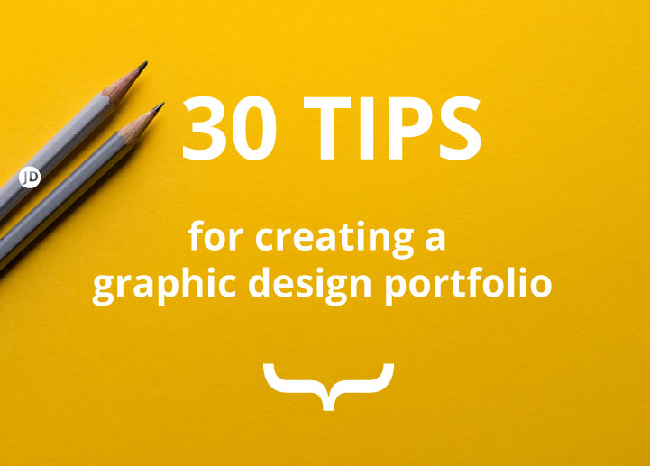
Tips for creating a graphic design portfolio. Getting noticed can be difficult in the design field. Whether you are a freelancer, junior or somebody that is looking at changing their career. This post is a list of 30 portfolio ideas that will help you with your design journey. – tips for Graphic Design portfolio
This will (hopefully) offer some ideas to create an interview-ready graphic design portfolio.
“There are three responses to a piece of design – yes, no, and WOW! Wow is the one to aim for.”
– Milton Glaser
Tips for a graphic design portfolio that may get you noticed
I will answer quickly the question that I was asked recently before going into the detailed list of tips on making a compelling graphic design portfolio. But before going further into these tips for graduate graphic designers, I want to share some of my knowledge and experience when recruiting for graphic design internsships.
Please bear in mind that I am not a recruiter. I’m a designer with over 14 years of experience. I was also a Senior Designer and Head of Department when I used to recruit somebody to help me and the company.
I was a Senior Designer, who hired graduates for junior ‘traditional design roles’, 3 month internships, and freelance positions. And when I say traditional graphic design – mostly print.
Myself and my former colleague, looked through a range of portfolios when trying to find a good fit for the company. Sometimes a job posting would get 100’s of applications in less than a week.
Another interesting piece of information you may like to know – I used to look at portfolios before looking at CV’s. I could write a post about the process but that is something for another day.
How can I make my Graphic Design portfolio stand out? tips
To get employers, agencies, and or anyone to hire you for a project or job. You need to have a portfolio that helps you shine, resonates with the employer and potentially be on brand with the person hiring. Look at who is hiring and ask yourself whether your portfolio is a match. What benefit can you and the portfolio bring to the role?
Take note, you, the designer will need to put your best foot forward if you want to win that job. You need to show that you can do what is asked of you and that you can offer value to the next role.
What you did yesterday is nice – what you are going to do tomorrow will be what gets you the job.
Not everyone will love you or your portfolio, but you want to give it your best shot until something eventually sticks.
Onwards for 30 tips for creating a graphic design portfolio – list of ideas
1 ) Have a portfolio
In short, yes you need a portfolio to get graphic design roles. Be it in digital or print form. People, designer managers, and recruiters need to see what you can do. This is the first tip. Without a design portfolio, there is no way of ‘showing’ what you can do. Without any examples of work, you are relying on an employer, agency or client to just take your word for it. I cannot emphasise this enough.
Yes, you need to show that you are a graphic designer and you at least have some idea of what you can do. Don’t tell them – show them.
2) Include your best, finished pieces
This is not as common as you might think. Graduates, in particular, tend to can put much process stages and fluff into their portfolios. Although this offers a good insight into how you work, too much can be counter-productive. This can be better shown in asked.
Many employers are in a hurry and want to see ‘results’ but not all.
And, I may burst a bubble here and go as far as to say that you may be working as a creative junior artwork / designer if this is your first role – even if the position is sold differently on the jobs board.
Hopefully, this won’t be forever. But be prepared to see a lot of this when applying for work – especially in the early stages.
Many artworking roles are dressed as creative design work when in fact a manager or client may be telling you what to do, and… you may be pushing pixels around to begin with as a junior designer.
When you also include you best pieces of work, consider making your portfolio like a sandwich. Really great stuff at the start. Less good stuff in the middle, great stuff again at the end.
3 ) Show your technical proficiency
If you have managed to find a job that is more ‘art and design’ or ‘illustrative’ then great! But if you are looking for more mainstream graphic design roles you will need to show that you can create the artwork in common industry standards. Programs such as, Adobe Illustrator, Photoshop, and Indesign are common at the time of writing this.
I would no longer assume that all design graduates come out with these software skills as a standard – not after recruiting interns and junior graphic designers for creative positions. I was surprised some establishments were churning out graduates without any software skills mentioned above at all, and I felt truly sorry for the graduates who sold these design ‘courses’. If that is what you can call them.
4 ) Design notes & annotations in the portfolio
Believe it or not, whether you are going to a meeting as a freelancer, junior or senior designer. People will read your notes and they will want to understand more of what is going on in your project.
You may know what your project is about but others will not, it is often best to spell it out in short sentences. It doesn’t have to be an essay. Just a paragraph with some annotations saying what is going on in a few words.
5 ) Make it relevant and appealing
This is one of the most important points in this list so make sure to pay attention. Make sure whatever is in your portfolio – is as relevant to the job as possible if you want the position.
Employers will want to see what you have done and also what you will do for them should they hire you for the role.
For example, if you are going for a packaging role at gifting company, try to emulate that you can do packaging and that you have past experience in the relevant market. If you have no commercial experience in this and you want to work in packaging and print, create some of your own initiated projects and show what you can do!
6 ) Your portfolio says one thing, your CV says another
Saying that you have x y z is one thing. But if your portfolio tells a very different story to what comes out of your mouth or what is written on your CV it will be evident by the end of the meeting.
Don’t bluff too much as you will waste your time and hiring managers’ time. And managers and directors really don’t have a lot of time to waste.
7 ) Woefully terrible portfolio
Subjective but…
I recall reading a CV and thinking to myself how epic a candidate was. I jumped over to their portfolio and they had just 2 pieces of dubious graphic design work in their portfolio. There was a dinky little piece of advertorial tucked up into a corner of the page promoting a grave-digging business, the other I cannot recall. But it made an impression..!
It was pretty evident that this individual was not a trained graphic designer and that some people in the industry may have been outraged by what was trying to be passed off as a portfolio. In a word – they were bluffing it and their portfolio showed it.
Perhaps they wanted to change their career.
If you are looking at changing career then study design, or at the very least have a portfolio with work that shows you are capable.
Don’t tell hiring managers how good you are, show them!
Also, don’t get me wrong, I don’t claim to be the best designer in the universe but you know… come on. I was hiring! My reputation is on the line and anyone who would put even a basic new fresh out of university or course graduate next to this would probably giggle.
So what to do with your graphic design portfolio – Let other eyes see
So, make your portfolio as awesome as you can! Do your best, look at other designers, and ask yourself some frank and critical questions. This would be a strong tip on how to create a design portfolio. Make it as best as you can! even this will get some brutal remarks most likely. Trust me, I both seen it and felt it.
8 ) Varied but relevant
The closer you can keep your portfolio to the job match, the better. If you have any relevant or applicable pieces that you believe can help land you the desired position – include them.
You want to show projects that are transferable to the position and present you in a good light.
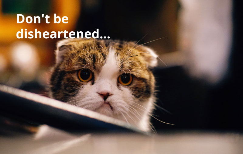
9 ) Not enough work
It can be frustrating even as a senior designer to hear, “Have you worked for anyone else?” or when I was a graduate “is that all?” from a recruiter. As a graduate, the chances are you may only have a few good pieces of work and a final major project that takes up a large portion of your portfolio.
Don’t be disheartened.
Create more work that will draw attention. Sounds easy, but the fact is, your portfolio shouldn’t stop once you leave university or college. If you can try to keep your work up to date and keep adding new and exciting pieces, this will carry you in good stead in the future.
tips Graphic Design portfolio
10 ) Personal projects
As long as they are good, polished, and relevant, include a couple of these projects in your portfolio. It shows that you are continuously trying to develop and some of these projects are on occasion, more interesting than your commercial projects.
11 ) ‘Discuss’ projects
With your printed portfolio, be ready to discuss not just what you did in the project, but for what purpose. For example, if your aim was to sell a product, mention this in notes and be prepared to elaborate if you are asked questions.
Keep the notes small and to the point but, try to write it in a way that will invite questions and open discussion.
12 ) Real-life examples
If you have created any real-life examples of your work be it packaging, stationery, or retail displays take photos of these and add them to your portfolio too.
Aside from breaking up your portfolio and keeping it interesting, having real-life examples adds a tangible authenticity to the project that a render of a flat image cannot replace.
13 ) If you don’t have real examples
If you don’t have photos or real-life examples then create your own renders and visual mock-ups to show your work in action! And if you can’t create visualisations, you could always consider using a website such as Graphic Burger for freebie mockups.
Websites, such as Graphic Burger have a ton of free mockup kits.
14 ) Have real products and samples for your meeting
Another thing to accompany your graphic design portfolio is to have physical samples of what you have made. So, for example, if you have created a piece of packaging and you have the box – take it with you to the meeting.
People like to touch things – we are tactile creatures.
You can always show some of the work in progress in your portfolio too and then pull out a “Here is one I made earlier”. It can also help to shake up dull meetings.
15 ) A ‘bit’ of the design process
Showing some of how you work can offer a little extra insight into you as a designer, as mentioned before. For me, I will often keep completed visuals alongside some of the rough drawings and processes.
It holds true for both print and digital design.
I have a link here visualising my creative journey
Tips for a graphic design portfolio – Section 2
This is a small break in the list! 30 Tips Graphic Design portfolio.
Hopefully, this has given you some ideas on how to create an interview-ready portfolio. As a designer, your portfolio is important at any stage of your career, whether you are a graduate or a senior designer.
If you are a graphic design graduate, I have written a post that may help you out.
16 ) Type of physical portfolio
It should be noted right here and now, that a nice display book for your portfolio is never a replacement for good work and eye-catching design. It is just tidy a professional vessel to show your best pieces.
Since University, I have used a tidy A3 mapac portfolio to display my work.
Your portfolio needs to look professional. No stickers, No A-level ring binders with cloudy sleeves… slick and professional.
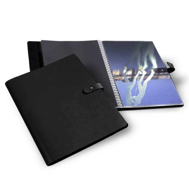
My personal favourite that is affordable is the A3 design book or if you have some cash for the sleeves too, archival cases.
Don’t use the cheaper-looking A2 ring binder portfolio that you probably went to a college interview with. You are a design professional now and you need to look the part, I would also like to remind you that you are in competition with other designers – with slick portfolios.
17 ) Art vs Design
I’m going to say something controversial to some – art & design, in most commercial settings, are not the same…
So, by all means, feel free to include some of your ‘artwork’ if it is relevant to the job.
But most agencies, unless you are an illustrator, are looking for a Graphic Designer – not an artist, and there is a difference, and more so in real commercial settings.
If you look too much like an artist as opposed to a design professional when you are applying for a professional graphic design role, this can work against you in a couple of ways:
- Secretly, you want to be an artist and your portfolio shows this. Therefore do you have intentions to make this dream a reality? (leave the role in 5 minutes)
- They are not hiring an artist (unless they are) they are looking for a graphic design professional for the position. You have sold yourself as more artist than a graphic designer
- You will be frustrated as you probably won’t get to paint. (Who doesn’t love to paint!)
Make sure your skills and portfolio are in line with the job requirements. What you have in your portfolio will reveal more than you realise. Sell yourself to the position.
Then create all CVs and portfolio and reflect this.
18 ) ‘Artwork’ in your graphic design portfolio
As lovely as some artwork can be, these more often than not offer an irrelevant distraction sadly. They may look beautiful, but unless relevant to a job or project it is best left out.
Or added to an alternative dedicated artwork portfolio.
If you have provided artwork for ad campaigns, an app, or something similar, include it if you feel it offers something to the job. But only if it offers something to the role. Make your portfolio about the job and what you can offer to the job that will be applicable.
19 ) How much work should I include in my design portfolio?
This question has been around for years and for as long as I have been designing – and in truth. I would struggle to say how much is too little for your printed design portfolio.
– For my printed portfolio, I try to hover around 14 pieces without it getting boring.
– I would say no more than 20 pieces in your portfolio. Recruiters would try to steer you toward around the 14 or 16 number.
Too much ‘okay’ work can dilute the great work. Be ruthless with what you include. it is a delicate balance of best foot forward and not selling yourself short. Or, if speaking to a recruiter for a role, ask them. Include work that will sing to the person hiring.
20 ) Stand out with your print portfolio
The tips and ideas listed in this post are elements of a much bigger goal – what can you do to make your portfolio stand out and get you a job?
Recruiters, HR, and businesses are busy and the chances are if you applied for a position at a company in a big city they will have received literally hundreds of applications. This is especially more likely if you are applying for work in the summer holidays.
How do I know this? Because I have been in the position of hiring for junior design roles.
So, this brings it back round to this point. What can you do to stand out in a roaring sea of busy inboxes?
Create real-world examples of how the project came out, If it is a piece of packaging then try to mock up the packaging. There are websites online that allow you to put together mock-ups if you can’t do this yourself.
If you have designed a kiosk, stand signage – take ‘in situ’ pictures that make a recruiter say “you actually made this”.
Other ‘wow’ factors for your graphic design portfolio
If it is digital design also, use web links to live websites if at all possible, however, it can be the case that website change – some make sure to take screen grabs.
If the website has changed and you only have a UI, create mock-ups of the design inside a computer screen or a Smartphone.
Assume that people will only spend around 60 seconds glancing at your portfolio. What can you do to hold their attention for longer? Also ‘show’ what something is as much as possible.
21 ) Make your design portfolio snappy
Did I mention that business owners are busy (or impatient)? Or both. I’m (and have been) guilty of this. I would advise making it so that your portfolio can be read easily and skimmed.
There may only be a couple of projects that actually catch the employers’ attention so make it easy for them to spot what they are looking for.
22 ) Compartmentalise and structure
Keep your portfolio in some sort of sensible order. Whether this is by project or by a medium such as print and then digital is down to you. Don’t jump between projects.
It will help any recruiter stay on track with what they are reading and make it look like you can apply some order to your projects. Being an organized designer is a huge plus too.
Do I need a ‘digital’ portfolio?
Yes, in a very short answer. A quick step out here.
I have been asked “do I need a digital portfolio?” or specifically a PDF portfolio. 100% yes. You do need a digital portfolio saved as PDF. Get this sorted first as with the digital age, this will be your first port of call.
When I was recruiting for internships ( you can read tips here on getting an inhouse graphic design internship) and hiring for a junior role, I would also need to see a PDF of work along with a CV. And shall offer a little inside sub-tip right here, right now.
Subtip – After a time I stopped reading a design CV’s first
Think that is an odd thing to add?
It was not uncommon for me to read a great CV from top to bottom and say – “Wow this person sounds great! Let us hire them now.“
Then I would look a the portfolio…
I can recall looking at some of these portfolios and asking myself whether they were even Graphic Designers, it made me feel genuine pity for Graphic designers trying to struggle through and find work in the industry when these ‘have a goes’ were trying their luck.
Secondly. I had wasted 5 minutes of my time reading a CV of somebody who clearly wasn’t a Graphic Designer. From then on I took a portfolio-first approach.
Make both your CV and portfolio as good as it can be. It will help you secure the opportunity you want.
And to answer again – yes you will need a graphic design portfolio / PDF version. It is very important. Which leads to the next point.
23 ) Create PDF or online version of your portfolio
Moving on from physical hard copy of your print portfolio. I will now offer some ideas and insights on creating digital versions of your portfolio with this being the first digital tip.
Create a digital PDF version of your portfolio so that it can fit inside a recruiter’s inbox.
Make it eye-catching and don’t make the recruiter or the person having to hire need to work for it.
Make it as easy for them as humanly possible.
If you are struggling to know which program to use to create a digital PDF portfolio you can use Indesign and Adobe Acrobat and ‘save as’ or ‘export’ from there.
24 ) Keep the PDF small
Don’t send a MASSIVE portfolio to the recruiter’s inbox. This will either take too long to download or may even get caught in a firewall.
So with this I mind, and knowing that you should send a concise version of your PDF portfolio this will probably mean that you may have to trim the fat.
Cull the stuff that won’t help land you the job – next point!
25 ) Create A ‘light’ version of your PDF portfolio
One of the obvious ways of shrinking your portfolio is by losing some of the pages which makes it so bloated and heavy.
Lose projects and be brutal with what you want to include.
If needs be, strip it back to the bare essentials. And then decide what matters to you and what you should include. I can be worth doing this every year. We can call this maintenance.
26 ) Don’t bother sending Wetransfer links to download your WHOPPING great PDF
Please don’t.
Remember when I said ‘make it easy for them’ sending a link or a ‘Wetransfer’ isn’t making it easier for the recruiter to see your work. Don’t make ‘them’ (people hiring) have to wait to download your 2 GB portfolio as this takes time and invites more problems for you.
I tend to strive to try and keep my PDF portfolio under 3 / 4 MB tops so that I can attach it and get it inside an inbox.
From a recruitment standpoint making me have to download a PDF from 100 plus applications makes it time-consuming and more difficult than it needs to be.
So, don’t make a hiring manager download anything. Don’t waste their time.
It will be met with an inner groan. You don’t want to make the person hiring burst a blood vessel!

27 ) Make it easy for the hiring manager
Make it simple. Don’t send dozens of links to various locations. Have all of the big content in a single PDF or keep it all together as much as possible.
The more actions you ask the recruiter to take, the more likely they are to get bored or move on.
And you don’t want that. They are people behind the jobs, after all.
28 ) Links to online presence
In addition to your PDF portfolio, you should have some of your artwork online. And when I say online, I mean on platforms such as Behance, Creativepool, etc.
Putting additional work on websites such as Behance can be a great way of showing off additional work and sending follow-up links. The bits of the process you can’t fit into a portfolio or the bit of a project that didn’t quite make the final cut.
As a freelancer, it is especially important for you to have your work visible online but that is another topic for another day.
29 ) Deciding on ‘not’ having an online graphic design presence
Mixed opinions on this.
If this was for a job for a classic print house then I could let it go – maybe. But in this day and age with so much information, projects, and work being online I would have found it strange not to see any of your work online.
Even as a pure print designer. I would advise that you have your print work online also.
Here are a few reasons: It will most likely be the first thing people will look at when they want to see samples of your work – in particular as a freelancer.
Not having work online will age you – in a negative way (too much of a senior designer?). It may also be perceived that you may not have an interest in design trends etc.
I’m not mentioning that to be mean. Even a senior designer myself. I have found this to be an issue in the past.
30 ) Website Portfolio
You may not ‘need’ a dedicated online portfolio if you are just going to focus on print design. But, if you are gearing towards working in the digital fields then I would say yes – you should have some form of a website or at the very least an online presence as a bare minimum.
If you are thinking of creating a website I have written some tips here on how to start with some very affordable web creation options – keeping in mind, that the post mentioned is geared toward small business owners as opposed to how to create a killer graphic design portfolio.
A website allows you to sell yourself and sell yourself the way you want to.
Having online a Behance profile means that you are in a sea of designers and you have to structure portfolio according to their rules and format.
Don’t get me wrong, Behance is great. And I believe you should set up a profile today but not at the expense of a website – more true if you are a freelancer.
So… do you need a Website? Is it compulsory to have one?
No.
But having one may help you to stand out and possibly look more professional. You need to give yourself an edge.
Summary | 30 tips for creating a graphic design portfolio
I hope these suggestions will help you in creating a graphic design portfolio that turns heads. If you also have tips for a graphic design portfolio feel free to share.
I have over 14+ years of commercial experience in graphic design – both digital design and print. I have also recruited quite a few graduate designers that I see falling at similar hurdles and I wanted to help you – as a graduate graphic designer (and maybe another professional designer) get to the design job you want.
Here are a couple of inspiring quotes:
“There are three responses to a piece of design – yes, no, and WOW! Wow is the one to aim for.” – Milton Glaser
“No masterpiece was ever created by a lazy artist.” – Salvador Dalí

If you are a graduate looking for some design tips read this.
Additional Resources | tips for a graphic design portfolio
– Getting a job in graphic design as a graduate – help me!
– Ways to create a website for free … or very cheap
– Photoshop – how to get the black you want in print!
– The graphic design journey – my process
External Resources
Behance – create an online portfolio
Creative Pool – Look for jobs and create an online portfolio
Thank you for reading, if you felt that this article was helpful please share. All the best with your portfolio. tips graphic design portfolio