How to design a kiosk. Designing a kiosk for retail, be it for a mall or a shopping centre is challenging.
The quick-fire answer to how to design a kiosk is to look at the environment, get the plans, and dimensions and draw up your intent in a document.
“create a detailed plan drawing that illustrates the intent and clearly shows key information about its construction.”
To draw and up a plan for your kiosk you, will either need to draw it in 2D or create a 3D model. Or both.
Designing a kiosk that is suitable for retail and will sell your product as best as possible, is not a small undertaking.
I am going to share my experience of how to design a kiosk for a shopping centre – broken down into bite-size steps.

Get your tape measure ready!
Actionable steps on how to design a kiosk
If you are looking to design your kiosk, these core stages will help you to pick through the design process.
It will also guide you on what you should do and what those behind the licensing of the kiosk may expect from your plan.
It should be noted here, as I am a designer that many of the steps and stages focus on concept, design, and planning stages.
Although I have an understanding of stand construction (even with a very distant background as a builders’ labourer).
My professional focus is in the design field, rather than implementation.
Below is a guide of what to use to design a retail kiosk.
Core stages on how to design a retail kiosk ( 1,2,3 )
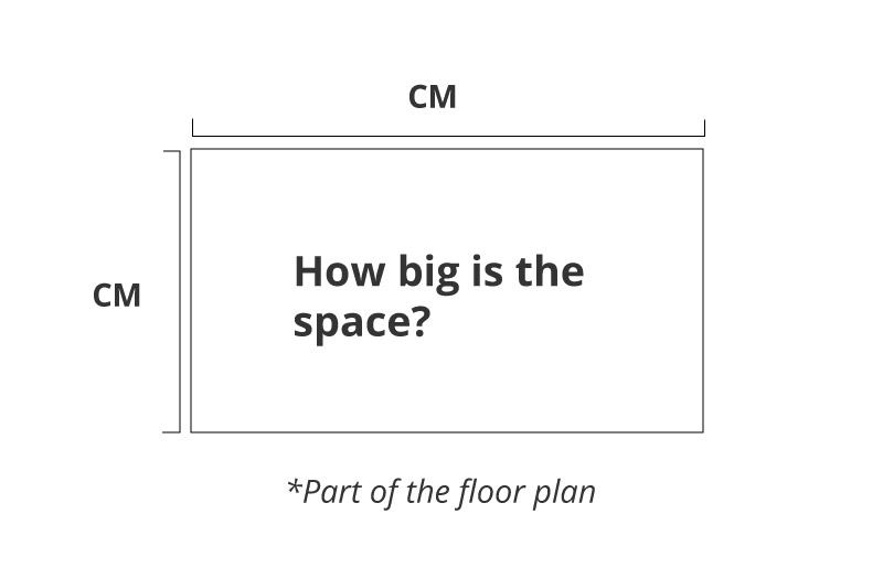
1 ) Get the plan and technical information for the available space
2 ) Enquire about any limitations with regards to the kiosk design – what you can and can’t do
3 ) See the environment if you can, size up the competition
5 ) Conceptualise the design and try to stand out from the crowd (send a proof)
6 ) Consider the customer experience when they use the kiosk or stand
7 ) Polish up the rough drawings and design ready submitted to the mall
8 ) Amend design if needed (make sure you have factored in safety)
9 ) Make sure your design is easy to understand for the stand builder

Kiosk Design | Get a plan and information for your retail space
Before opening up any design packages or generally getting too carried away the experience, make sure to get the space information.
Eg, the floor plan and dimensions.
This stage is essential. If you leave getting all of the specifics about your space and information to the end of the project, you run the risk of hitting delays.
Worse still, having to redesign entire sections of your kiosk.
Get the information first, or at least! As early on as possible.
If you are considering designing your own kiosk, these tips will save you a lot of trouble later on.
With this still in the back of your mind, if you have any questions you can request my kiosk design services here.
The kiosk planning stage – get a floor plan
Get the dimensions for your space and see what you need to work with.
Often malls and retail centres will have a top-down view or plan and layout of the area. It is better still if they have the written dimensions of your allocated space.
This will save you the trouble of having to go to the shopping centre to take measurements.
In addition to the floor plan to help you design a kiosk. Any diagrams with notification of electrical points, fire exits, ventilation, and sprinklers will be important to know about and should be factored into your design.

How to design a kiosk | what you can and can’t do with the design
Knowing your limitations with the kiosk and retail space is just as important as to know what you can do with space.
All malls and retail centres are different.
You will find some retail centres are stricter, and others have basic requirements with the visual design.
It is also good to know the limitations and rules on what type of lighting you can and can’t use.
Knowing these rules and limitations for your kiosk design will help you with your design and save headaches further down the line when it comes to the final design and implementation.
Ignoring the rules is a likely way of delaying getting your kiosk or booth open to the public.
When it comes to kiosk design for a retail centre. *You can’t do anything that will pose a fire or safety risk to others.
You can’t build outside of your allocated area and you shouldn’t block items such as sprinklers and ventilation.

How to design a kiosk | Visit The Shopping Centre
If at all possible, I would recommend going to the shopping mall where your kiosk will be situated.
For myself, I find this a key stage in the creative process.
I want create the best customer experience possible. I want to put myself in their shoes!

By going to the environment where your kiosk will be built, it will potentially help you with the design concept.
It covers you for the unexpected.
It helps you to size up what the competition and lastly, you can observe the shoppers behaviour. Not to mention helping to see what is really going on with other shops and stalls.
When it comes to kiosk design, this is an ideal that I can come to the centre, but sometimes this isn’t always possible.
If you can’t visit in person, you can always get somebody at the company commissioning the kiosk design to take pictures. Or a member of the team to go.
How to design ‘your’ kiosk – perks of visiting your area
As already mentioned before, and especially if you are designing your kiosk in-house. I would strongly advise that you visit the space where you intend to build.
This is important for both the kiosk concept and the practicalities.
This is a small list of why it will benefit you in designing your kiosk :
- Allows you to put yourself in your customers’ shoes
- Helps you to spot things and anomalies not on your plan supplied by the license givers
- Shows how you will compare to other kiosk and shops
- You will be able to see where people come and go in the mall
- It will allow you to take your own pictures
- And you can make additional measurements if required
To list a few.

Kiosk Design | How to conceptualise and draw ideas
When considering how to design a kiosk, it is important to consider how the whole concept will work.
Gather as many facts and inspiration as necessary to create a kiosk that is practical and engaging. For inspiration, you may wish to look at websites such as Pinterest or go to shopping malls for ideas.
When I am engaged in a kiosk design project, I use those approaches as needed.
The concept stage of myself is the stage where permit the chance to jump in with both feet!
And if you have followed this guide so far…
You can too.

As a reminder to help you with how to conceptualise your kiosk make a note of the following:
- How can I design a kiosk that stands out based on the limitations?
- What are the business goals of the company?
- Who is the target demographic?
- How does the kiosk design plan need to be submitted?
- To what capacity do you need have plan, eg 2 pages, 5 pages 10 pages.
Many of my past kiosk design projects have focused on creating a retail experience that makes the customer say –
“WHOA! What’s that!”
– Imaginary customer
In hopes to pull the customer toward the stand engage with the brand and product. Or at least that is what I aim for.
How “you” can conceptualise and design a kiosk
I would advise all of what I mentioned above if you are designing your own kiosk. Get the facts, get the plan, get the measurements, find out about health and safety.
And then –
Design your kiosk.
When conceptualising your kiosk, you should consider how the user will engage with the stand. Make good use of design to help sell the product to reinforce the brand image.
Also, on a practical note.
The kiosk design needs to work for all parties – including the staff. And storing the product after hours.
If you are also on a budget, you should also consider how this will affect the cost of the build. The plan and concept is just one stage.
Kiosk Concept Design Services
As part of my commercial design services, I can draft up a concept design for you to pitch. These services cover kiosk illustration, plan drawings, thoughts abstracts, and ideas.
All of which can be compiled together into a single PDF at the end of the project.
Freelance kiosk and retail design services UK >
A good customer experience and making a sale
When creating a kiosk, I take into account how the kiosk will be used by both the brand and the consumer.
In addition to designing a retail kiosk that resonates with the audience, you should also strive to make it profitable for your business.
And In order to help make the kiosk as profitable as it can be. I have asked what products the client sells.
With regards to making a good sale, you should also think about what product you would like to sell first.
Keep your kiosk easy to use, fun, and easy to sell from.
With the kiosk design, consider consumer psychology
As much as I personally dislike the manipulation to get people to spend more than they need in the supermarkets. You cannot deny that the tactics used are clever.

You may believe that buying a product is a logical / considered thing. It is and it isn’t. Many customers make purchases on emotion and impulse too.
An inate need that they need more than they actually do – “just in case”
Examples of visual persuasion and tactical positioning in retail :-
- Placing low-cost sweets at a checkout.
- Putting big red signs saying “deal to be had”.
- Placing items in areas where people loiter or come and go.
None of these tactics are new. And none are by accident.
But they do offer an interesting lesson that can be taken away. This all steers a sale. it ties in with positioning
Notes for steering a sale with your retail booth *kiosk
As part of my design process, these are just some of the factors and questions I will use when designing a new kiosk, including the all-important signage!
– Who are the products for?
– How can I make the best of the product space?
– Does the theme and visual design tie together with the brand story?
– Are there signs showing the customer where to look?
– Where can you can put important products?
– Create an area for low, medium, and high-end products (adopt the rule of second crappest
Post on another website, (love this post)
– Are there spaces where the customer may linger?
– Is it easy to move around and browse?
– Will lighting illuminate the products?
These are some of the questions I will ask the client or myself in the “design thinking’ stage of the project.

If you are designing your own kiosk and would like help with the concept or thinking stage. You can read more about my Freelance Creative Direction services here.

How to design a kiosk | Come to an agreement and speed up the process
By this stage ( or if earlier ), I would have illustrated a 2D visual – a mock-up of the kiosk.
To create this render, mock or illustration I would have used the processes above.
The kiosk concept is important, as is the information you supply about it’s design to the landlords and those granting a license.
You will need to come to an agreement with the design.
After all, the ones granting permission to use their space typically have the final say on the design.
One of my biggest tips I can give you if you are designing your kiosk in-house. Is to create some rough ideas and renders first.
Once you have created some of these polished illustrations or renders of the kiosk. Send them off for initial approval.
If this initial design is approved.
Then add the details ‘after’ this stage of the kiosk design process

If you send a 100% polished final design of your kiosk draft of your design and it needs to be changed – as design often does. then you may have to go over the entire design document and make those changed throughout.
Instead of having to change just a couple of items on your plan.
Don’t be cheeky either.
Remember what I said about who gets the last say? The chances are, if you are the stand designers who have been granted permission/lease for space – it isn’t you!
Getting your design accepted and then changing your build that deviates too far from the design plan is a huge no-no.
Don’t do it.
This will most likely cause you kiosk delays in the opening if you worry or annoy the landlords.
Do what you agreed in the plan. As much as you can!
Important in kiosk creation – “DO NOT” do this with your kiosk
“Do stick to the agreement.”
The plan – the kiosk concept -once finished and signed off by those granting the lease, should be adhered to. This is a mutual agreement between both you the stand builder on the mall offering the lease for you to place or build a kiosk.
The design plan is in place for you to stipulate your intent and for those granting the lease to see what you intend to do.
This the opportunity for both parties to land on the same page and be happy to go ahead.
Do not do anything that deviates too far from the design plan.
A ‘qualified; stand builder should be allowed room to execute their knowledge. The stand builders should know their craft and will flag when something is a bit off with your idea, it is a good idea to do this during the design process, if possible.
But even with the best intentions, things may arise were ‘minor changes’ need to occur.

Minor changes…
If you decide to build custom shutters, new fixtures, wacky lights, things that block or stop ventilation and this is not shown on the original plan – which was agreed.
The solicitors or those granting the lease will either tell you to change it, amend the plan or they will stop you from opening the kiosk.
“that was not was agreed!”
Making substantial changes like this without consulting the landlords / those offering you space is a pointless risk in which you are the only one likely to lose.
Don’t be sketchy.
If you need to make substantial changes, later on, tell everybody involved and amend the design plan.
How to design your kiosk | amend the design if required
By this stage, you should be moving toward the completion of the kiosk design.
If you followed the previous steps, then you will have already shown an illustrated or 3D mock-up of your design.
Working on the design of your retail kiosk in incremental stages is better and saves time in releasing a big 15-page document in 1 go.
Imagine drawing the kiosk 10 or 15 times only to be told you need to change it across all 10 pages of the design document?
That adds a lot of bloat and time to get your design plan completed for your kiosk and may delay in the kiosk installation.
As preferred method, and when possible. I like to submit early design visuals before tightening up on the details.
If you are very lucky, you may not need to amend you design information. And, if this is the case. You can submit your design document and mark it as complete.
Get the sign off from the parties involved in running the mall. And you are getting closer to building your kiosk.
Preparing the PDF document of your booth concept for the landlord
If you are a qualified designer, you will be familiar with the different programs you can use to wrap up all of the documents into one neat and tidy plan.
As a general guide, if you are not using a standardised piece of software that creates documents. You can either go to a ‘Save As’ under file > menu or more often than not “export’ which will give similar document saving options.
If you are a Graphic Designer, then you can either use Adobe Indesign, Illustrator of Adobe Acrobat to compile together the images and artwork into a single PDF plan.

How to design your kiosk | getting it ready kiosk/stand builder
By this point, you will have most likely had your design signed off and be ready for the visualisation to be turned into something tangible for retail.
You may or may not have had the stand builders involved for consultation in the early stages.
The communication with the stand builders is an important step. When working with stand builders on the installation of the kiosk, make sure the document is easy to read and follow.
Clearly write the measurements, the materials, the functionality, lighting information on the design plan.
Make it easy to read and understand as much as possible.
Example of the project for Bluewater (inspiration)
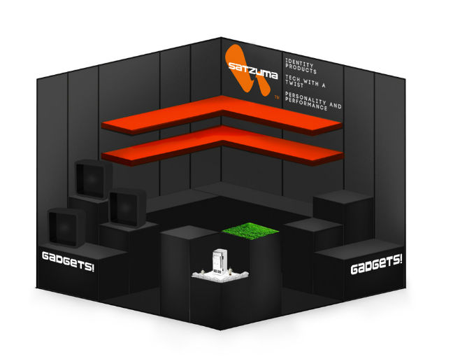
As part of a project for a new retail unit that was to be put into Bluewater shopping centre – I was heavily involved in the kiosk design.
These visuals I am sharing are from that kiosk design. You may be interested In looking at these for inspiration on your kiosk design.
The design followed many of the core processes and principle mention throughout.
Branding, modular design and methods for easy storage and stacking to name a few.
Along with the team I worked with at the time, we also visited the retail centre before creating the design.
Have a look at the images for your own reference and inspiration.
Project for Bluewater


These are just some of the artboards that contributed to the project.

The image of the concept above is another example of a booth or kiosk concept that would be presented to a landlord.

How to save money on your kiosk design
To save money on your kiosk design you should consider “modular design”. Modular design, or designing your kiosk in a way that it can easily be taken down and assembled elsewhere is a strong money-saving tactic.
Another simple way to save money on your kiosk design.
Present your rough ideas sooner rather than later. Don’t wait to show your best-polished work to the very end of the near building stage. Time is money. Show your design intent sooner rather than later to those offering a lease.
Last tip for reducing cost on kiosk design – look and ready-made solutions.
The more ‘bespoke’ your kiosk design is. The more likely you are to need to spend money on custom installation and building.
The design above is an example of a kiosk design that uses the modular method. This is so it can be assembled and taken down more easily and potentially moved to another shopping centre in the future.

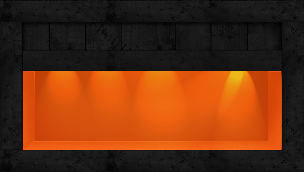
You can also consider what resources are available to you. Such as this crate!

How to design your retail booth (in-house)
By following the steps above you should design your own kiosk in stages and by following the limitations set in the plan.
Consider the materials, branding, cost, and work hours to build and install the kiosk also.
Designing a kiosk is not a small undertaking. You should seek advice from those that know how to build kiosk and from the owners.
IF you would like any help with your kiosk design I would be more than happy to get involved.

How to design a kiosk for retail – the conclusion
In order to design a kiosk that is suitable for a retail environment, your need to create a detailed plan drawing that illustrates the intent and clearly shows key information about its construction.
With regards to useful information to include on the construction plan, you should consider adding the following pieces of information:-
- Kiosk size and floor plan with measurements
- An illustration or render of the kiosk
- Detailed pull-outs of what is happening with the construction
- Notes on materials
- Where electrical points will need to be added.
- How and where customers can pay
- Storage
- How the Kiosk can be made secure overnight.
There are many factors that you may need to be included in your kiosk design plan. And to what degree and detail you need to create your proposal,l is down to your and the owners of the mall that are leasing you space.
Help with ‘designing’ your kiosk
If you have found this article helpful and over you, some step by step guidelines follow you may also be interested in contacting me or looking at my freelance kiosk design services.
Feel free to share this article to any budding kiosk or retail designers.
Below are some other helpful links
Retail and kiosk design-related posts
– How to design a stem product
– How to pitch and game and make money
– How to draw on a computer with a stylus and tablet
External Design Services
– Kickstarter campaign designer
*The kiosk design is copyright copyrighted to the respective business. Do not use. – Thank you for reading – jimmsdesign. Steps on how to design a kiosk.

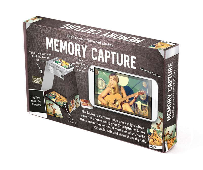
Packaging Examples

